UNIT 1: INTRO TO RED / GREEN
Intro to RED/GREEN
This term we will explore the unique variety of colors and relationships inherent to the Red-Green compliment set. We will create a series of Color Charts and Template studies upon which to play our color chords and expand our color lexicon.
Unlike the Orange-Blue set where the temperature contrast is clear (Orange is clearly warmer and Blue is clearly cooler), with the Red-Green set we enter a more nuanced relationship with temperature. Who is warm and who is cool? It is not so clear. Red can easily lean more magenta-cool or tomato-warm, and green can easily lean yellowish-grassy-warm or turquoise-cool, depending on the pigments we choose to pair.
SO, with this set it is often more helpful to simply name the hue of the light- is the light “Red” or “Green” rather than “Warm” or “Cool”— to help clearly organize our thoughts and the structure of our palette.
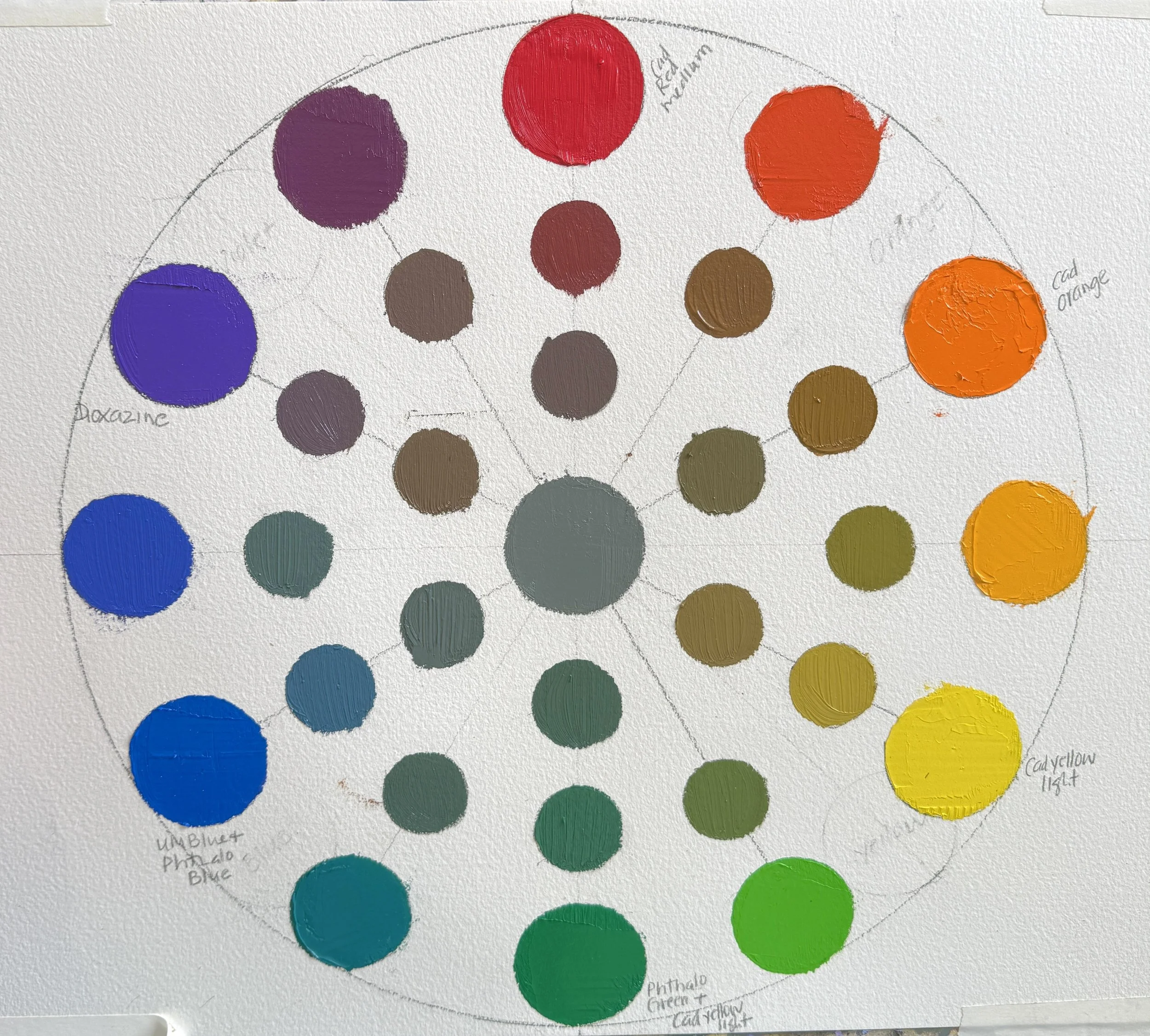
Mixing RED-GREEN Compliment Set Palettes & Creating Color Charts
Throughout this term, we recommend doing several (at least 3) Color Charts, exploring different Red and Green pigment combinations.
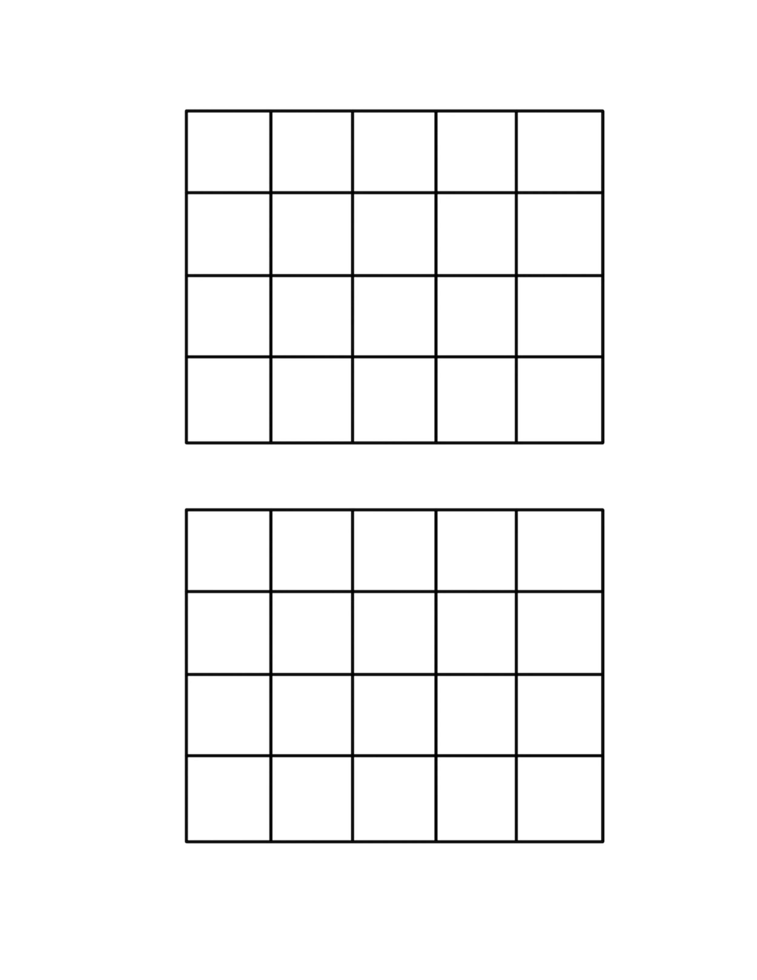
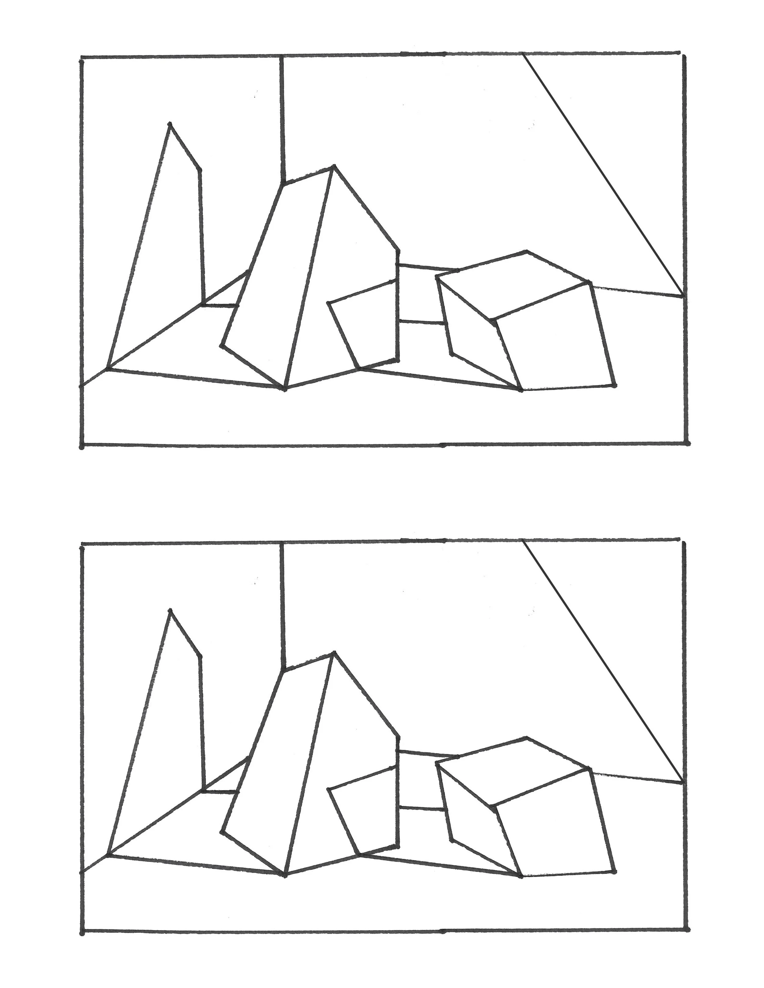
These colors can then be used to develop Template iterations that experiment with contrasts in Value, Temperature, and Intensity. You can use our Box Template and/or Rock Template (pdf images below), or Other Templates of your choosing.
Some of the different pigments we recommend are the following. Feel free to add your own:
REDS:
Cadmium Red Light (opaque)
Cadmium Red Medium (opaque)
Mars Red (Williamsburg, opaque)
Quinacridone Red (transparent)
Quinacridone Magenta (transparent)
Napthol / Fanchon Red (semi-transparent)
Others?
GREENS:
Phthalo Green (transparent)
Viridian
Sap Green (transparent +phalo)
Permanent Green (Windsor Newton +phalo)
Cobalt Green (opaque)
Courbet Green (Williamsberg, opaque)
Blacks + Yellows!
Others?
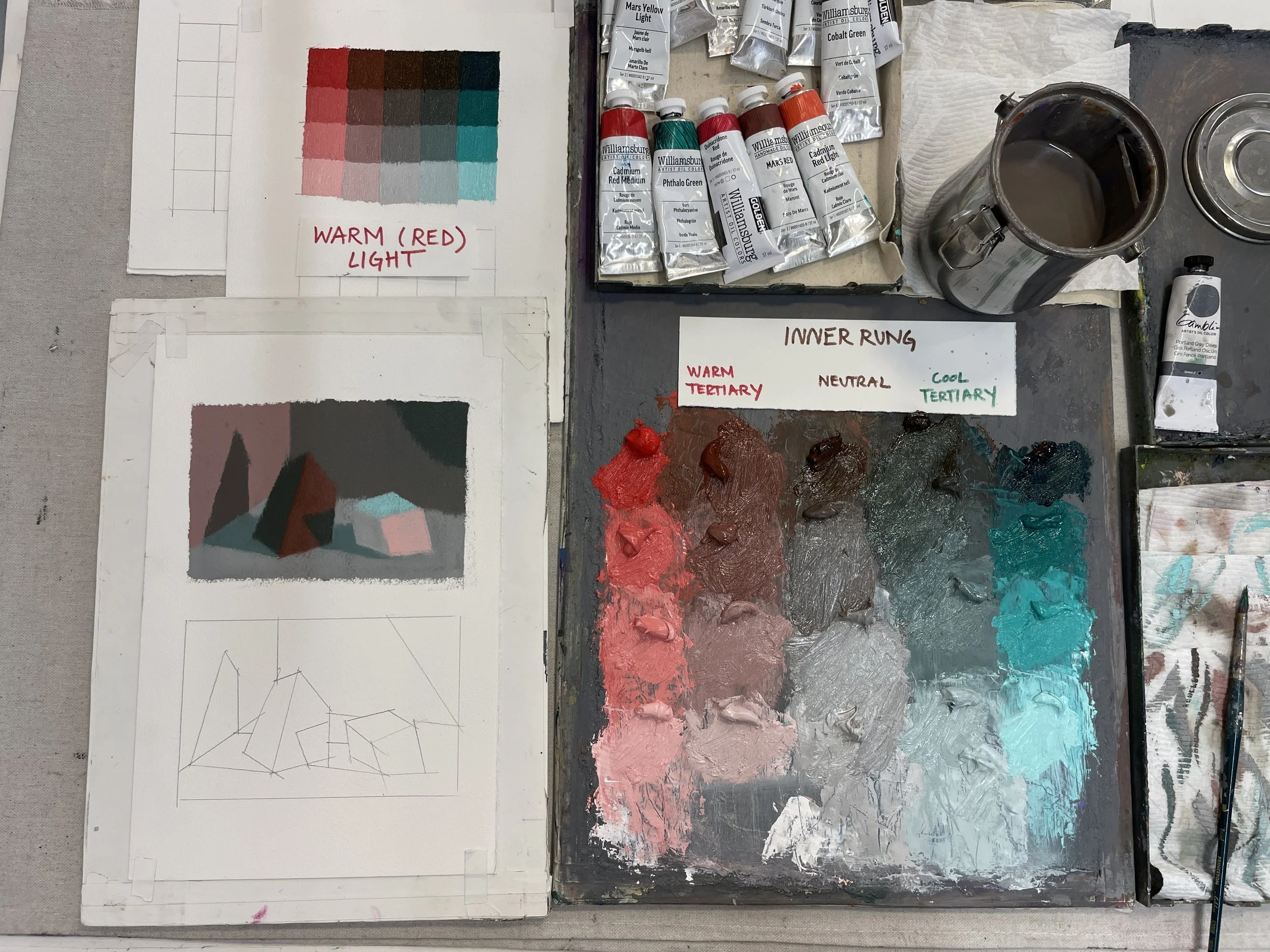
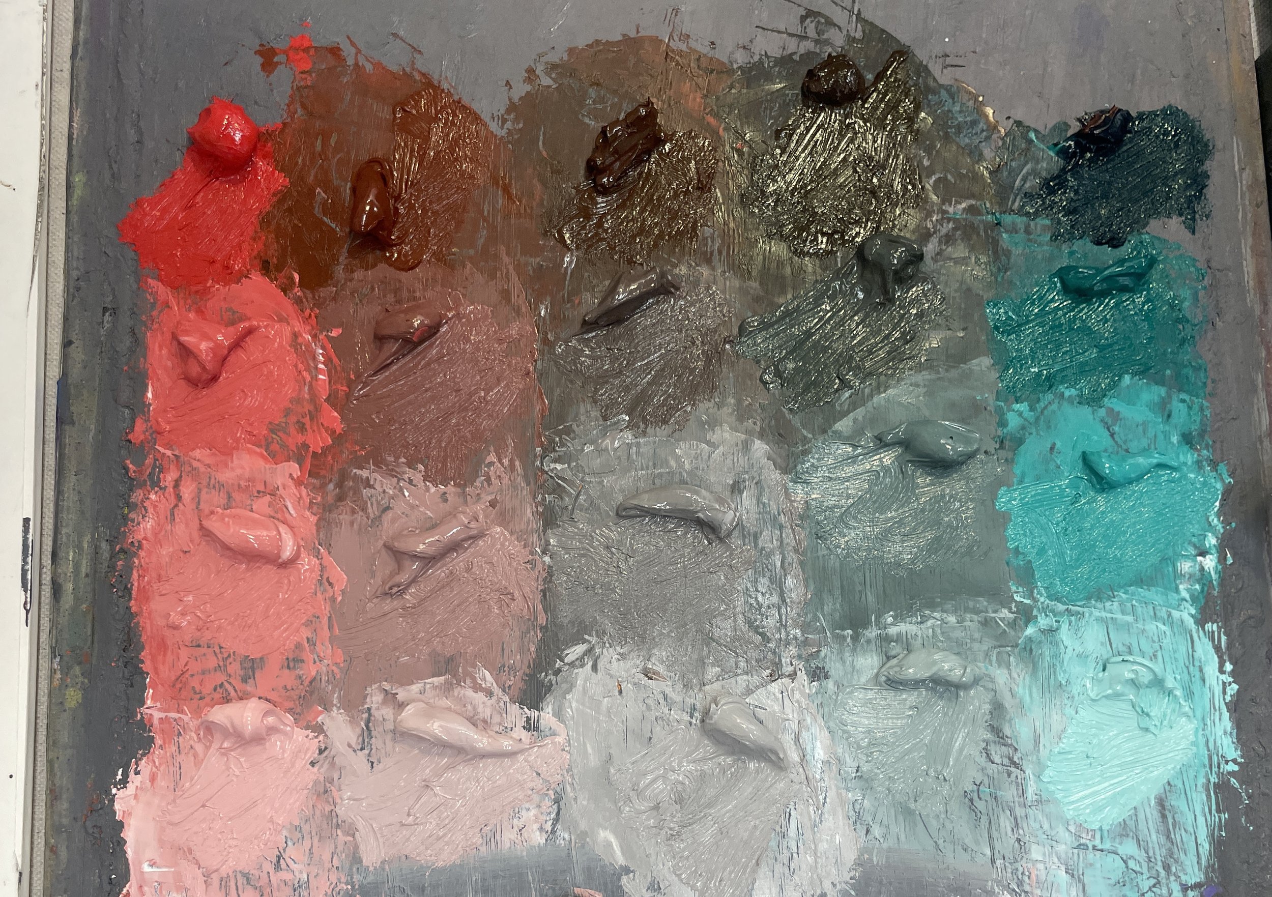
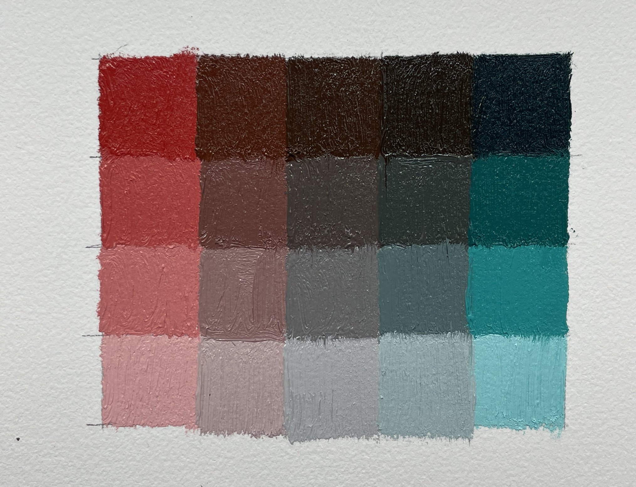
This video shows the mixing of Cadmium Red Medium with Phthalo Green and creating a Color Chart.
I consider this a “classic” set; the phthalo is a very COLD green and the Cadmium Red is relatively warmer, so the temperature contrast is more traditional/ clear. Overall, this palette leans pretty cold. NO AUDIO.
Narrative elements of interest in this video: I give a “thumbs up” when I mix a central neutral that appears as the “third thing”- a color that appears neither red nor green. I then calibrated out from that center, to achieve a warm tertiary and a cool tertiary on either side that fell between the neutral center and the out-of-tube saturates.
Additionally, after the video, I ended up adjusting the lightest value of my Neutral and my Cool Tertiary to be lighter in value, so that the bottom row of my colors are more similar in value.
A NOTE: I do not mind that my rows are calibrated differently in value. It is more important to me that each column shows a clear difference in value between each of the 4 values. However, I DO like the final, lightest row to be calibrated the same. You may find that you want to structure your charts differently. The main point of these charts is just to get a sexy overview of options from the set.
This Video shows the mixing of Transparent Red Oxide with Sap Green and creating a Color Chart.
This palette is much warmer overall. NO AUDIO.
Template Studies and Explorations
One of the most important lessons we like to share in the Modern Color Atelier, is how to set-up a studio practice that includes a lot of playful and nerdy color explorations. DO YOUR RESEARCH and have a blast doing it! Color Charts are a meditation; Template iterations are how we experiment with and put our colors into practice.
Sometimes we have a clear plan; Sometimes we just let the iteration follow an unexpected pathway. There is no wrong answer. What we are doing is creating an intimate relationship with our colors. Playing the keyboard and seeing what can happen as we arrange and rearrange our contrasts in Value, Temperature, and Intensity.
We highly recommend that this research be a regular part of your studio practice, running parallel to and mutually informed by your more conceptual studio projects and motif developments.
BELOW YOU WILL FIND A FEW VIDEO ITERATIONS/ EXAMPLES OF THIS PROCESS.
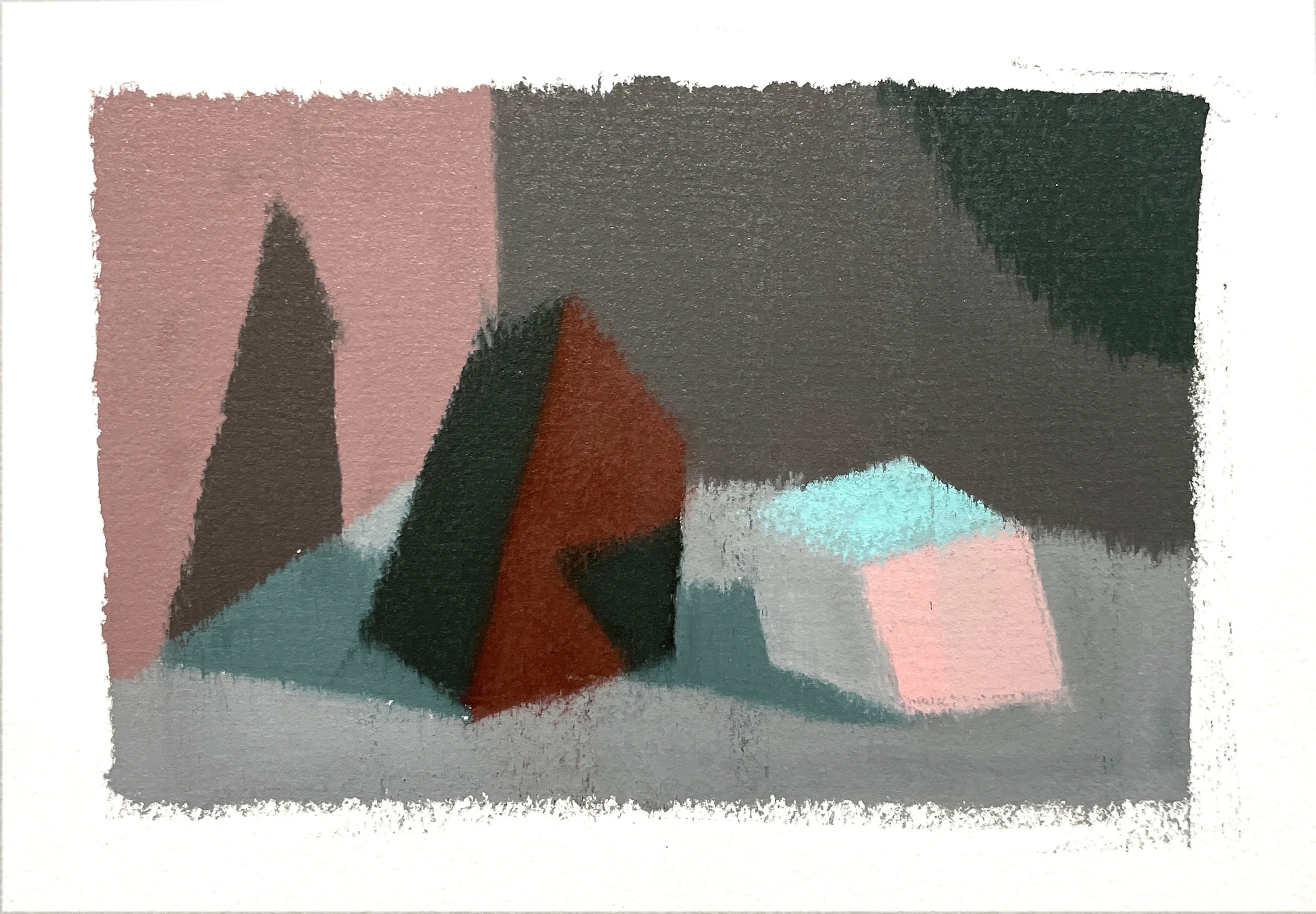
This Video shows the block-in of a 2-Rock Template, using mostly the Inner Rung Tertiaries. Cadmium Red Medium and Phthalo Green. NO AUDIO.
Narrative elements of interest in this video: In the 2-Rock Template, I designate the cube form on the right side to be my lightest object, and the pyramid form on the left as my darkest. The value of walls and ground were a “choose my own adventure” as I went along. I held onto Relative Value relationships of each surface/ object, and remained consistent in my “temperature” structure (a RED leaning light).
HILARIOUS 1st move: I immediately forgot that I wanted to only use the 3 inner rung hues, and went for the warmest light hue for the light on my white box! Ha! I end up realizing this, scraping it down, and replacing it with the lightest value of my warm tertiary instead. What is groovy, however, is that when I scrape the study down at the end, the warmer pink showed through from underneath…and I love that!
I continue calibrating and jostling my value relationships throughout the process, scraping-down when i want to make adjustments.
FINAL MOVE/ RULE-BREAKER: I used the saturated, phthalo green, lightest light for the top of my cube. …I was just feelin it!
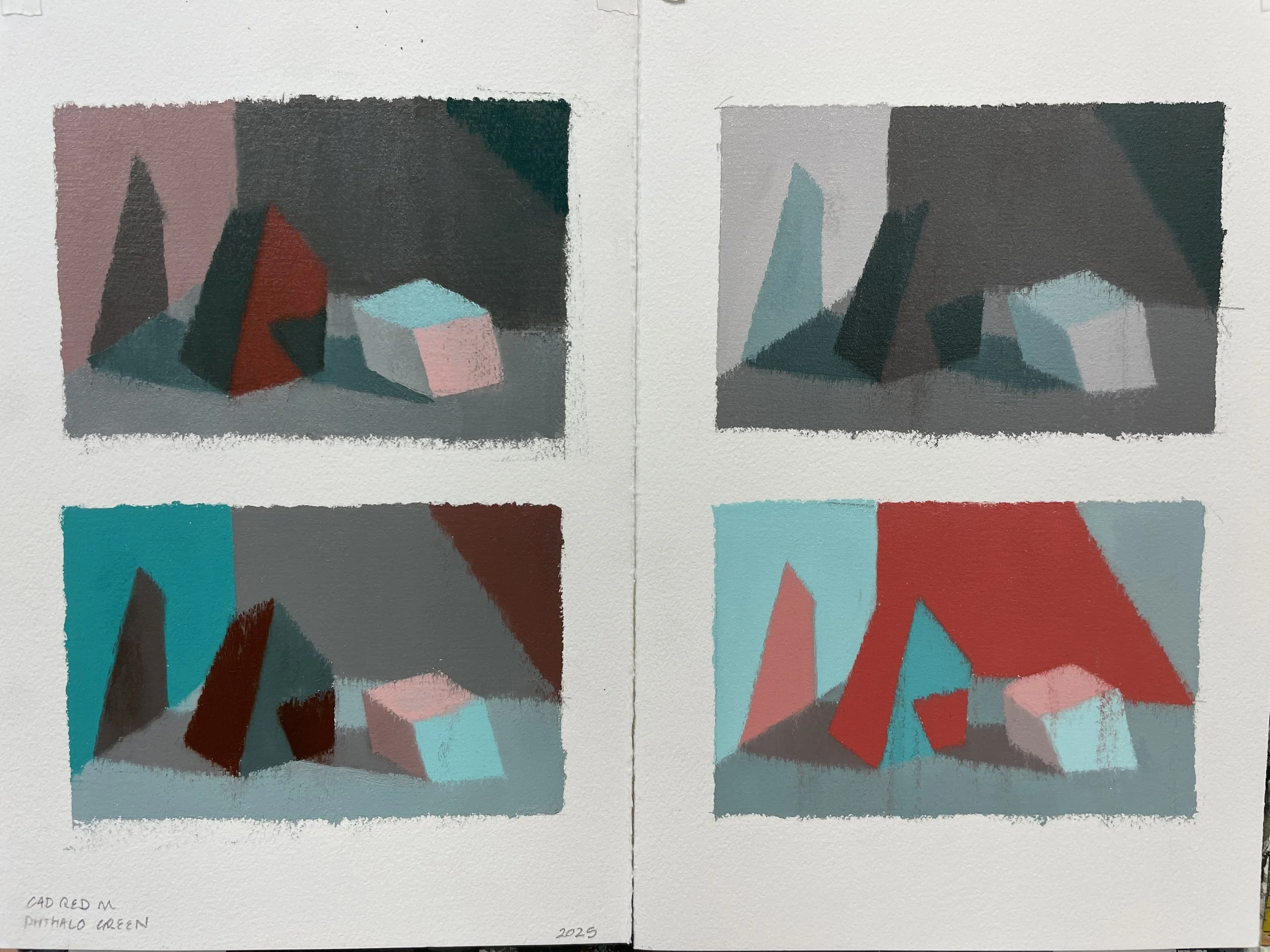
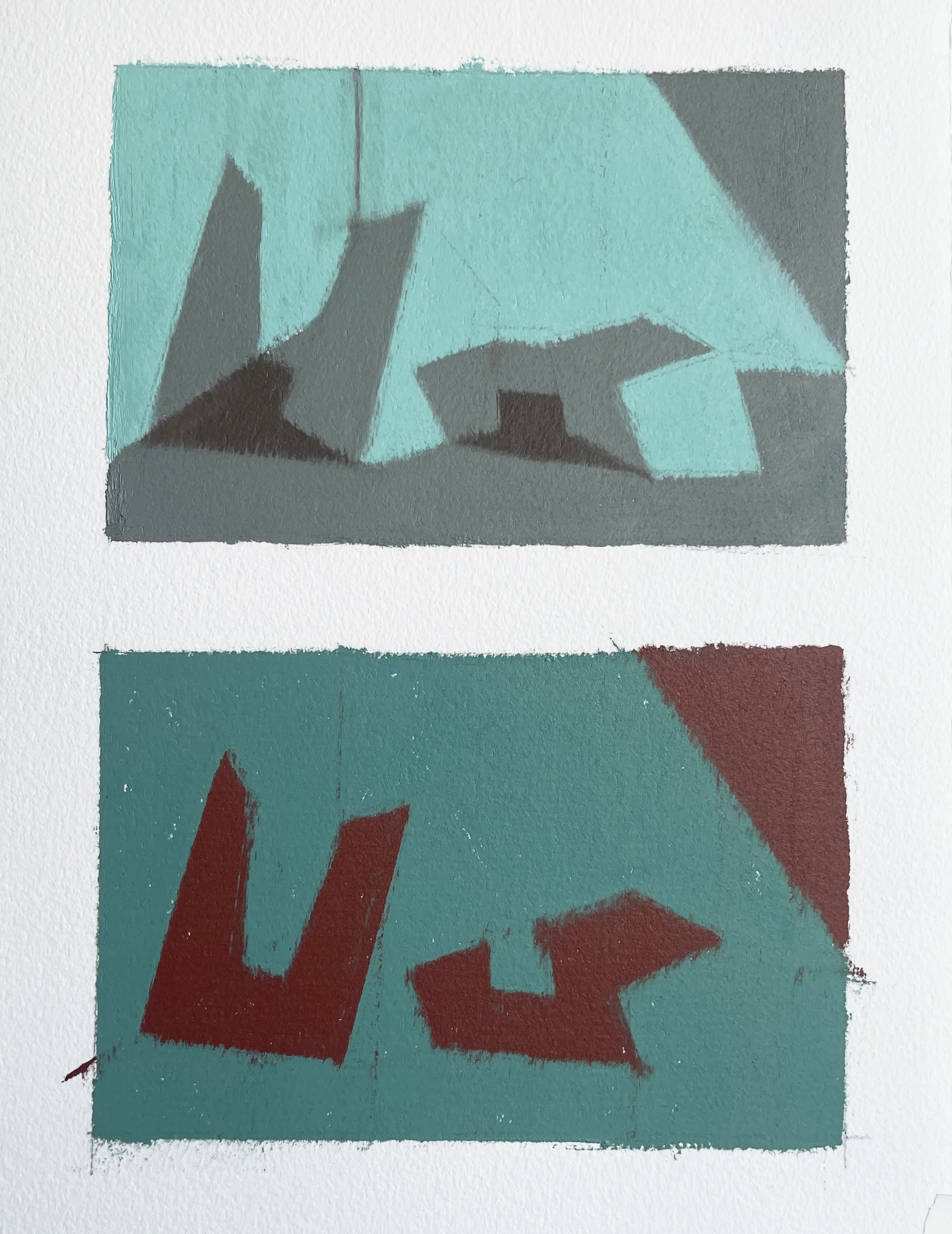
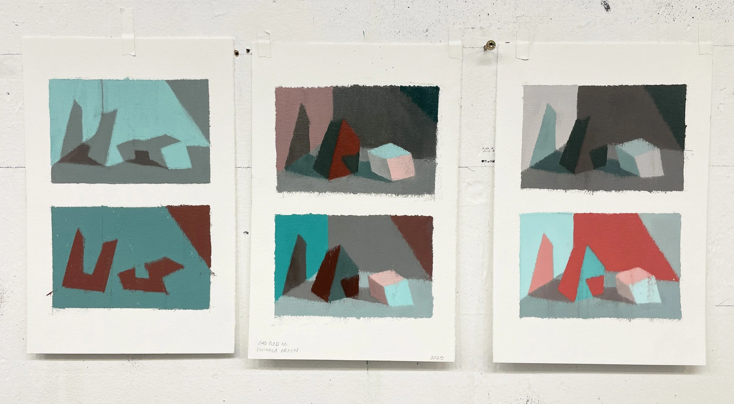
…and many more iterations to come!
This Video Shows the block-in of a Box Template, using a limited Tertiary Palette. Transparent Oxide and Sap Green. NO AUDIO.
Red Light; Green Shadows. Tertiary white box study; using only the Warm Tertiary column to express “warm” (red) light and the Cool Tertiary column to express “cool” (green) shadows.
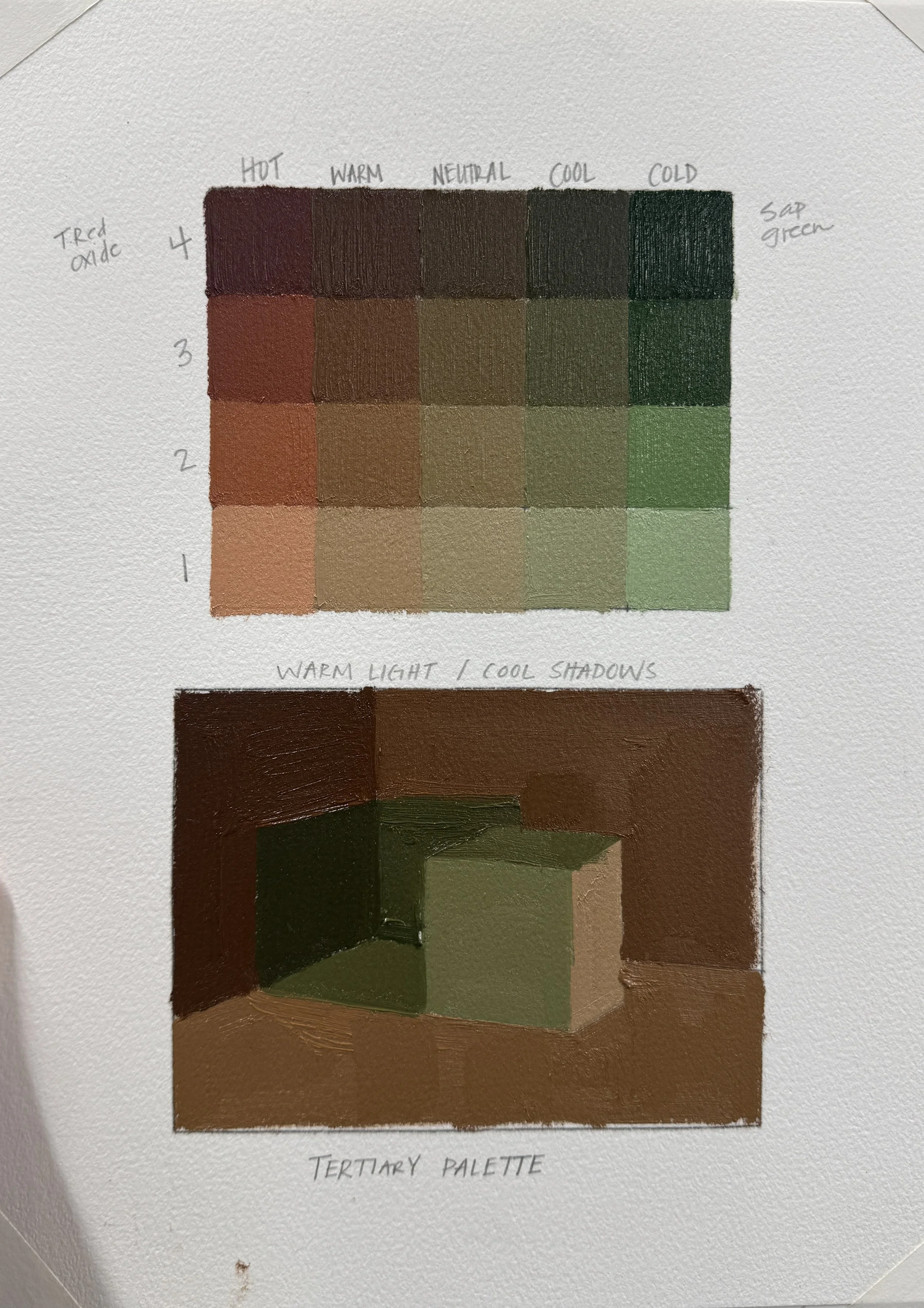
This is a 14 min video labelling Value and Temperature decisions using a full intensity red-green palette.
AUDIO DESCRIPTION INCLUDED
Transparent Red Oxide, Sap Green, and Titanium White
PDF Chart & Template Options:
Click on any of the below pdf documents for your Color Chart and Template needs. Also, of course, feel free to develop your own.