UNIT 7:
SATELLITING
Now that we have some experience mixing a complement set and applying those mixtures to different Value, Temperature, and Saturation contexts, we are going to expand our palette to include additional hues.
Our starting complement set- in this case orange/blue- will remain our bloodline, the main family of colors into which all other colors will be mixed.
Additional hues— or satellites— will give us access to harmonious versions of all other colors.
Studio Set-Up:
Be sure to have LOTS of space on your palette surrounding your initial, tertiary grid of colors. You will need this space for mixing.
Prismatic Hues: these can be an array of different pigments. Seen here: Cadmium Red Medium, Cadmium Red Light, Cadmium Orange, Cadmium Yellow Light, Phthalo Green, Phthalo Blue, Ultramarine, Blue, Dioxazine (Egyptian) Violet, Quinacridone Magenta).
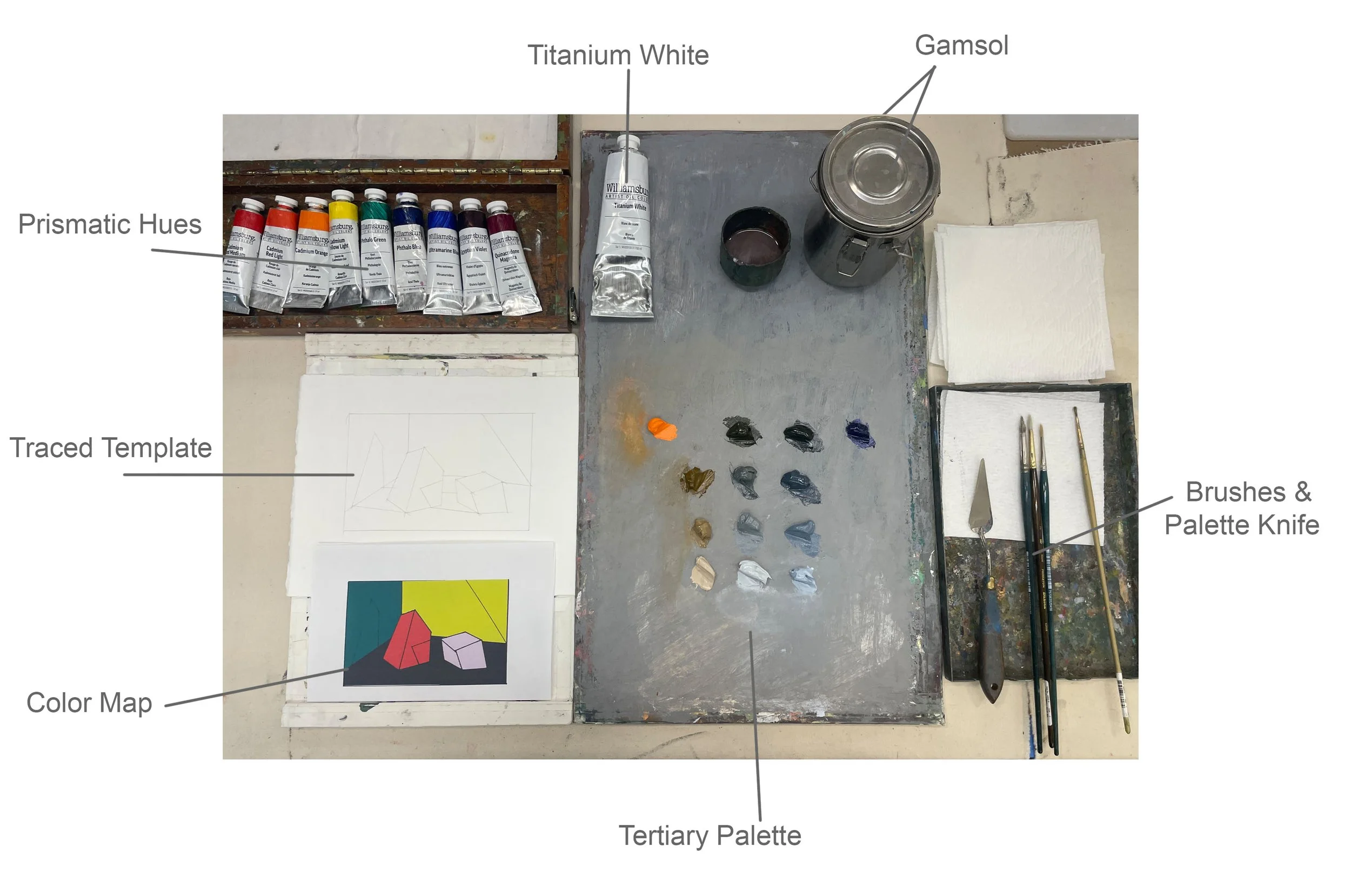
Starting Palette:
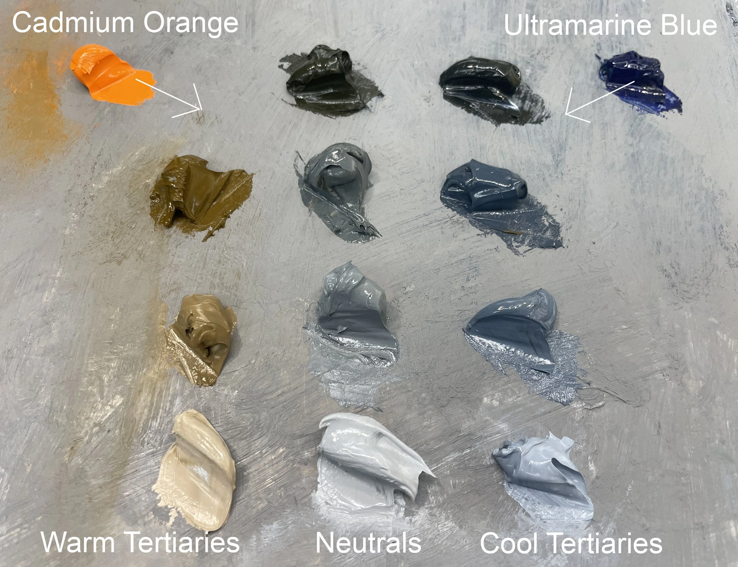
This will be our starting grid of colors. Using Cadmium Orange and Ultramarine Blue, I’ve mixed a Neutral, a Warm Tertiary, and a Cool Tertiary-with several Values of each.
This is just one option for a starting palette. You could have a more limited palette (just a warm and cool tertiary), or a more expanded palette, as in the full range of tertiaries from the last unit. You could even just start with a single mixed neutral.
The starting palette is what we will use to satellite additional colors INTO. By using a Complement Set as a starting place, we are accessing a specific cross-section of the color wheel. By mixing all of our colors out of this cross- section, we are ensuring that all of our colors have a harmonic relationship; they will be related to each other.
The Template:
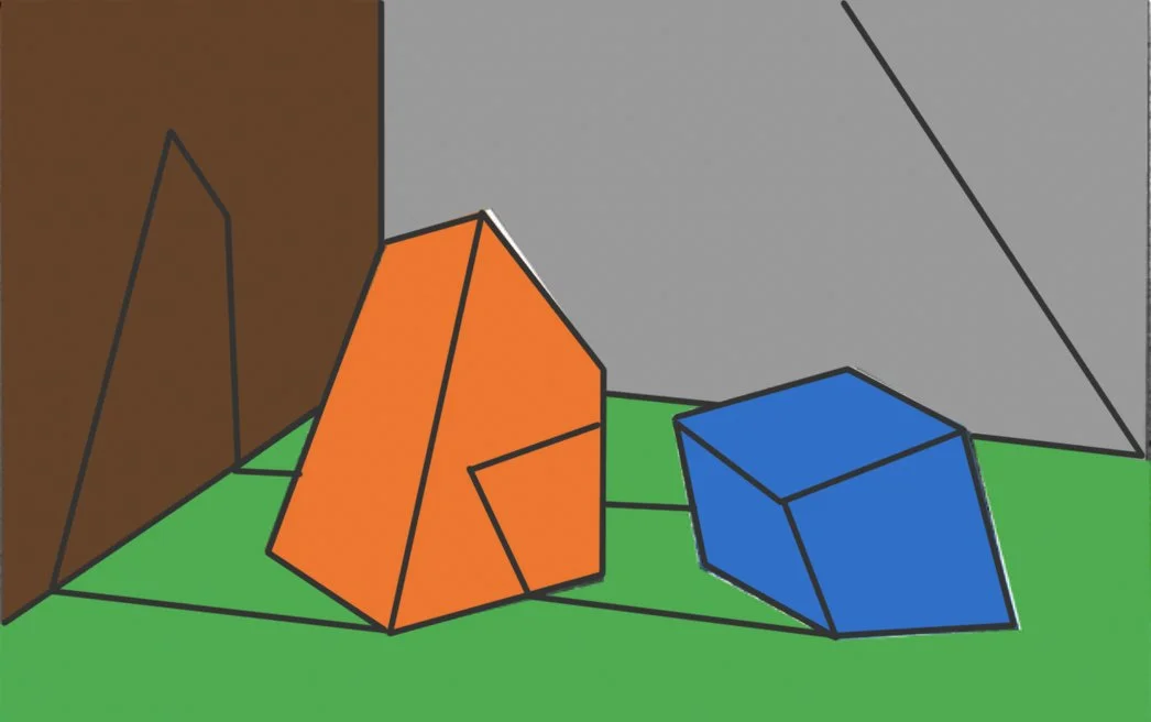
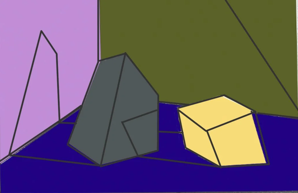
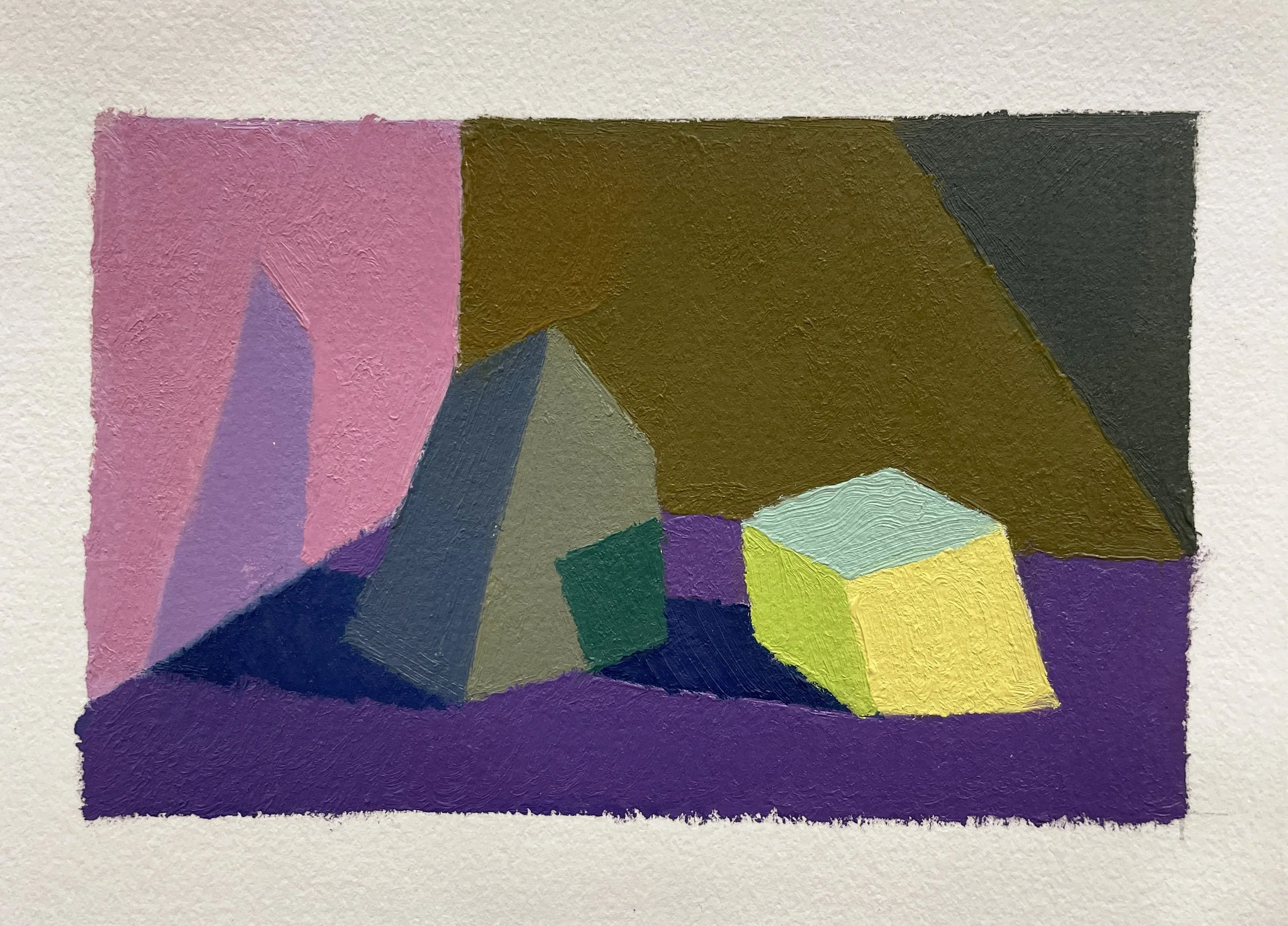
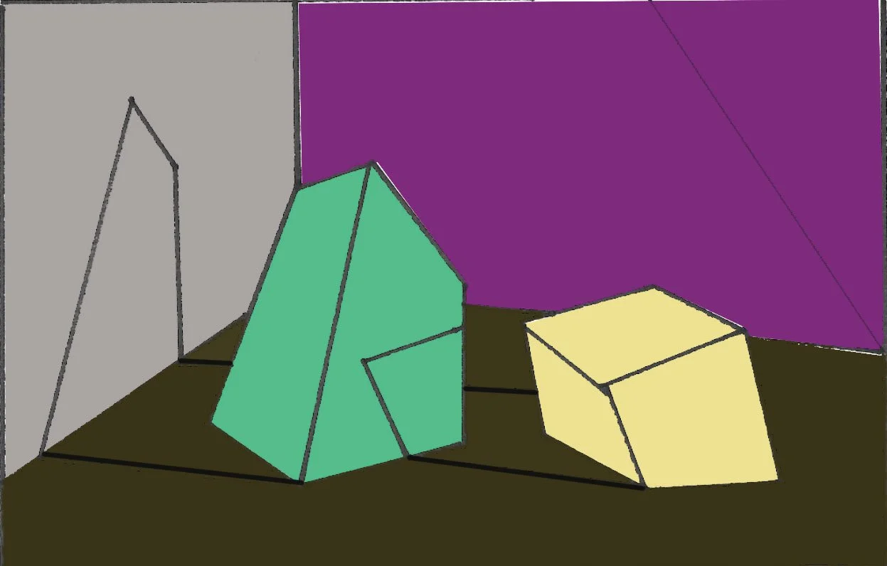
We will use this 2-Rock template and assign each object and surface a different local color.

Click on image for downloadable Template
Analogous Hues:
Analogous hues are simply colors that are next to each other, or neighbors, on the color wheel. When we mix analogous hues on the outer rung of the color wheel, we maintain intensity; these colors do not neutralize because we are not mixing the 3 primaries together (tertiaries), but rather only 2 of the primaries. For instance, mixing red with purple, we can get an array of magentas; mixing yellow with green, we can get an array of grassy, limey greens, etc.
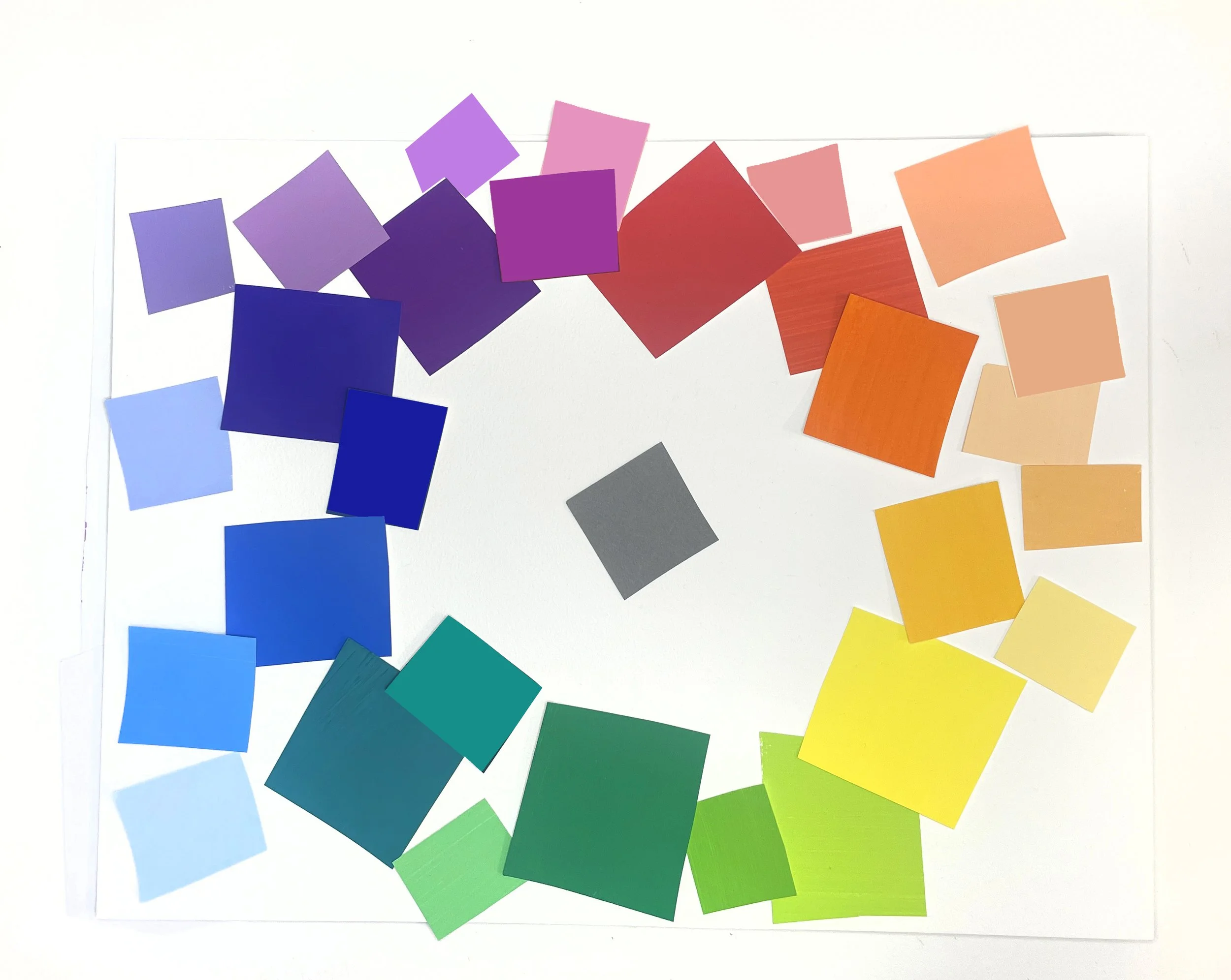
Keeping our analogous hues in mind as we are satelitting, is helpful for mixing warmer and cooler versions of each local color, in order to express the temperature of the light and shadows.
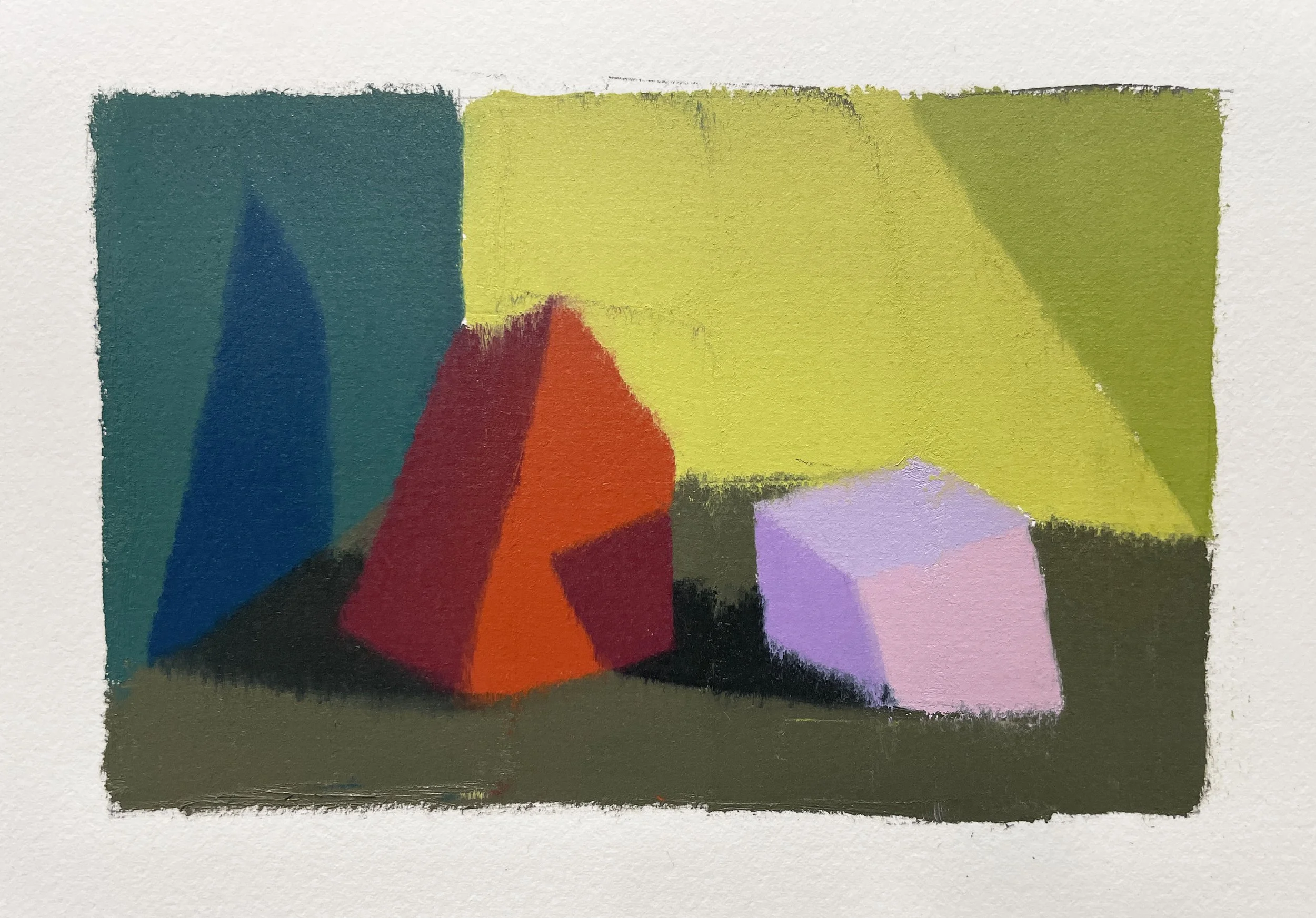
For example, if an object has the local color of red, we can mix an oranger-red to express warm light on that object, and a purpler-red to express a cooler shadow on that object.
This is true for all the hues except Orange and Blue. Orange is warm no matter if we move towards red or yellow, so to cool it down we must enter the inner rungs of the color wheel- by adding it’s complement.
Blue is cool no matter if we move towards green or violet- so we can either enter the inner rungs to warm it up, compromising it’s intensity, or we can make a choice about whether the light is more greenish (a yellower light)or purplish (a redder light), and then make the shadow the other option in order to show contrast- the important thing is to express a change in hue, as well as value and temperature.
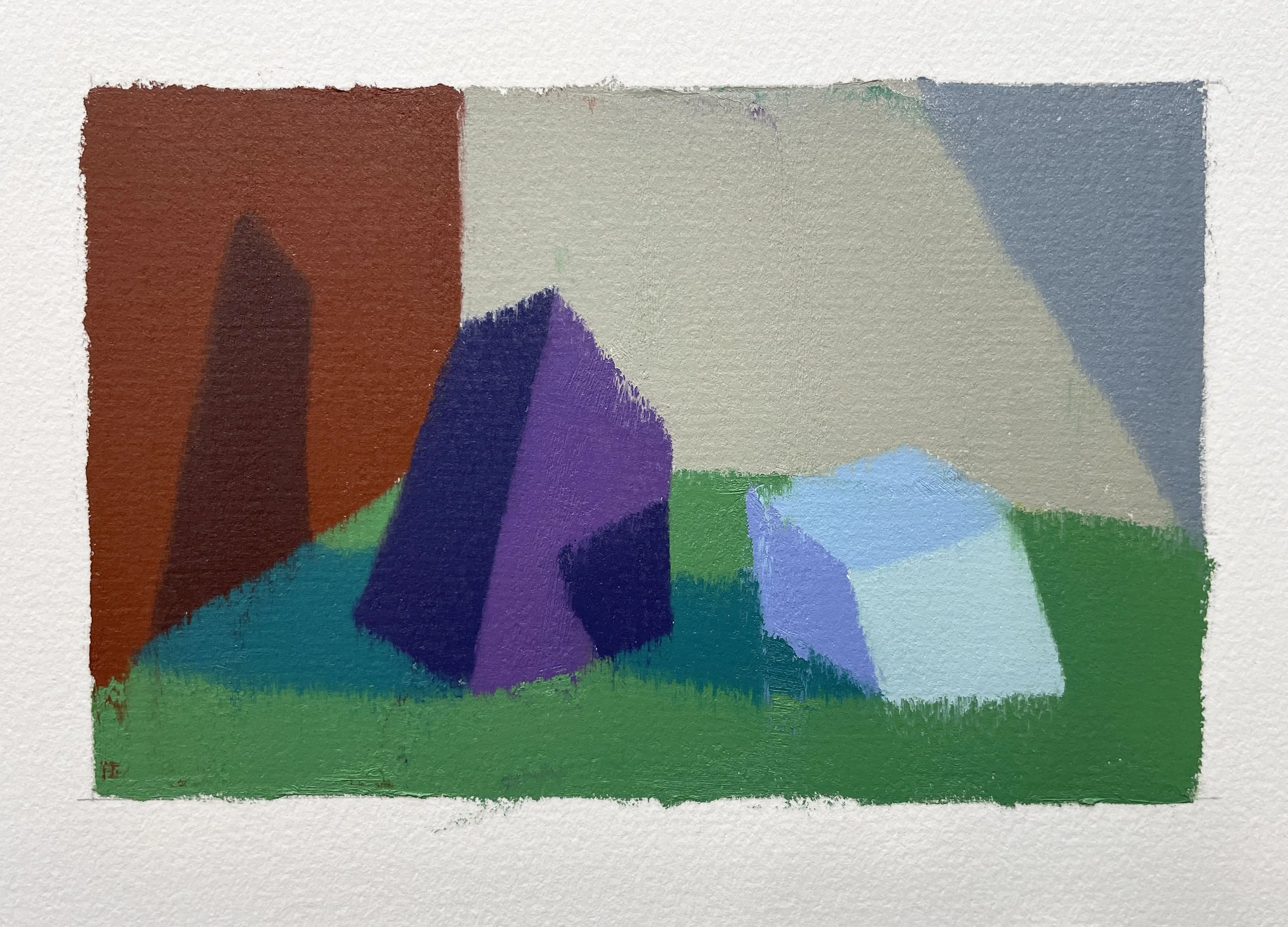
Satellite Example 1:
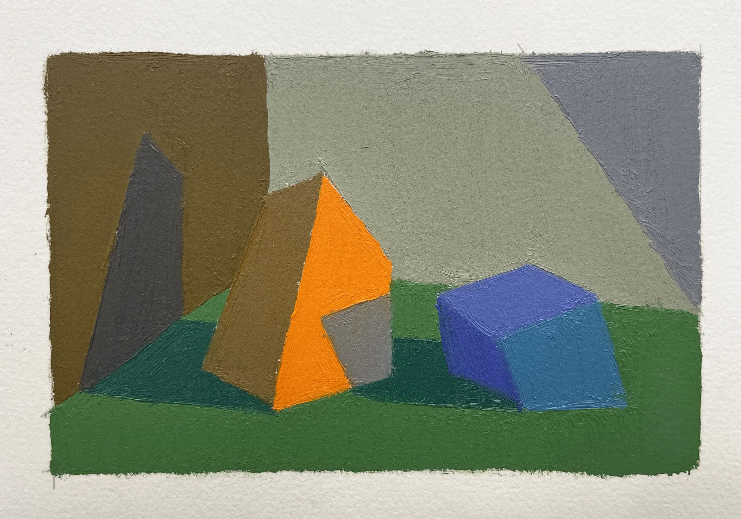
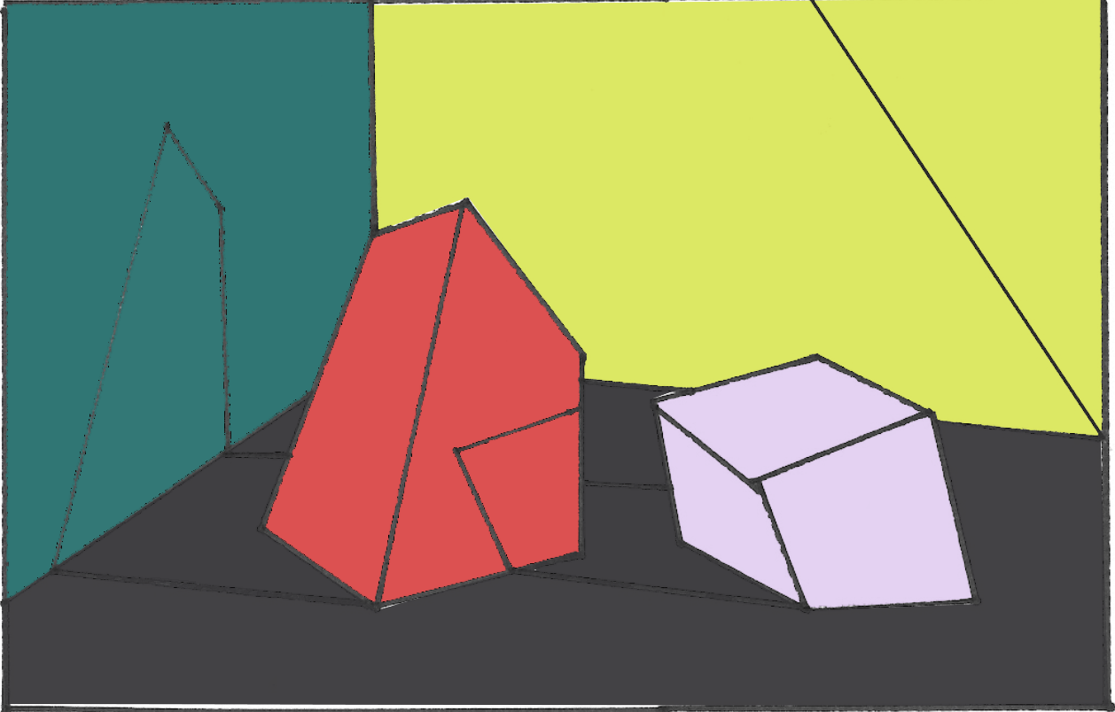
This is the color map we are going to use for our first example. This shows the local color of each object and surface, as well as its relative value.
Warm Light / Cool Shadows
Palette Hygiene:
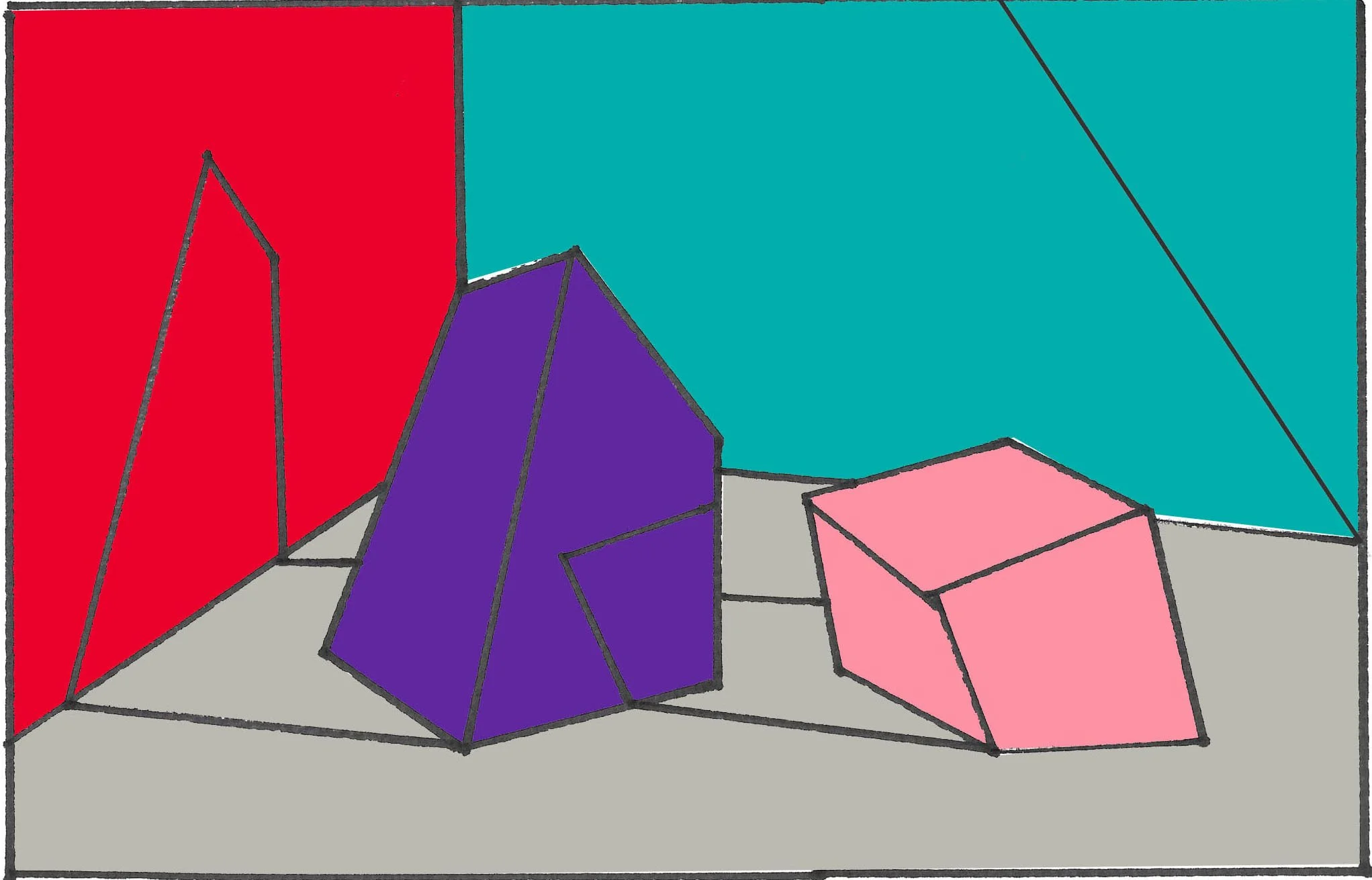
Satellite Example 2:
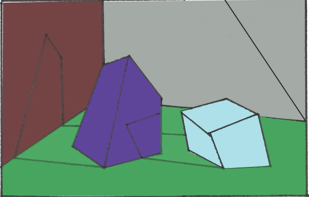
Warm Light / Cool Shadows
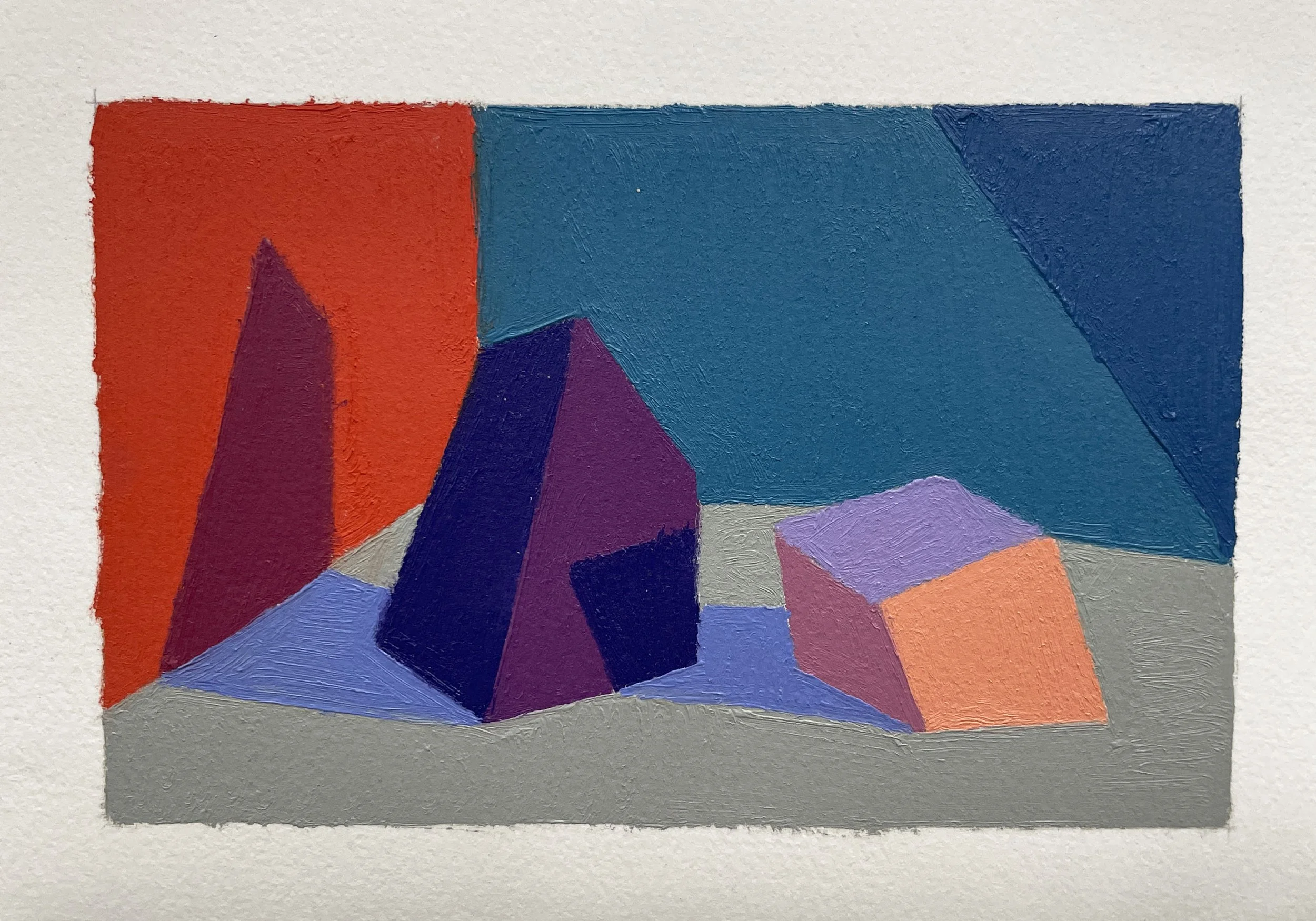
Satellite Example 3:
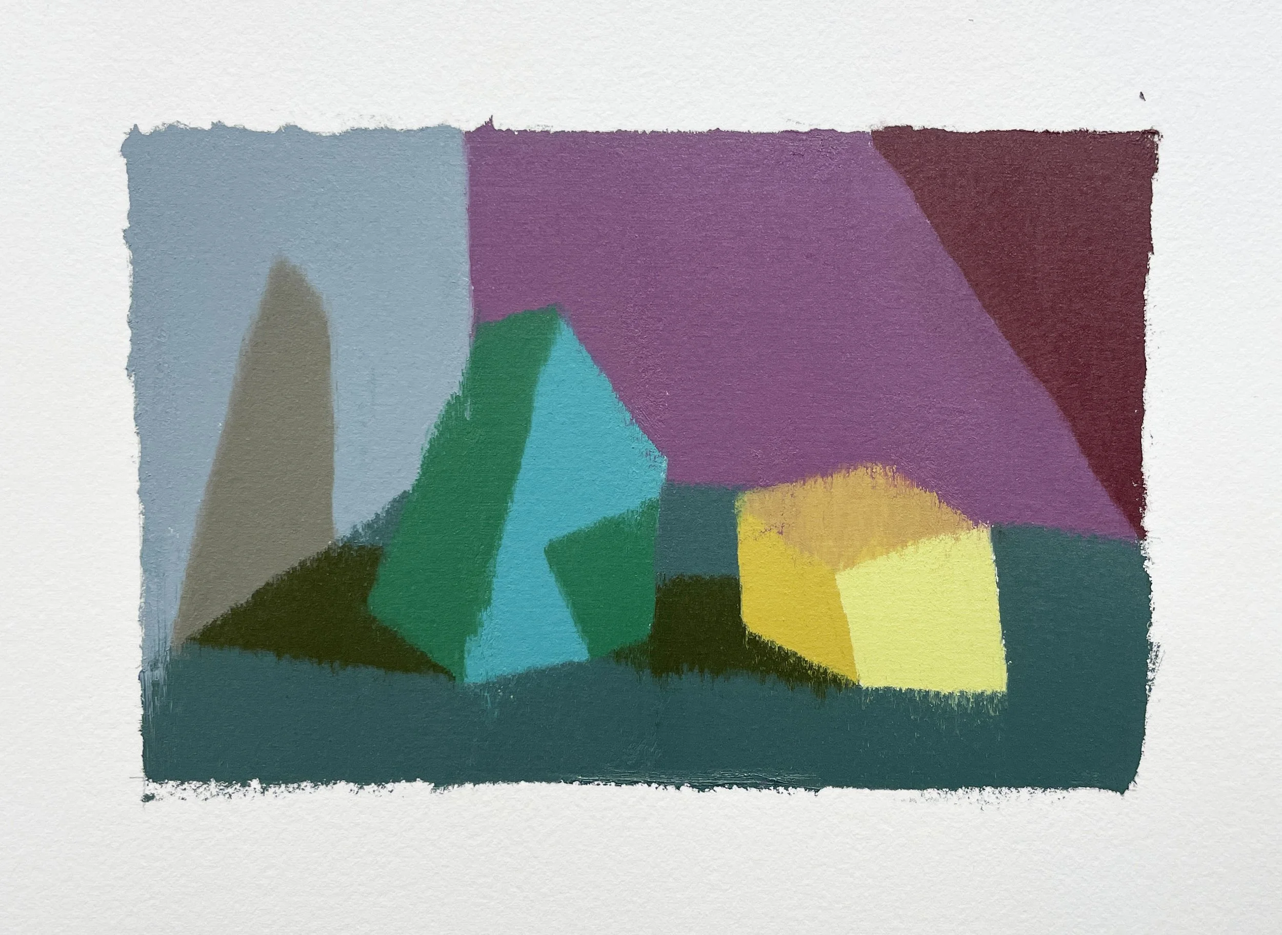
Cool Light / Warm Shadows
Other Examples: