
UNIT 6:
INTENSITY
Saturation vs. Neutrality
This week, we will be expanding our considerations of Temperature to include the idea of INTENSITY. Intensity is yet another tool in our toolbox as painters that influences the structure of our pictures and is another means of expressing pictorial contrast. Another word for Intensity is Saturation; our most Intense/ Saturated colors are on the outer rung of the color wheel.
Last week, we began by naming the light as either “warm” or “cool” and using a simple warm tertiary mixture and a cool tertiary mixture to describe the temperature of the light. This method very elegantly illustrates the light as either warm or cool, but it does not give us the option to express any differences in intensity among the objects and surfaces.
This week, we will be considering 3 aspects of color:
-What is the relative Value of the object/surface? How light or dark is it?
-What is the Temperature of the object/surface? Is it being touched by light or is it in shadow? Is the light warm or cool?
-What is the Intensity of the object/surface? How saturated or neutral is it?
This week, we will be expanding our Orange-Blue Complement set palette to include:
Hot
Warm Tertiary
Neutral
Cool Tertiary
Freezing
The expansion of your palette will give us the ability to express different intensities or saturations in your scene.
Feel free to use any orange-blue pigments you have. Below are some pictures of different tertiaries you might achieve, depending on what pigments you start with.
Mixing an expanded Temperature Palette
Orange Blue
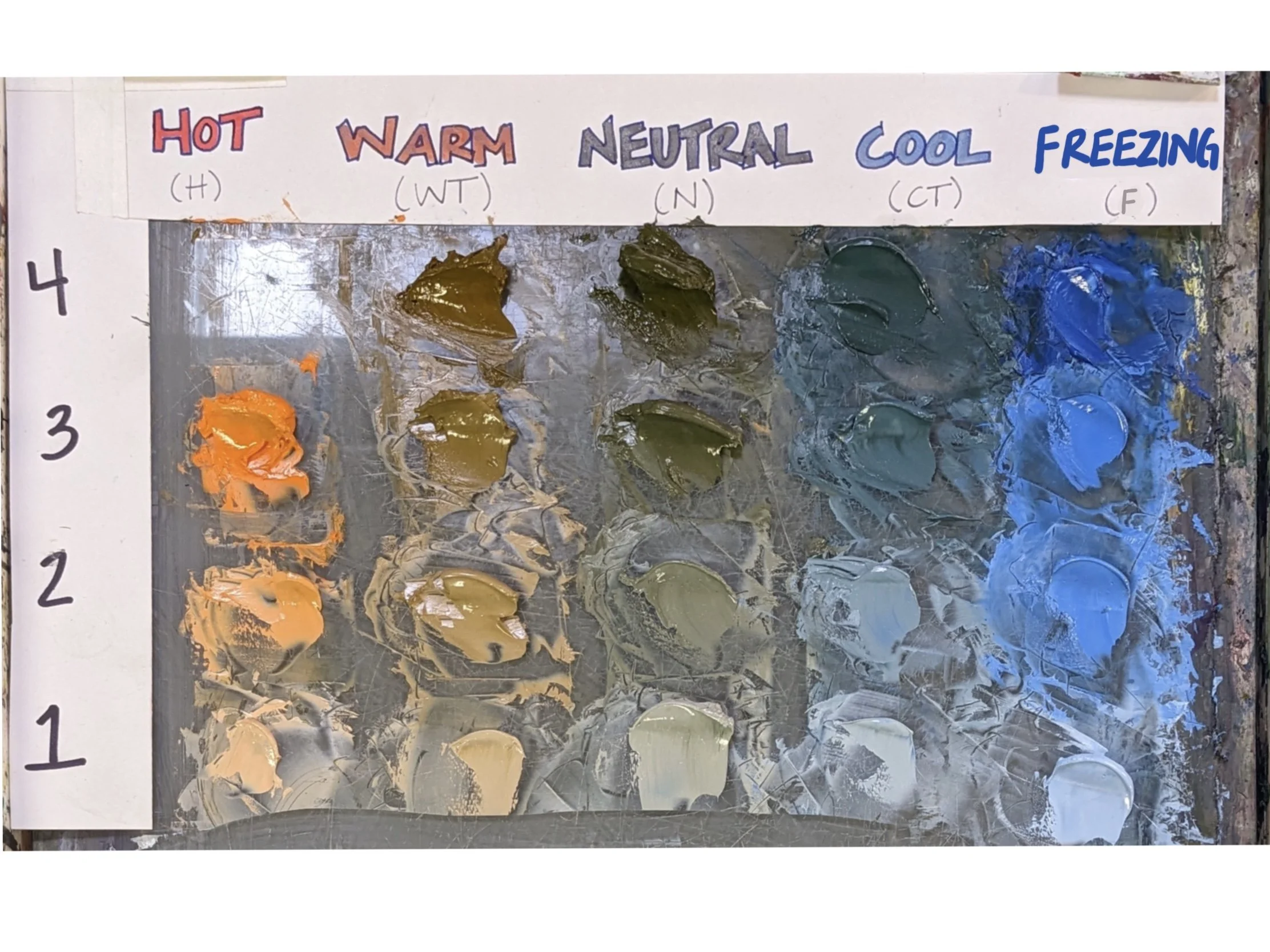
Cadmium Orange / Phthalo Blue
Mixing Orange Blue Compliment Set; AUDIO DESCRIPTION
Another Mixing Example:
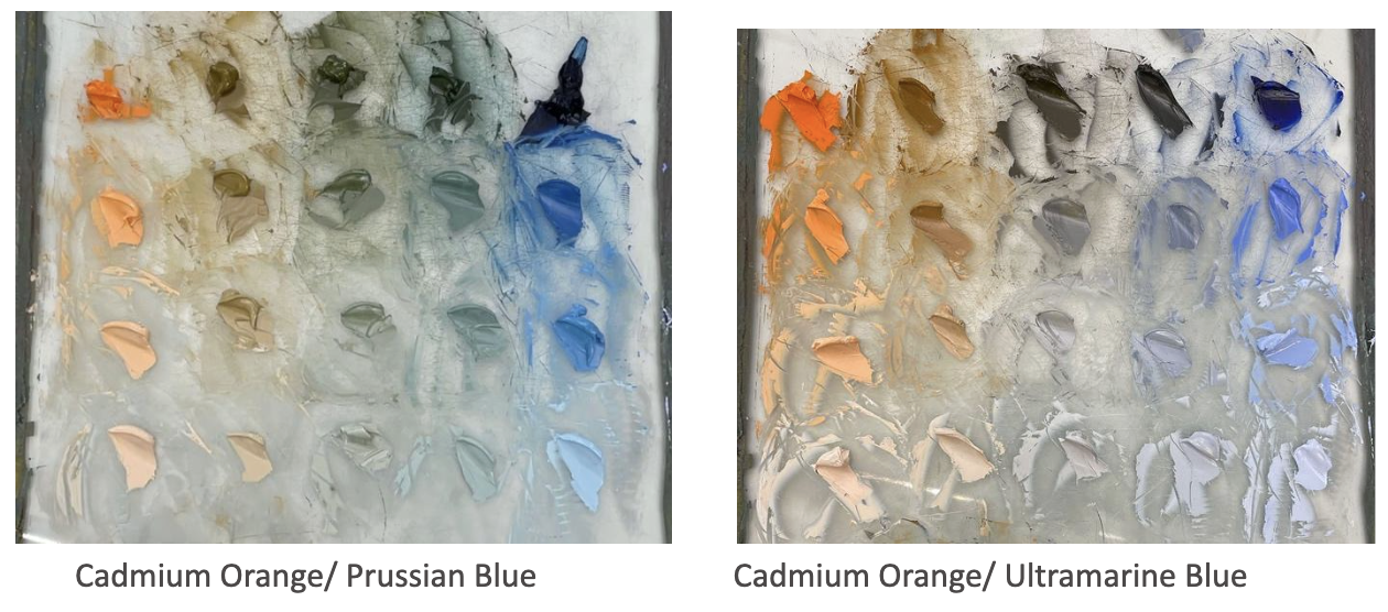
Mixing Orange-Blue Complement Set; SUBTITLES NO AUDIO
Painting your Orange Blue Color Chart
Video of painting-in a Blue-Orange complement-set color chart; NO AUDIO
Box Template Studies
We will be revisiting our Box Template now with our expanded temperature palette while still paying attention to the Relative Value of each surface, and the Temperature structure of light and shadow.
Click on the image below for a downloadable PDF of the Box template. Trace this template onto your painting surfaces.

Video Showing the labeling of a Temperature Map; AUDIO Description
Video of Box Study Block in; Audio Description
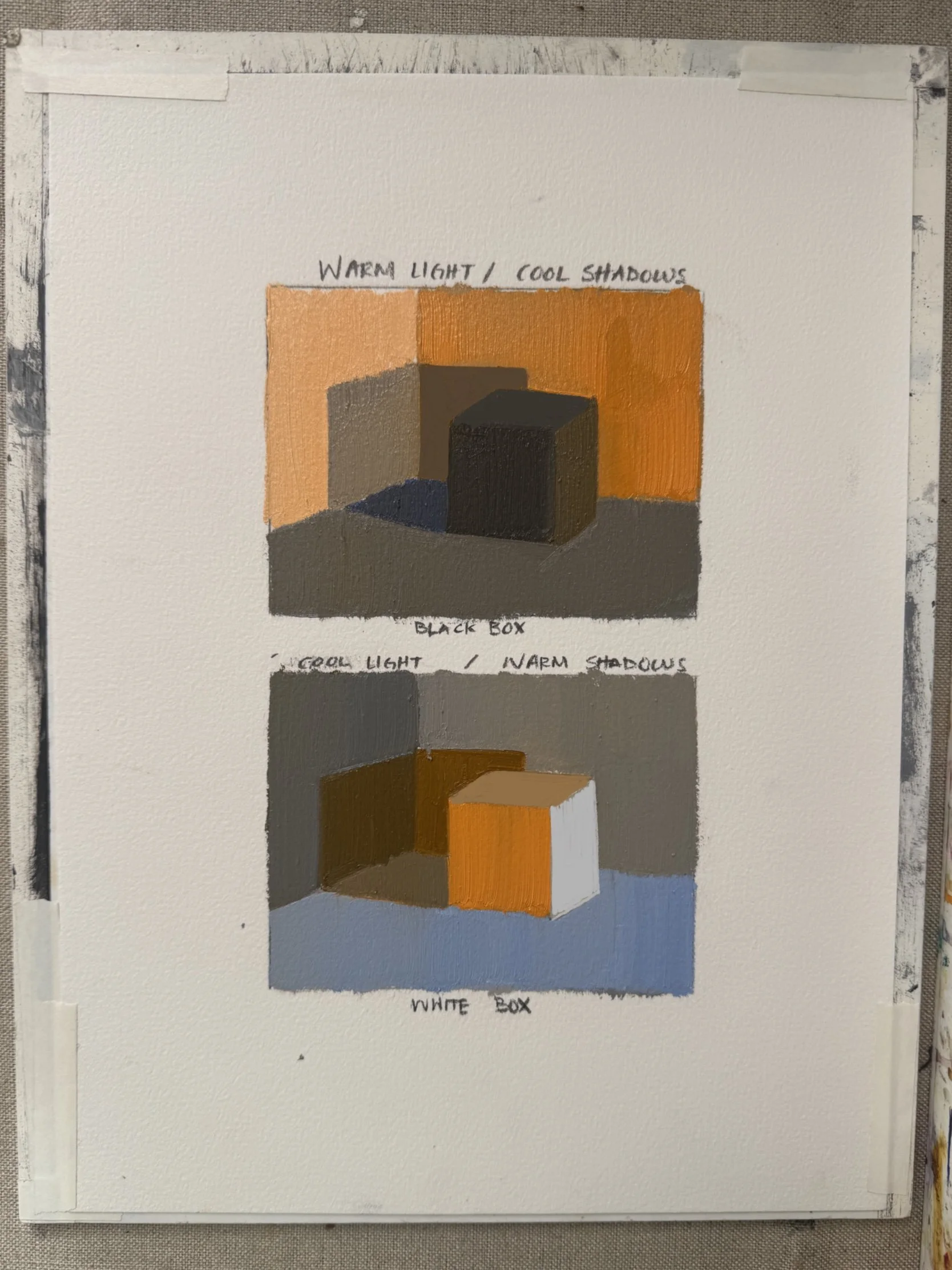
Other Examples:
Now that you understand the logic of intensity, you can use your box experiments to play with the idea of intensity/saturation as a design choice. We can now see that large or extreme temperature contrasts are another tactic to lead the viewer’s eye around a picture; therefore, you might begin a new box study and experiment with some new inquiries, such as:
Where do you want to put your most extreme temperature contrasts?
Do you want the box to be your protagonist or perhaps one of the walls/floor planes?
What if you build the entire box study with your saturated hues and only a few tertiaries? or vice versa?
Your only rules are:
Stay true to your relative value structure
Be consistent with the temperature of your light
NOW have fun and get weird!!
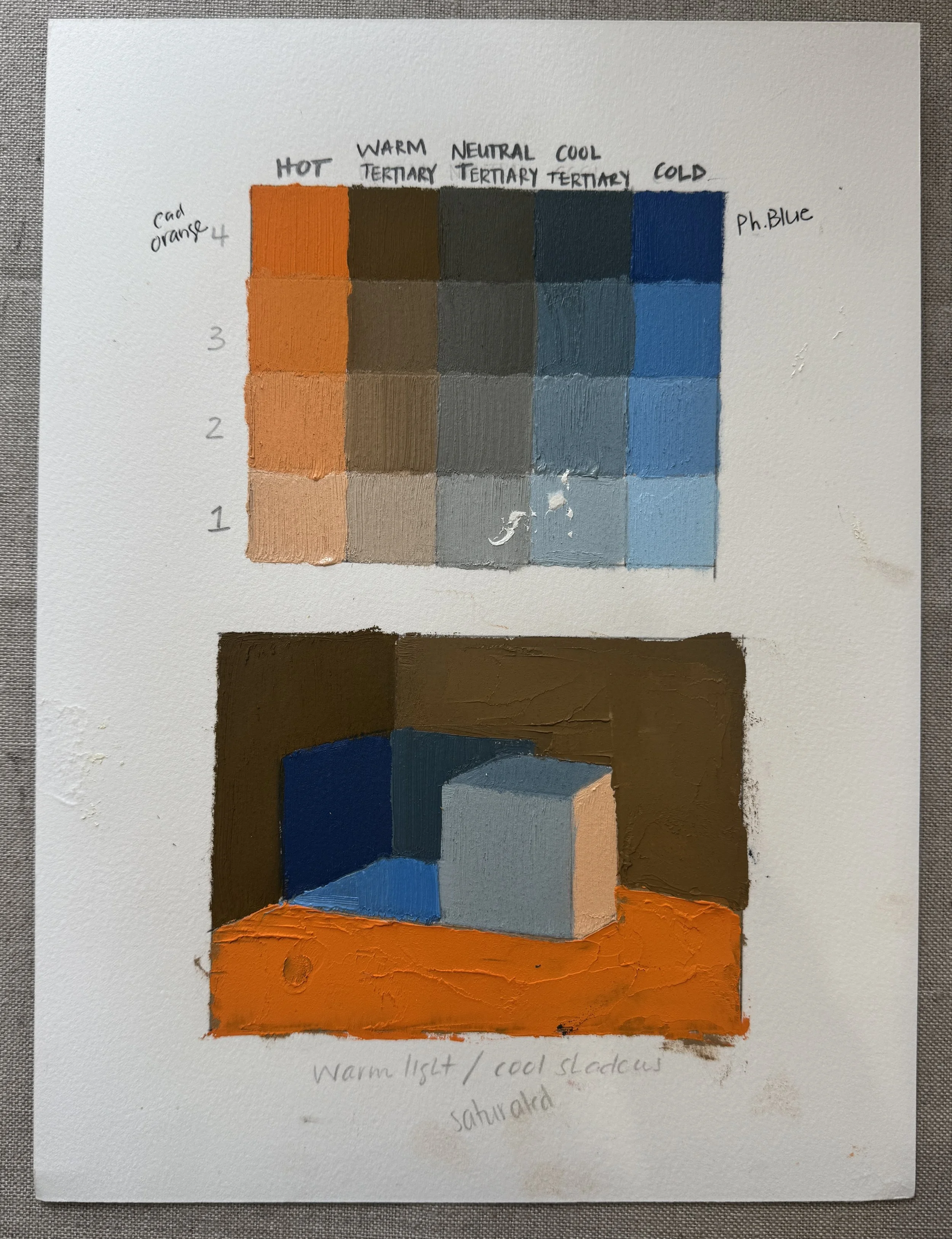
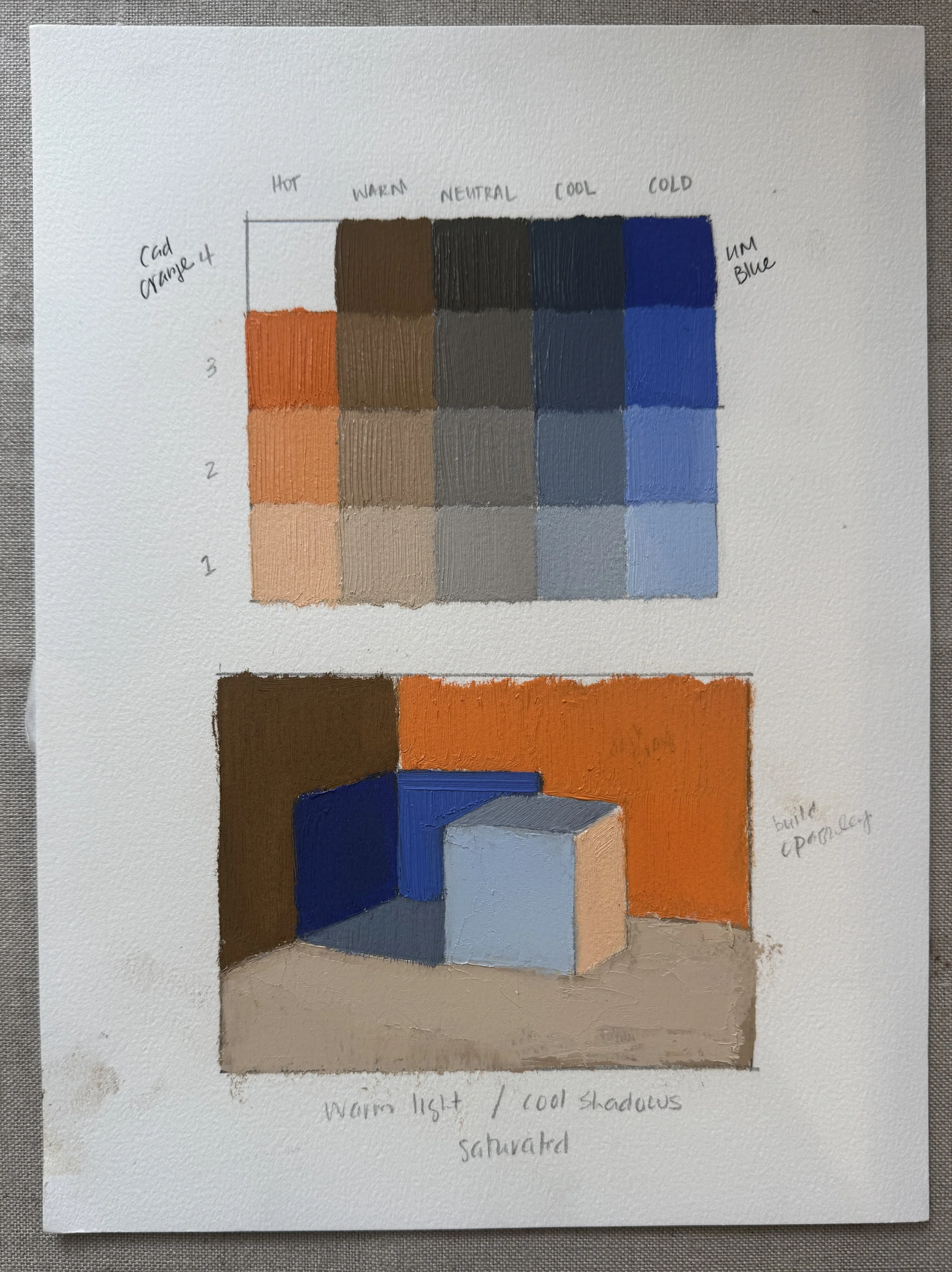
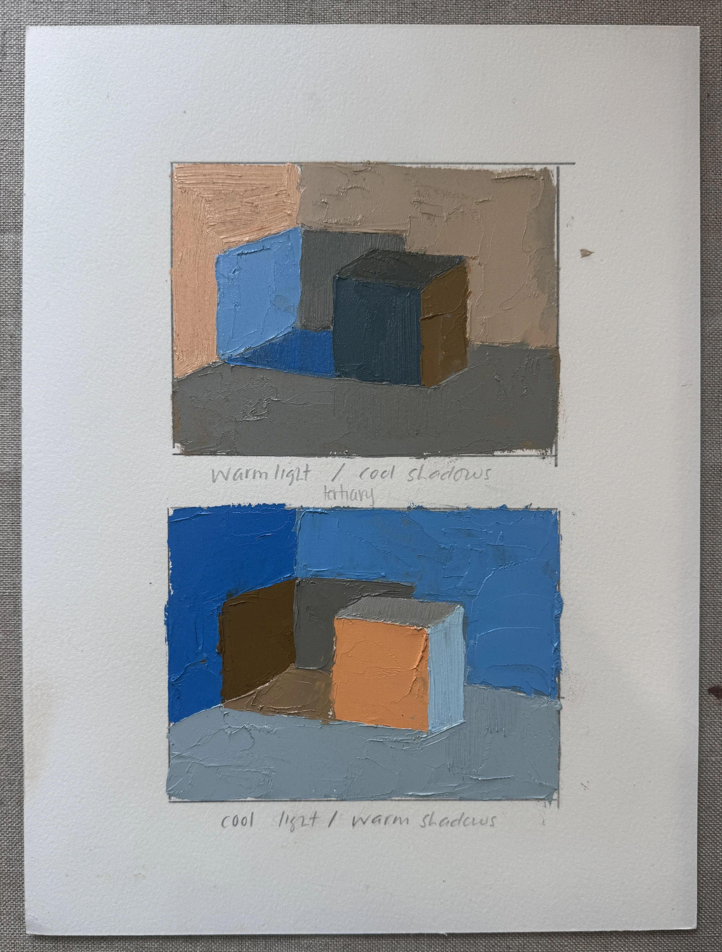
LOGIC: White box; warm light/ cool shadows; more “extreme” temperature contrasts
LOGIC: (top) Black box; warm light/cool shadows; Used more tertiary with a couple pops of intensity
(bottom) white box; cool light/warm shadows; more extreme temperature contrasts; used more saturated hues vs. tertiaries.
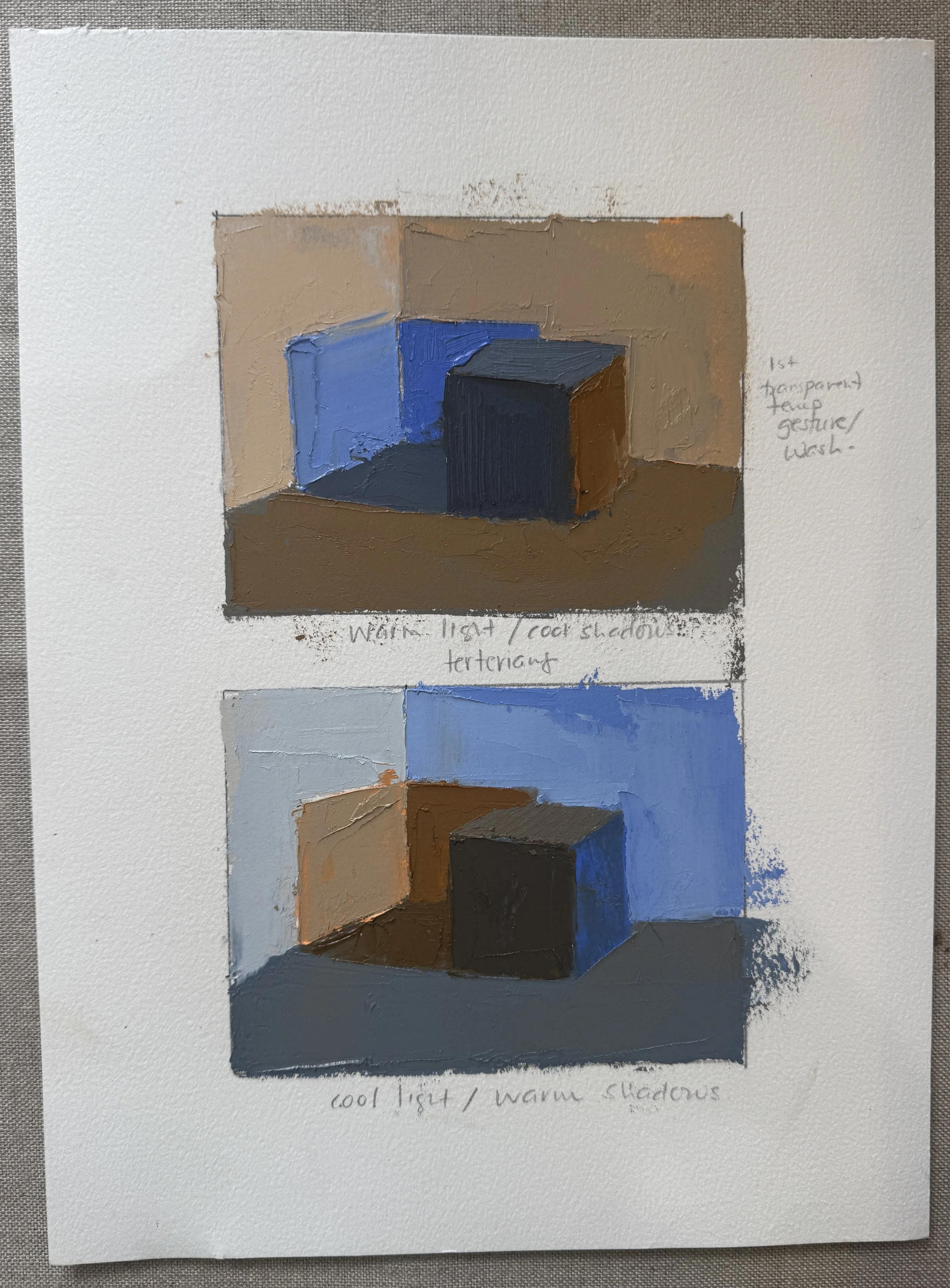
LOGIC: (top) black box; warm light/cool shadows; Used more tertiaries with a couple pops of intensity
(bottom) black box; cool light/warm shadows
For this exercise, you will need to choose one of your 4-5 value rock studies as your value map/guide. You are then going to pretend/ invent a degree of intensity for each object and surface, by assigning them as Hot, Warm, Neutral, Cool, Freezing. Try not to overthink this part; almost arbitrarily assign each object and surface one of the 5 intensities. You can explore various options in other iterations
Applying to your Rock Theater
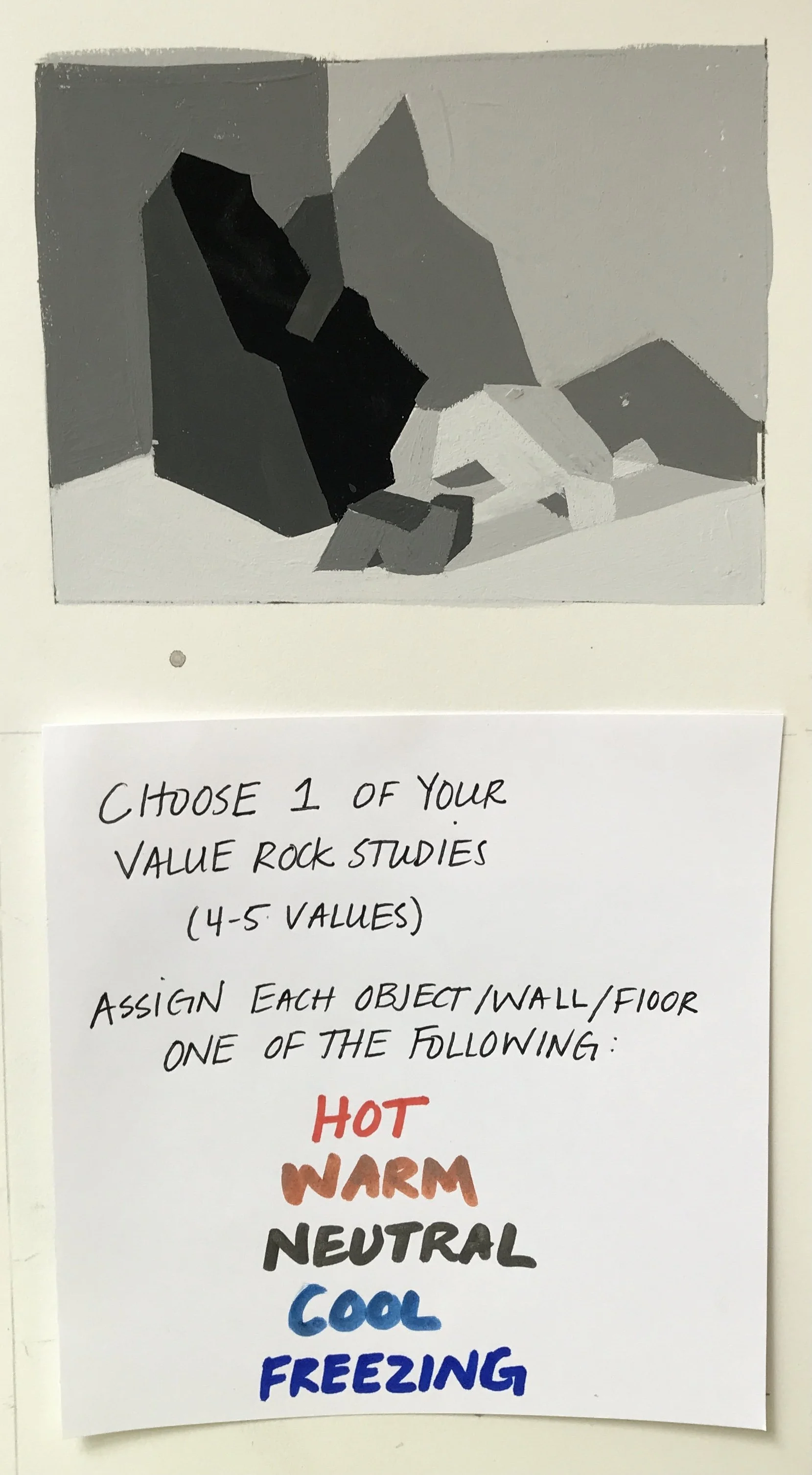
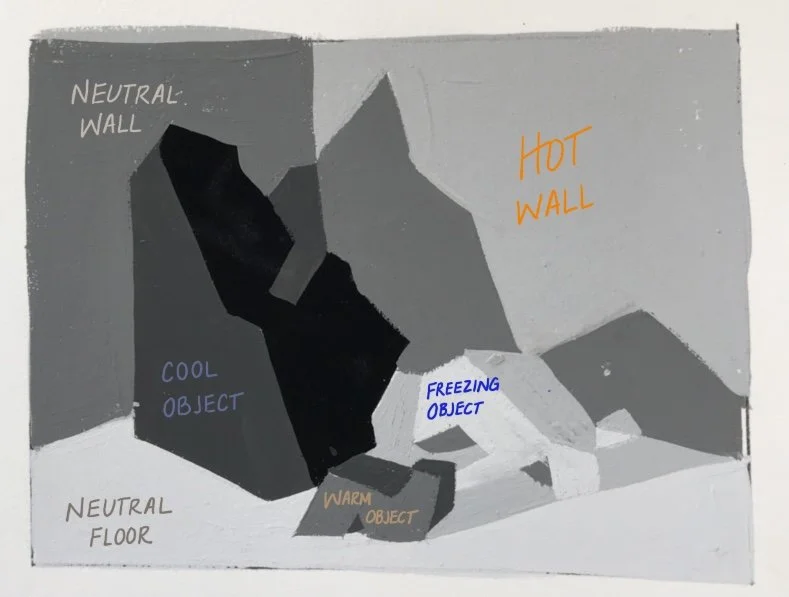
Once you assign your intensities to each objects and surface on your value study, watch the below video where I think/talk through how to create a map/key prior to painting our study.
Video Showing the labeling of a Temperature Map; AUDIO Description
Temperature Block-in Demo; Audio Description
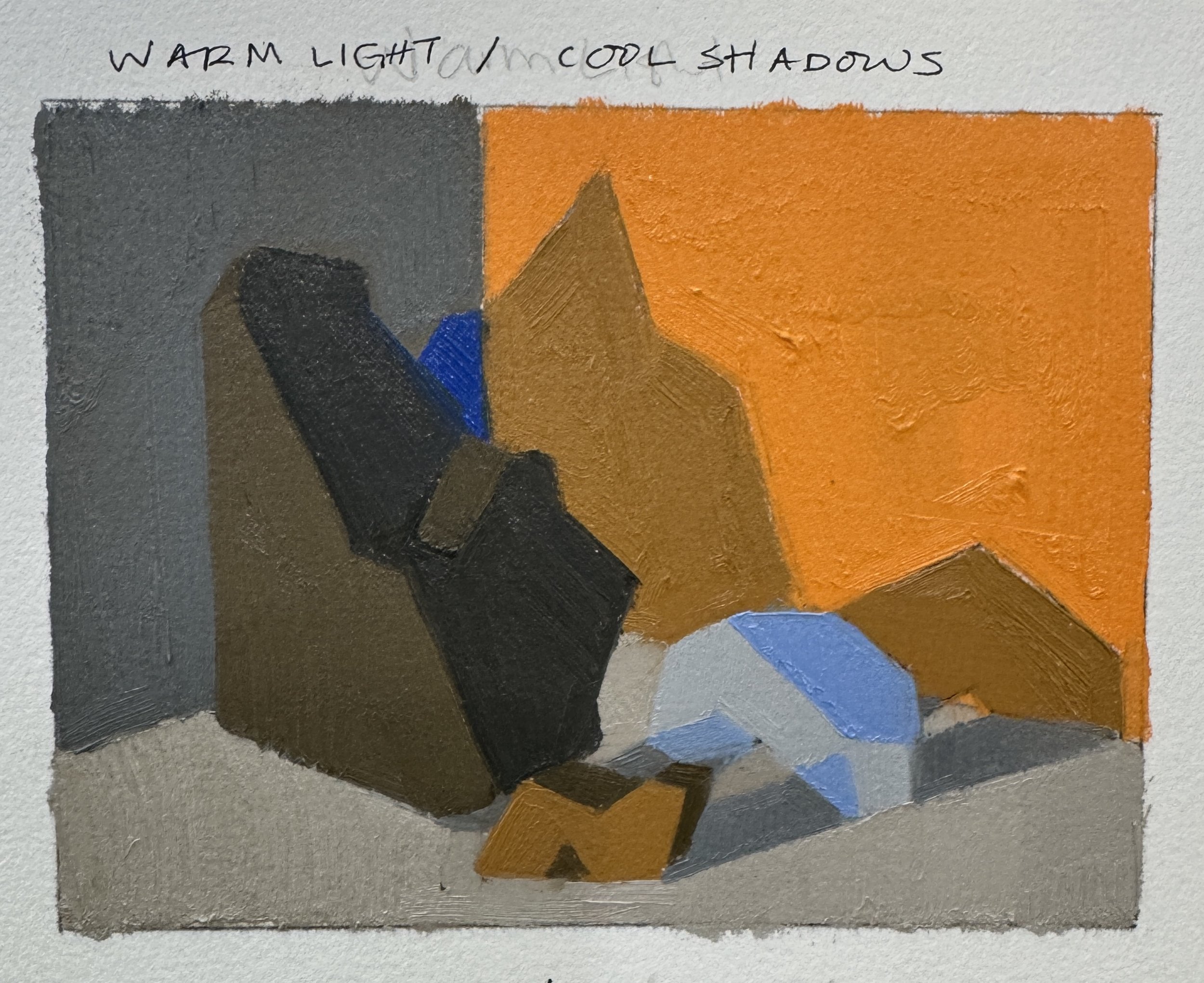
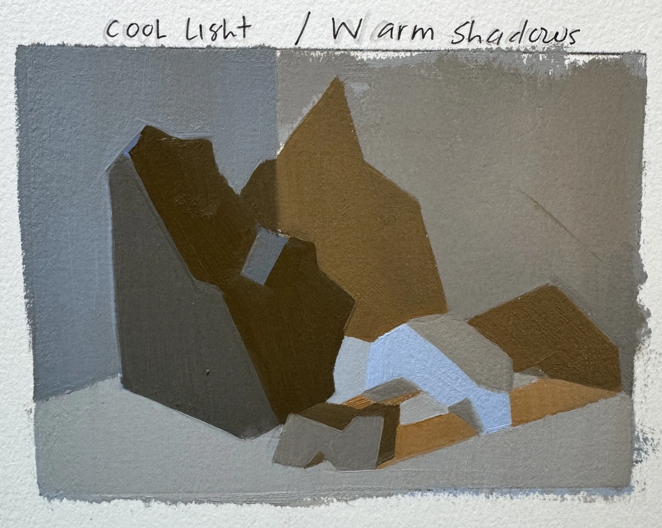
Do as many different iterations as you like. Treat these just like expanded box studies, where you ask yourself various questions and play around with where you want your contrasts to be in your picture. You might also like to play around with using another one of your 4-5 value studies as your starting point.
HAPPY RESEARCH!