UNIT 5:
INTRO TO TEMPERATURE
We are now adding-on to our color knowledge the consideration of Temperature. As with Value, Temperature is a means of pictorial contrast that influences the structure of our pictures.
Recognizing the interplay of lights, darks, warms, and cools as they dance across our surface creates agency for building meaningful compositions.
Value and Temperature contrasts need not adhere to the representation of forms and light— this pattern can be totally invented and non-objective. However, in following suit with our Rock Theaters, we will apply Temperature as a means to express the specificity of light and shadow.
With Value, we are analyzing the quantity of light (how much or how little); with Temperature, we are considering the quality of light (what kind of light— warm or cool?).
Complement Sets/ Tertiaries
When we mix our Complement Sets, we are actually mixing the 3 Primary Colors together- creating wonderful, neutralized colors called Tertiaries (Latin tertius, meaning "third"). These are complex colors for which we often have no names. As painters, it is crucial to learn, to fall in love with, and to confidently access the infinite inner rungs of Tertiaries on our color wheel.
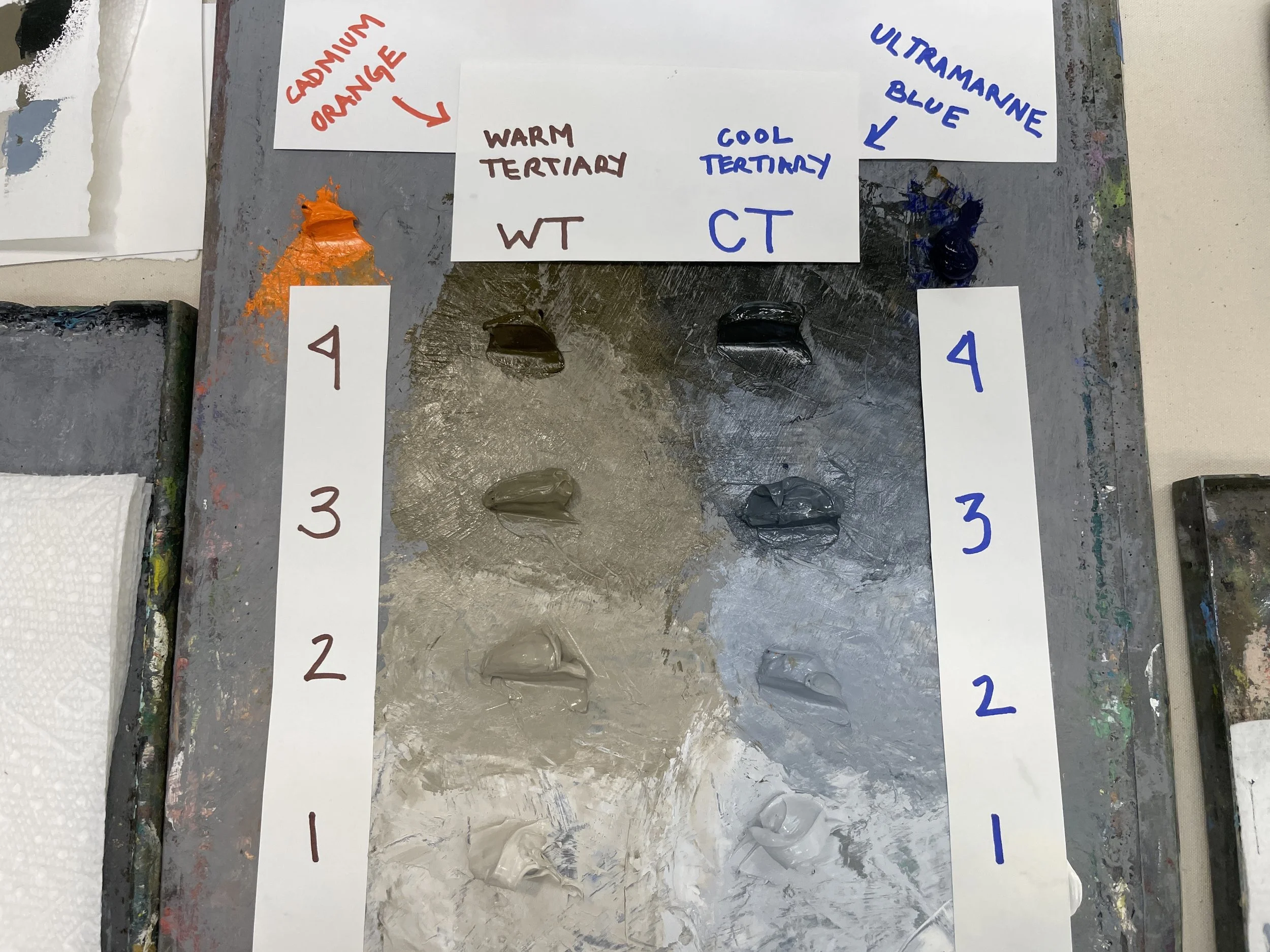
Mixing a Tertiary Palette: Orange and Blue
Using an Orange-Blue Complement Set to mix a Warm Tertiary and a Cool Tertiary, and then creating additional Values by adding White.
Box Template Studies:
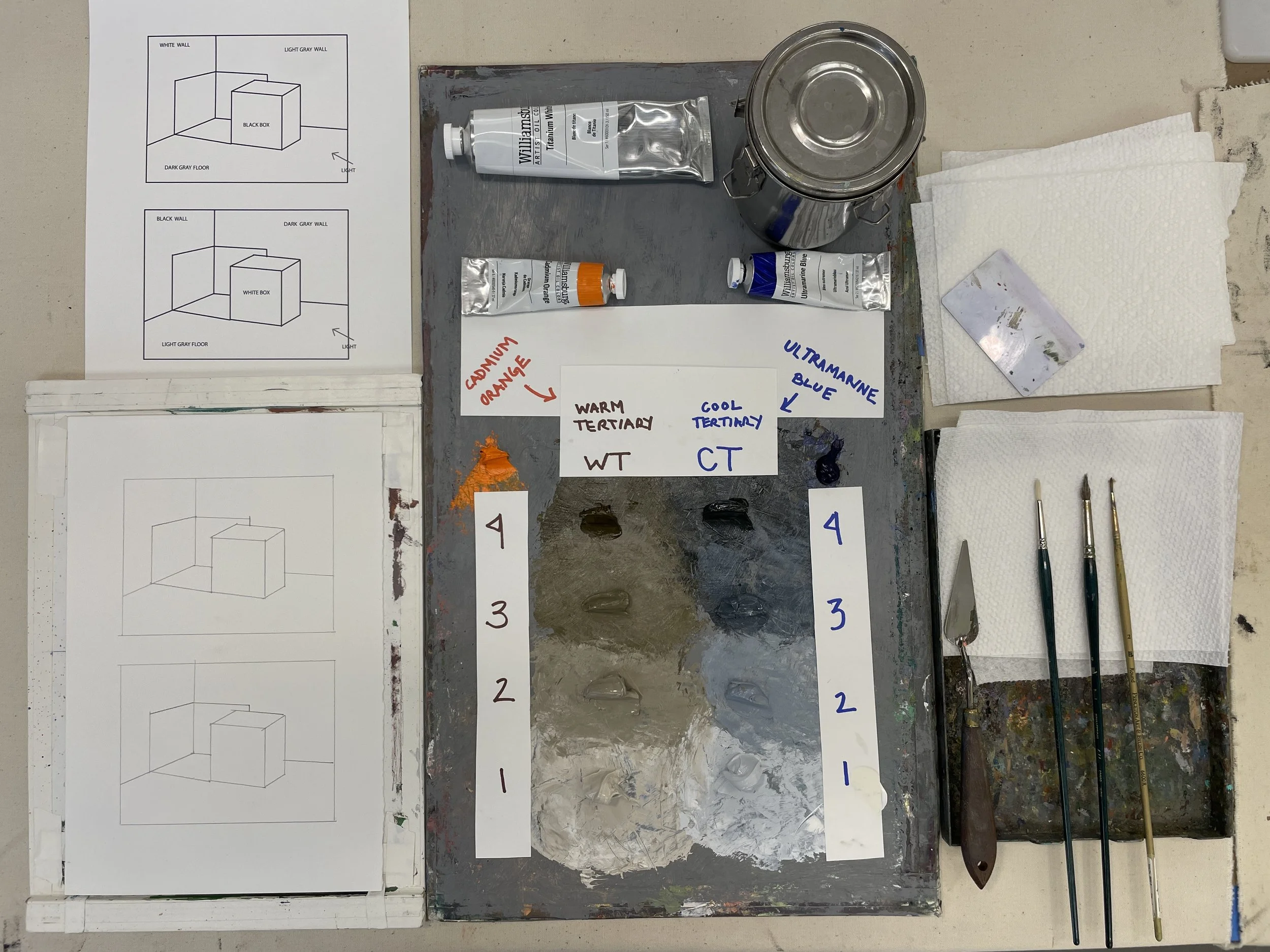
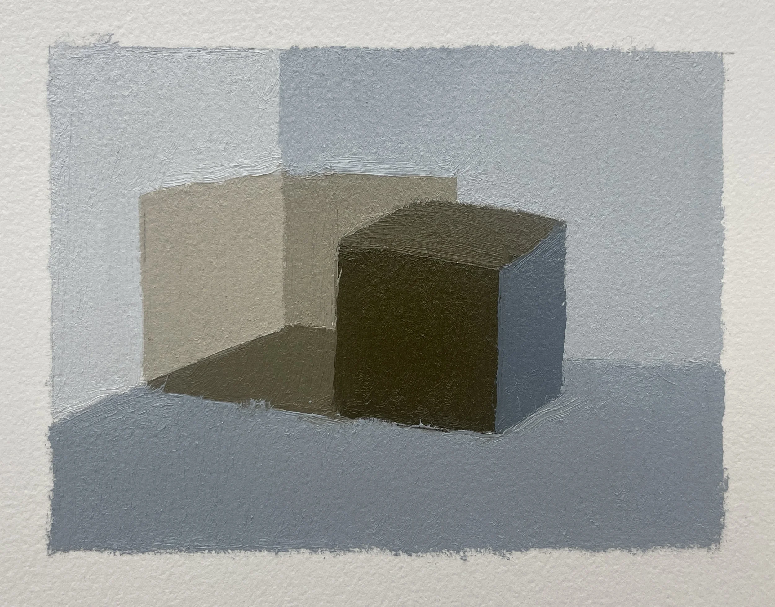
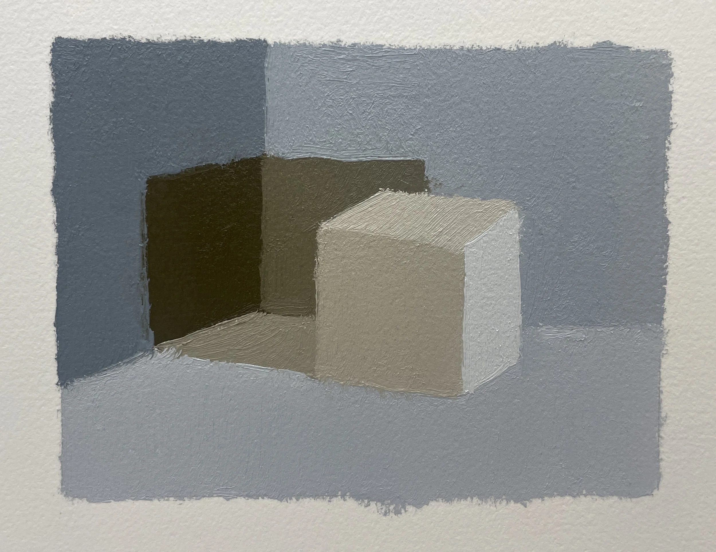
Using our Box Template, we will apply our Tertiary Palette to the given scenarios, paying attention to the Relative Value of each surface, and the Temperature structure of light and shadow.
Click on the image below for a downloadable PDF of the Box template. Trace this template onto your painting surfaces.

Studio Set-Up:
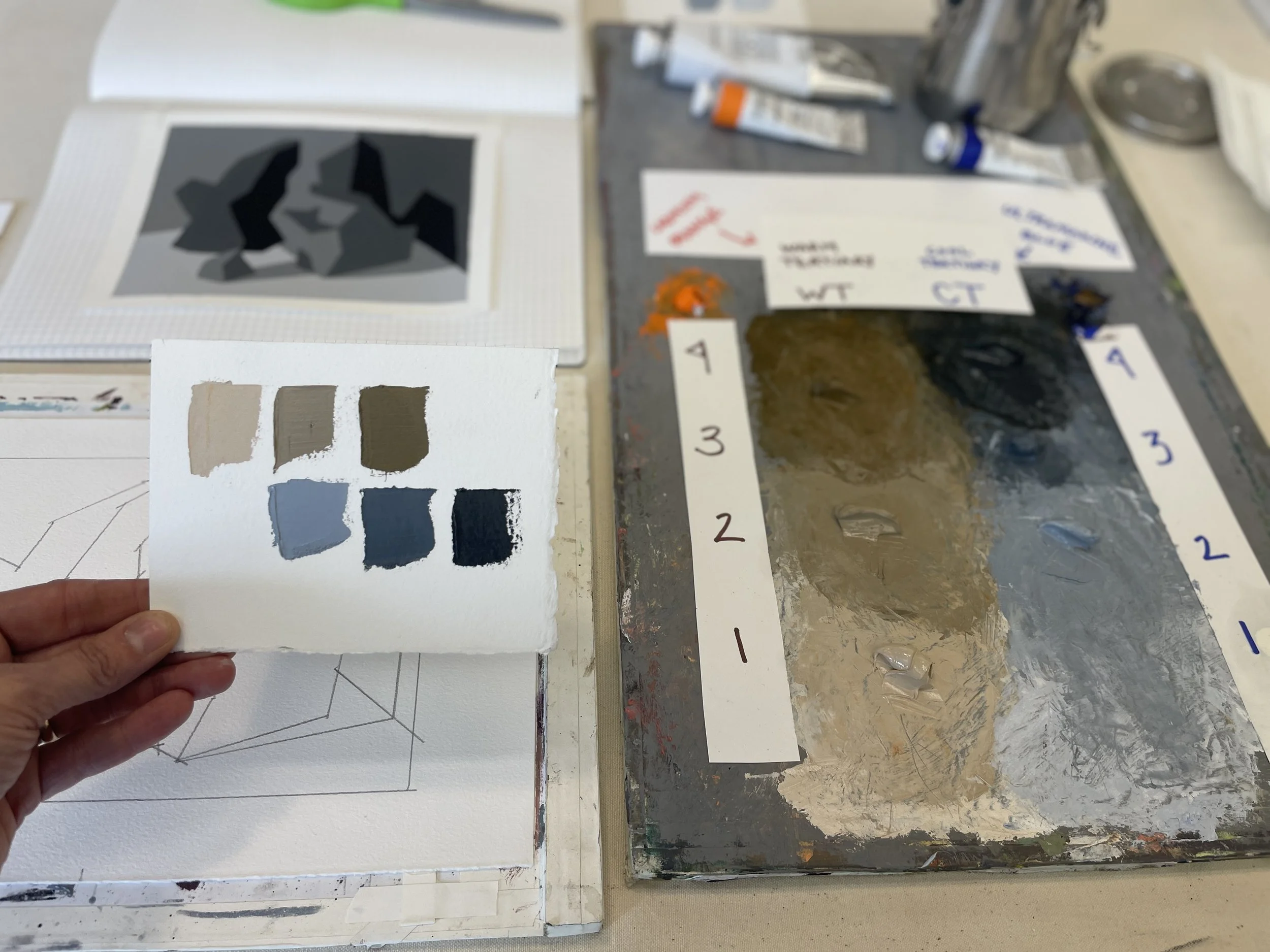
Tertiary Palette, oil painting tools and pigments, traced template, and reference template.
Black Box Warm Light
White Box Warm Light:
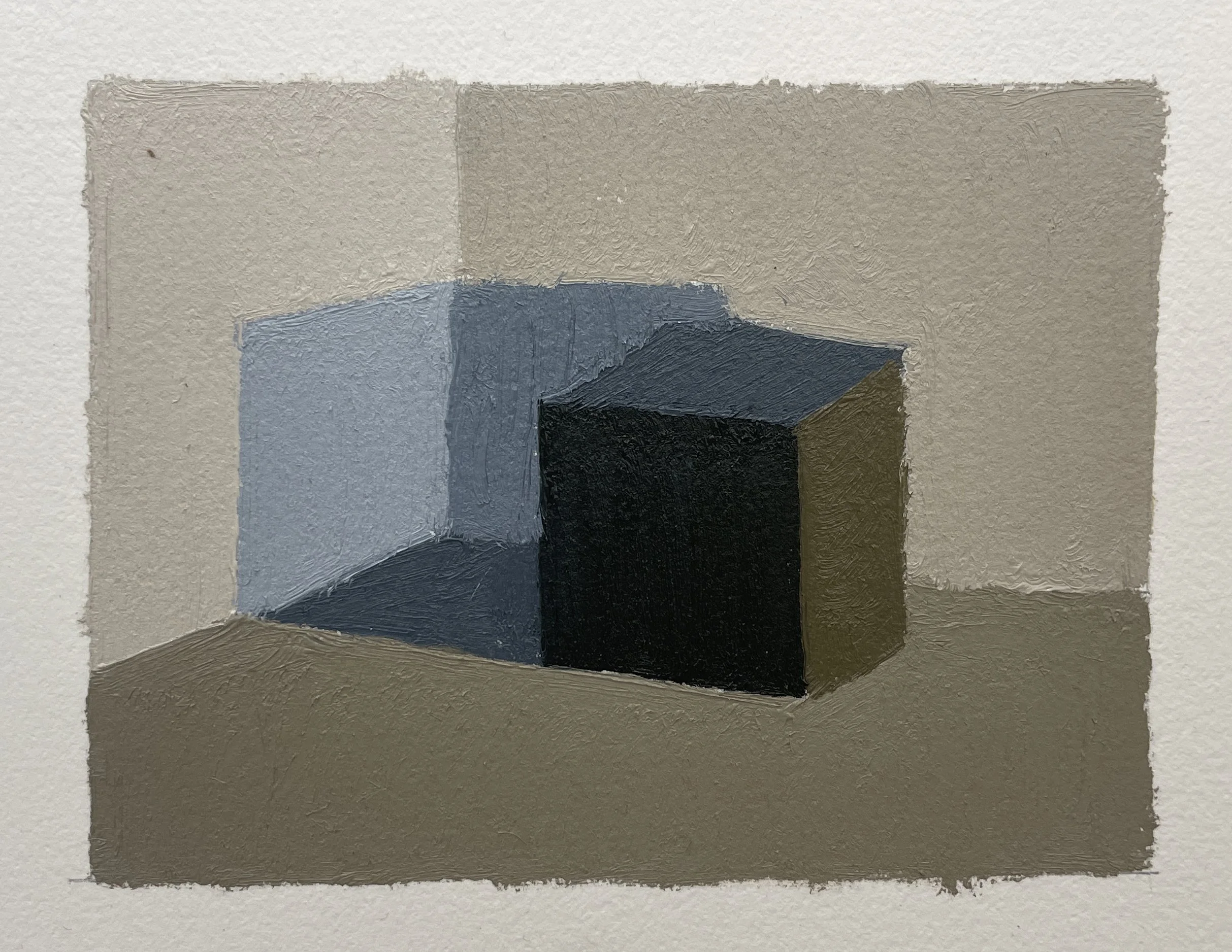
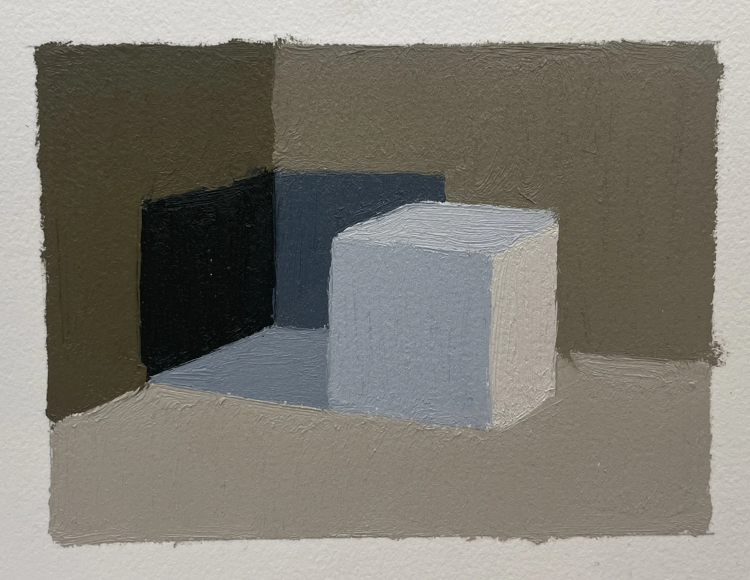
Black Box Cold Light:
White Box Cold Light:
Rock Template Experiments:
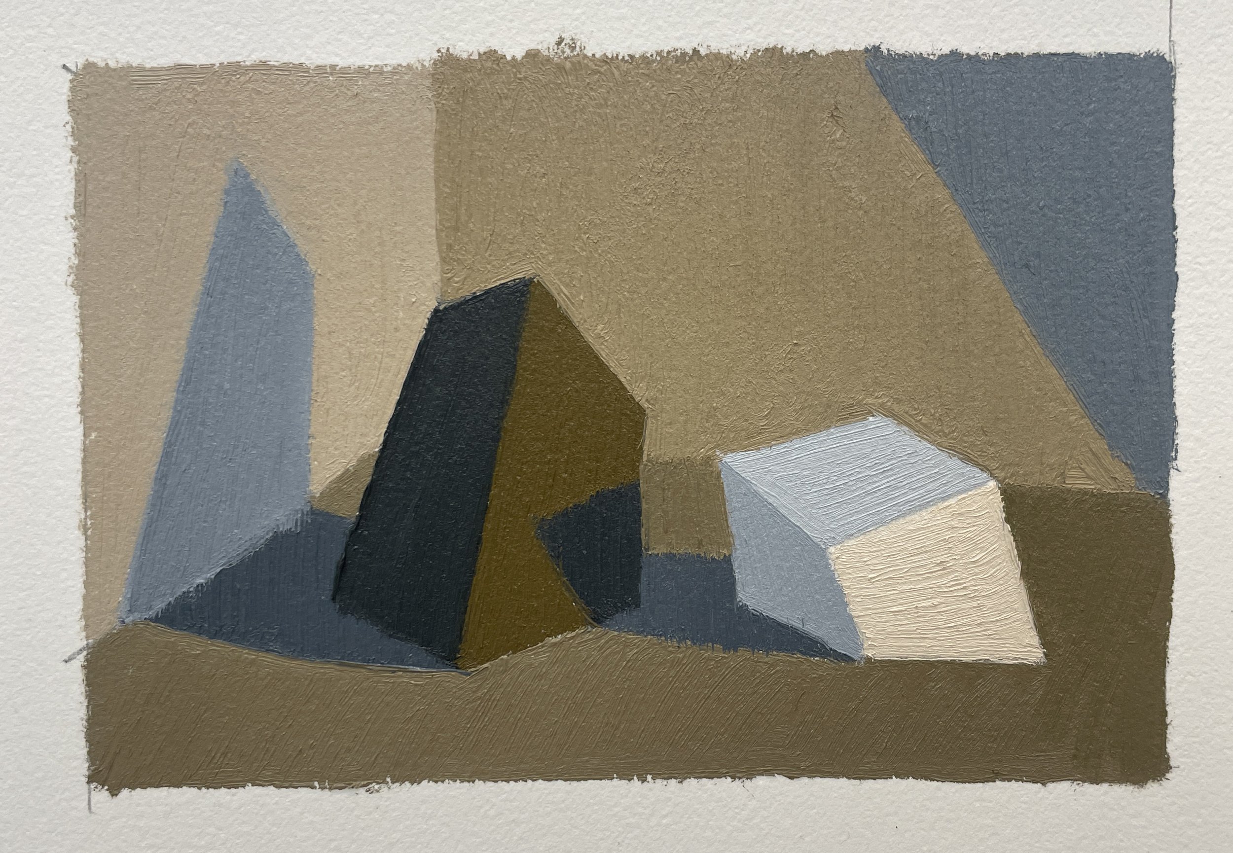
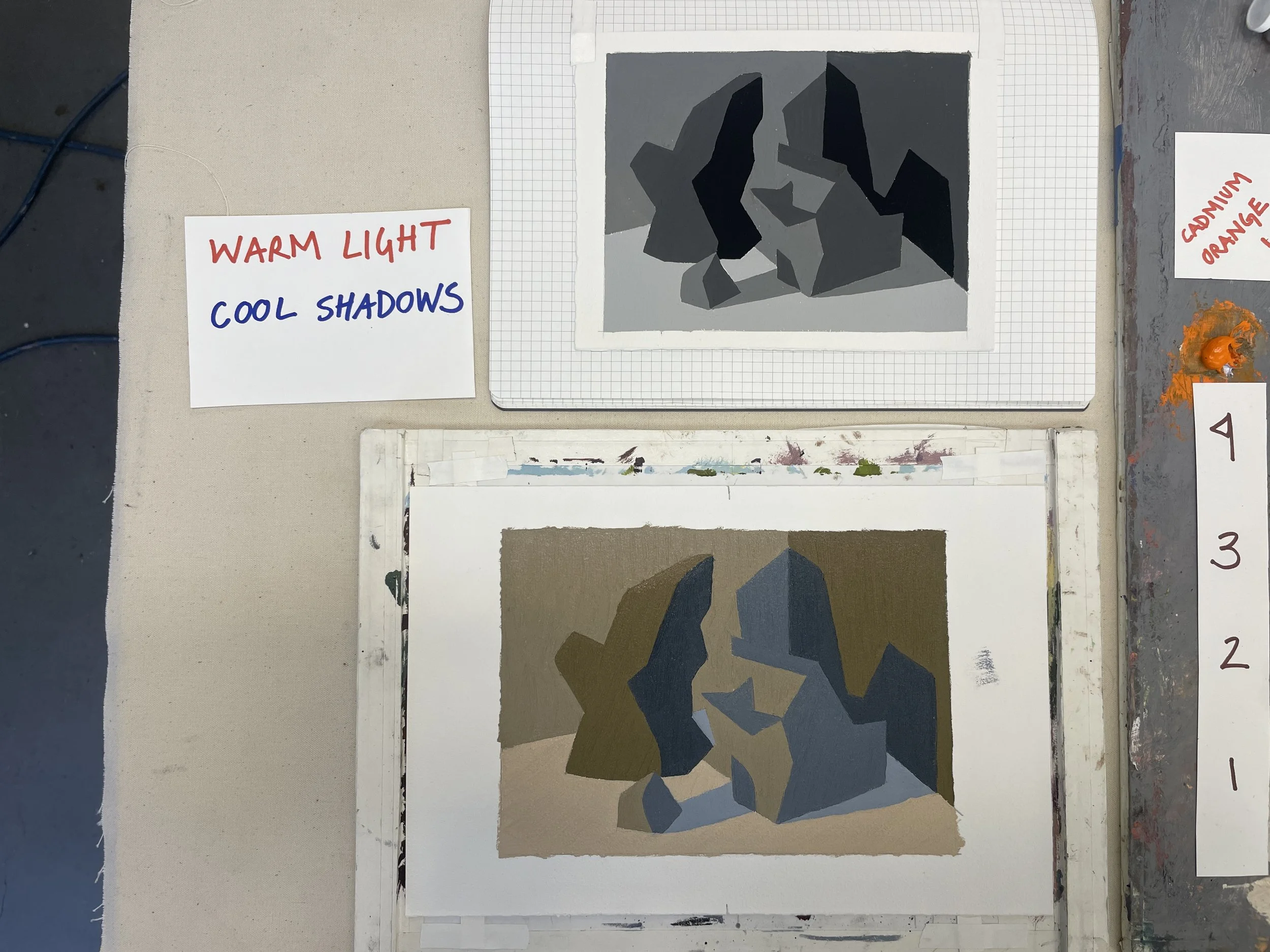
Warm Light / Cool Shadows
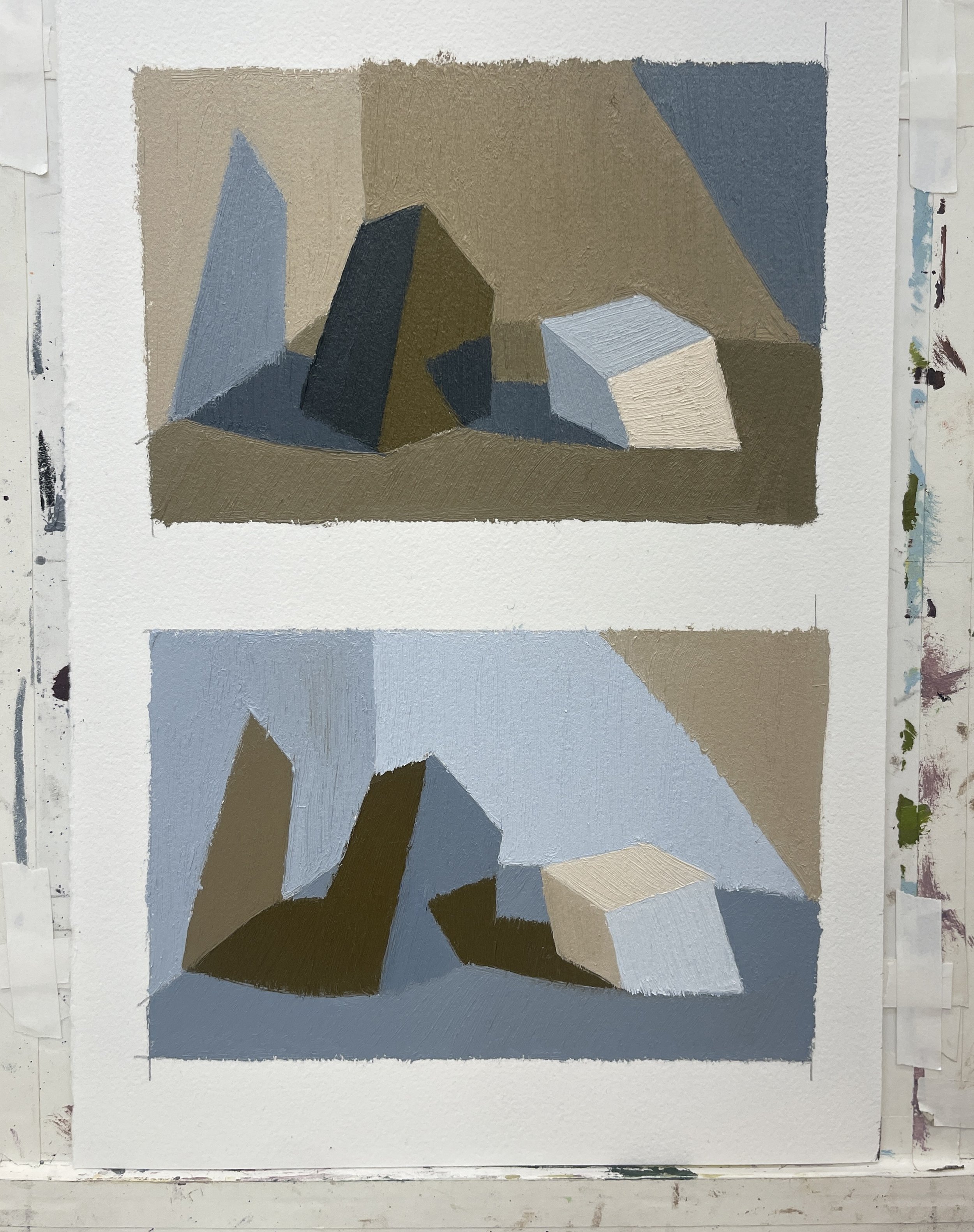
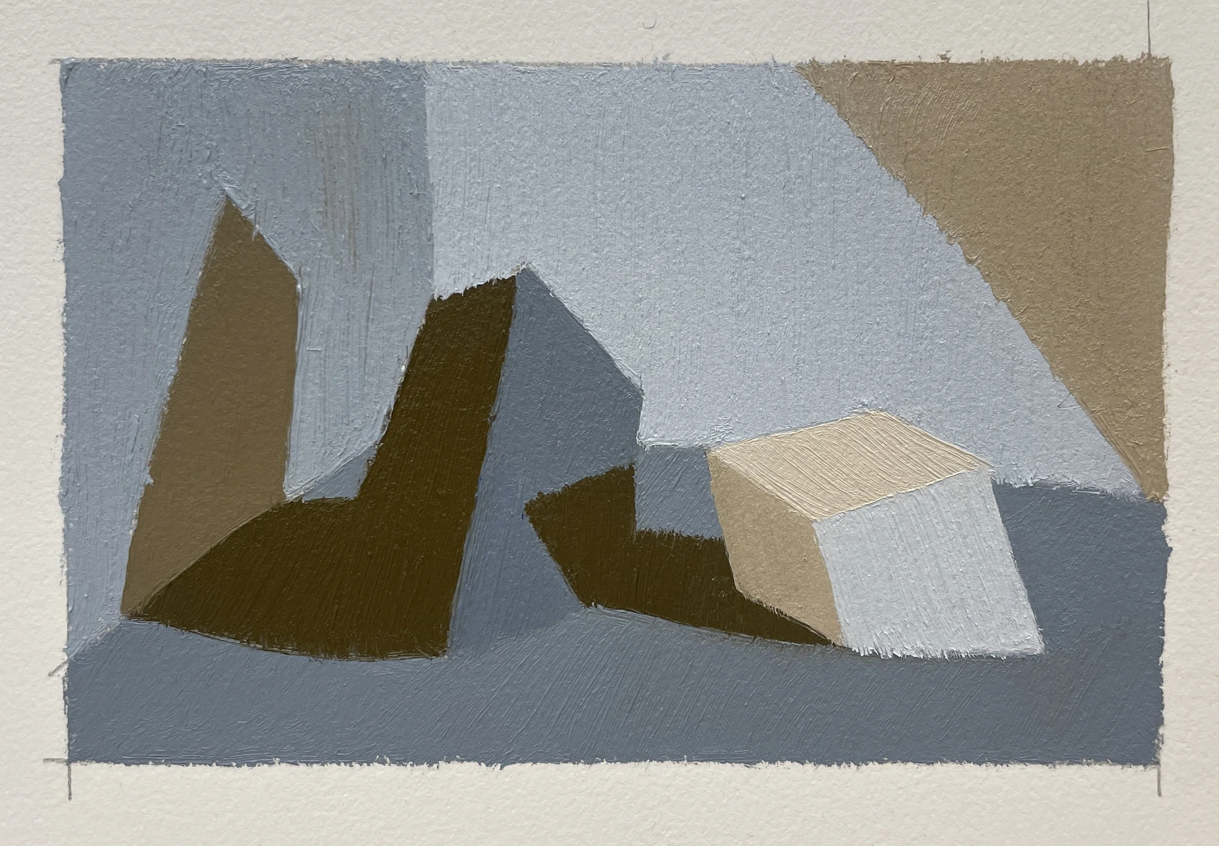
Cool Light / Warm Shadows
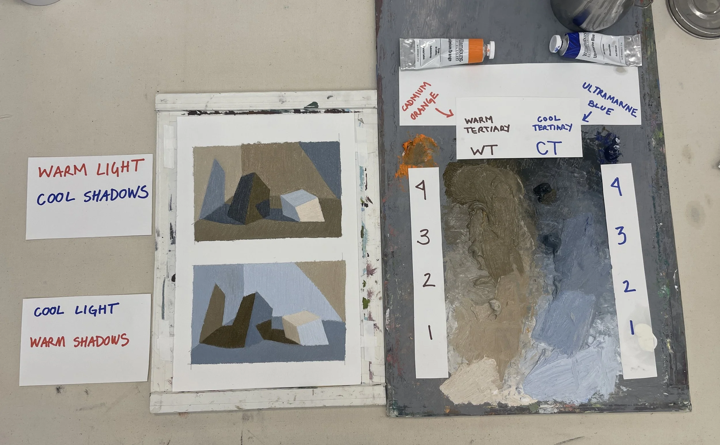
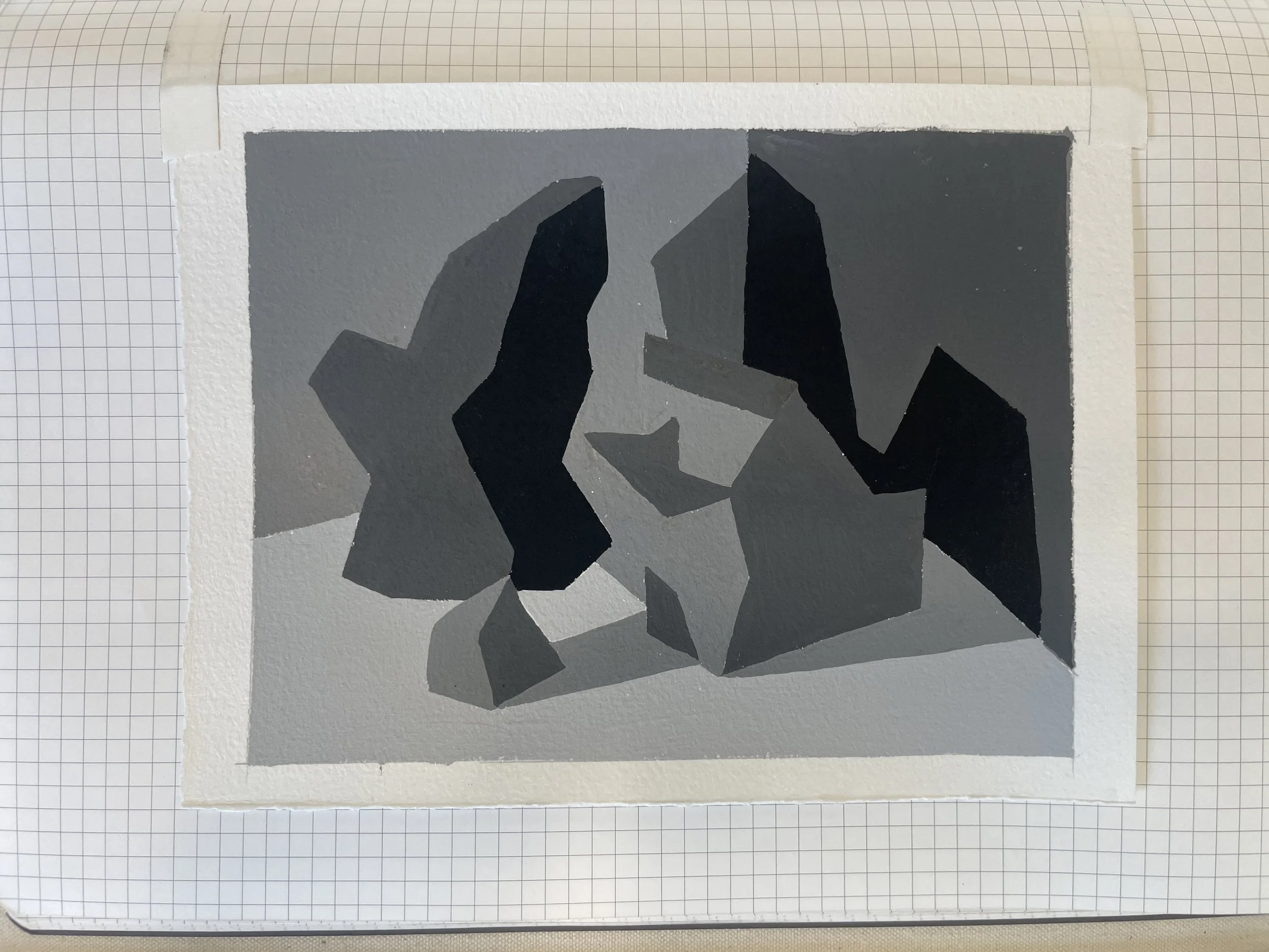
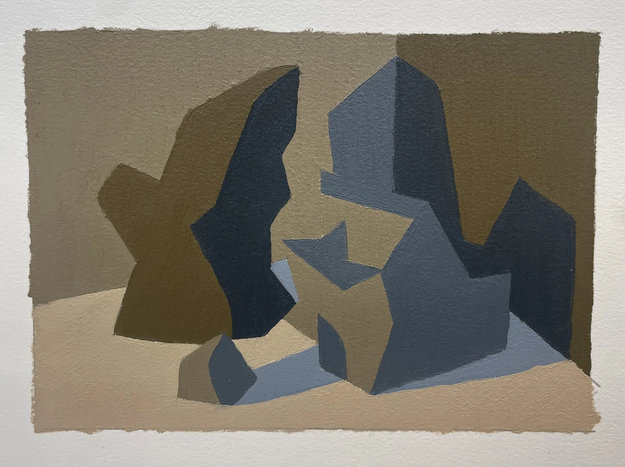
For these next experiments, I chose from my Value studies and applied Temperature structure.
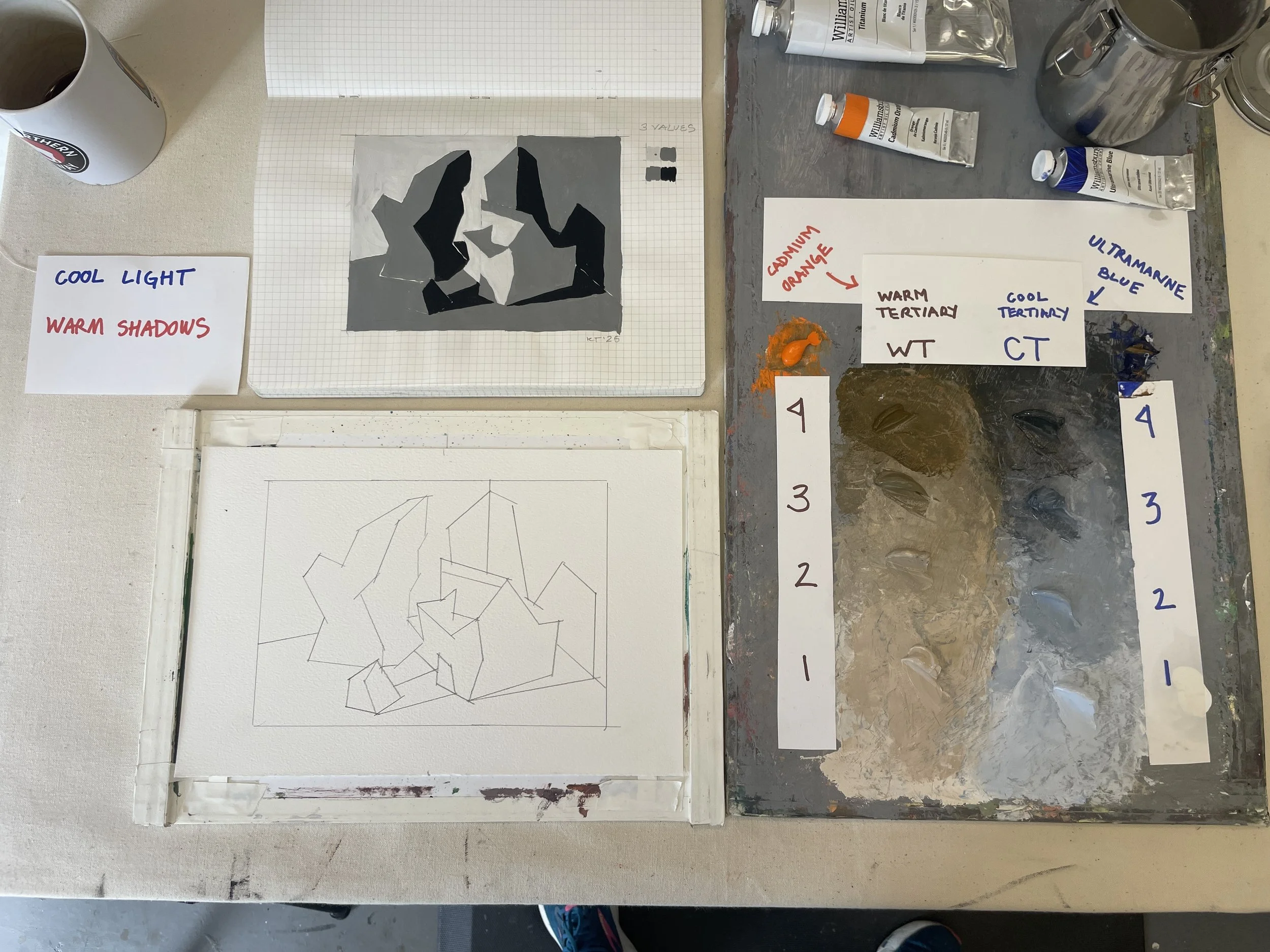
For this experiment, I chose a 3-Value gouache study as my guide. I decided to name my light as Cool and my shadows Warm.
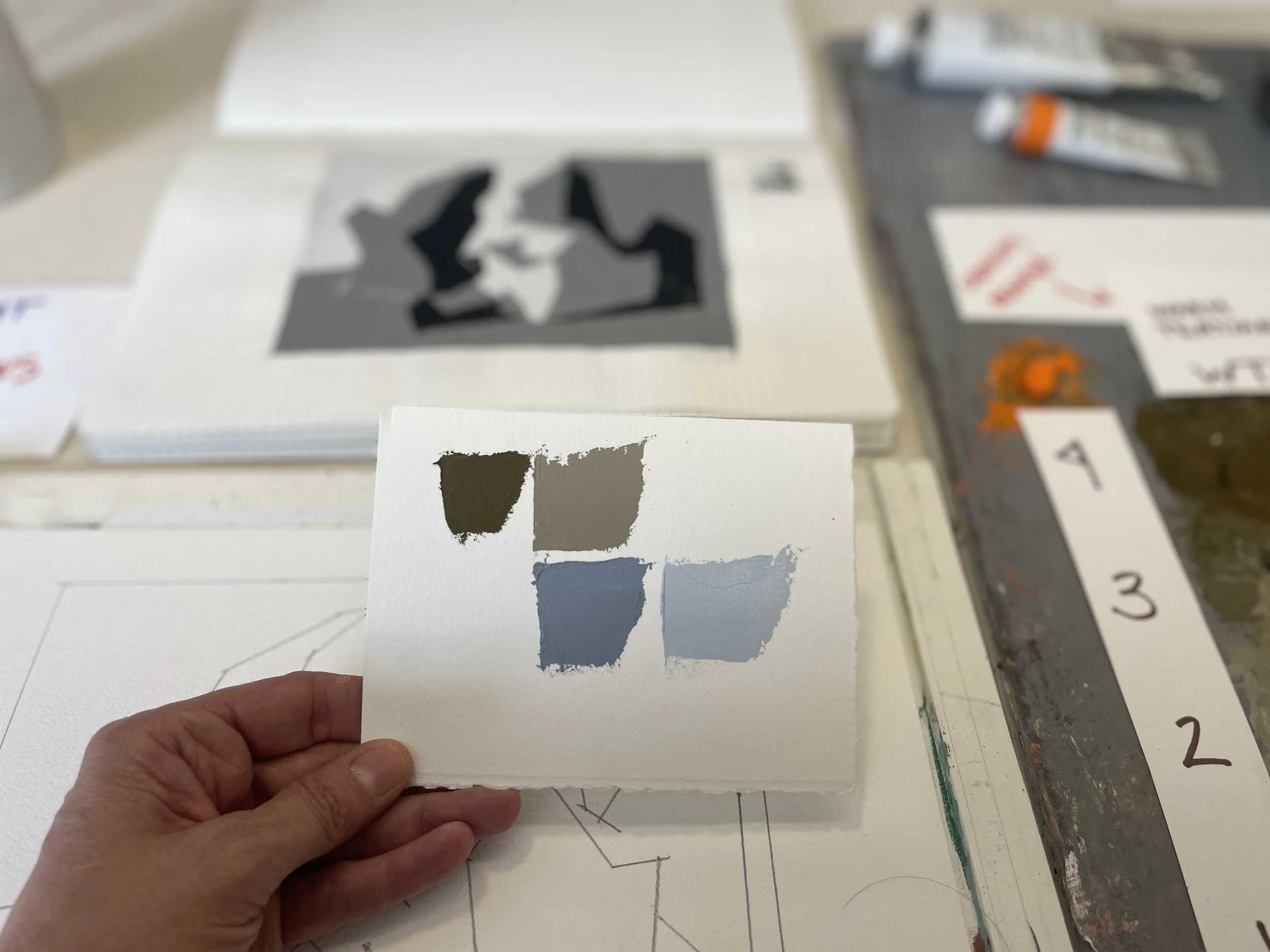
Because my shadows are warm, the darkest value is my WT 4.
Because my light is cool, my lightest value is WT 1.
My middle value, however, plays 2 roles: on some surfaces it represents light, and on other surfaces it represents shadow, so I need 2 temperatures of my middle value: WT 2 / CT 2.
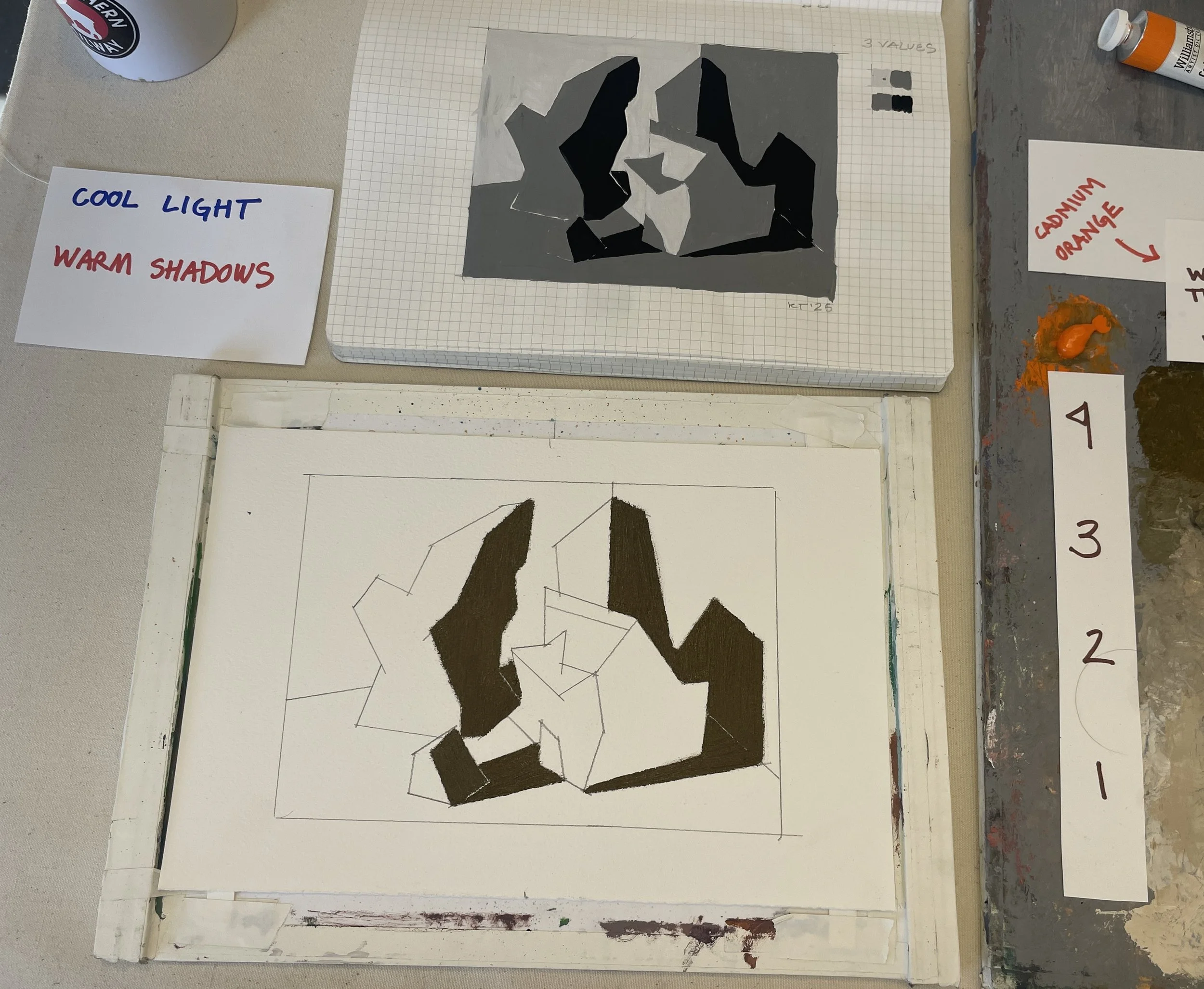
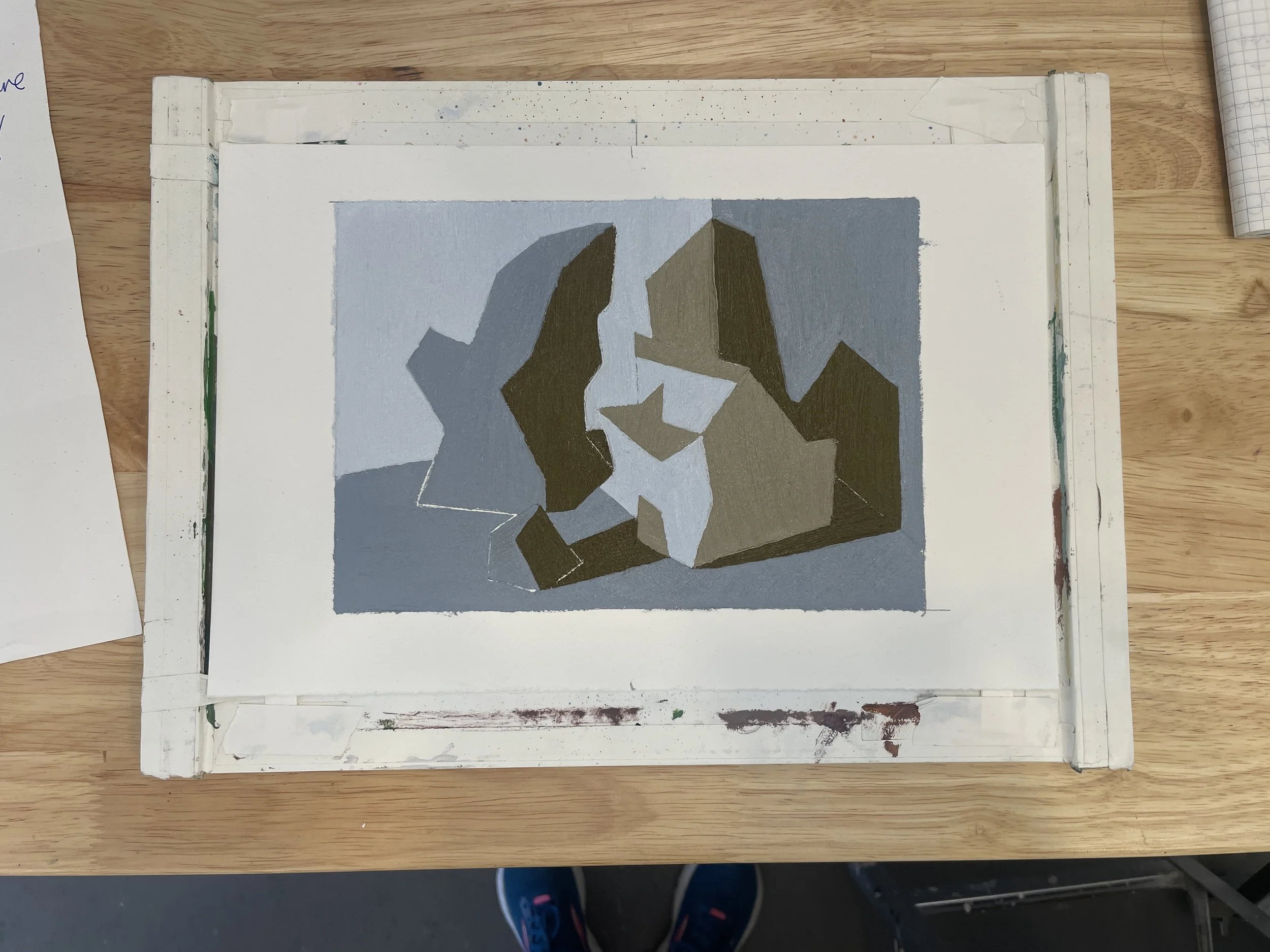
I created swatches of color from my palette to follow the structure of my value study, which is: 3 Values / 4 Colors.
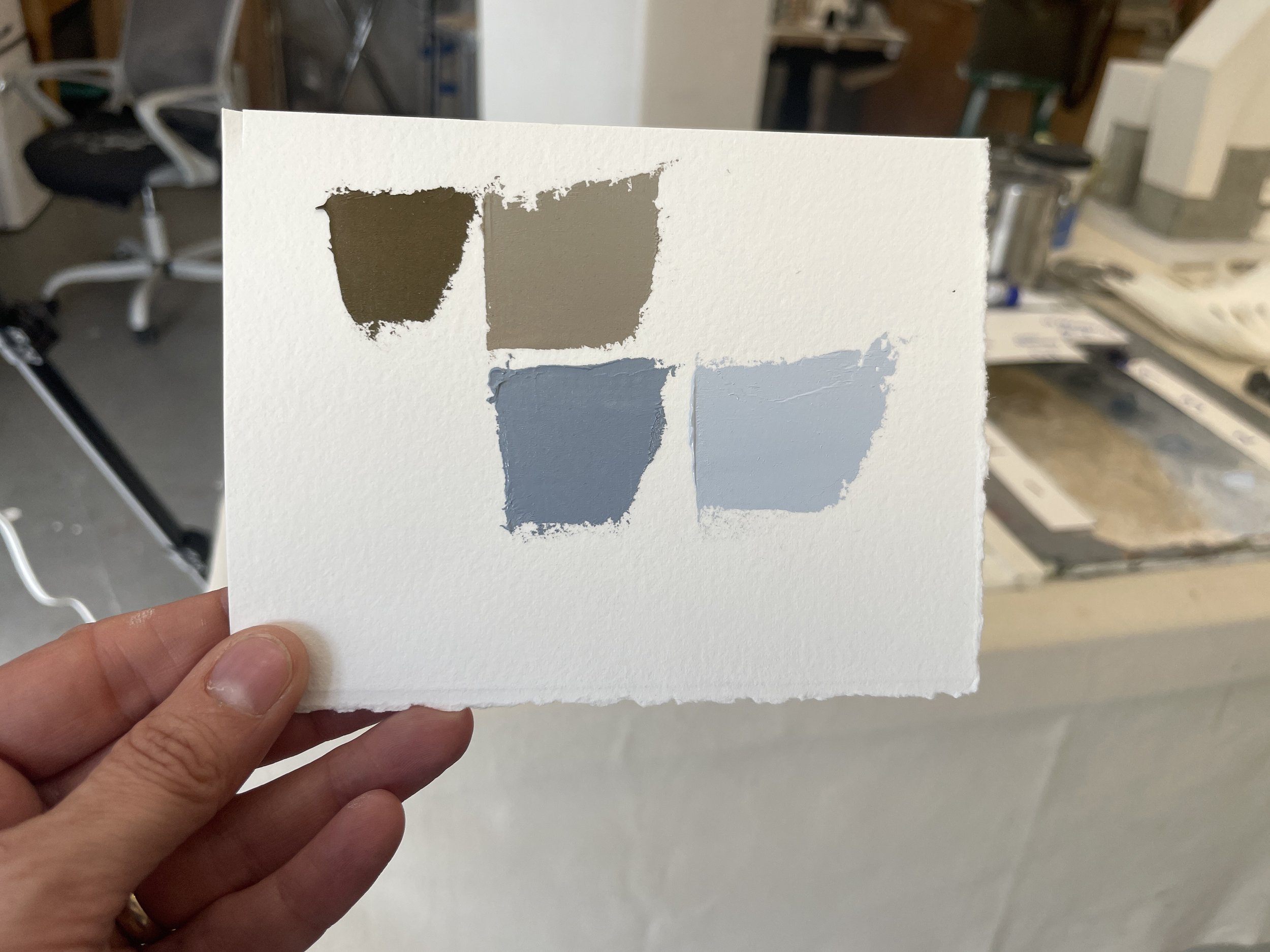
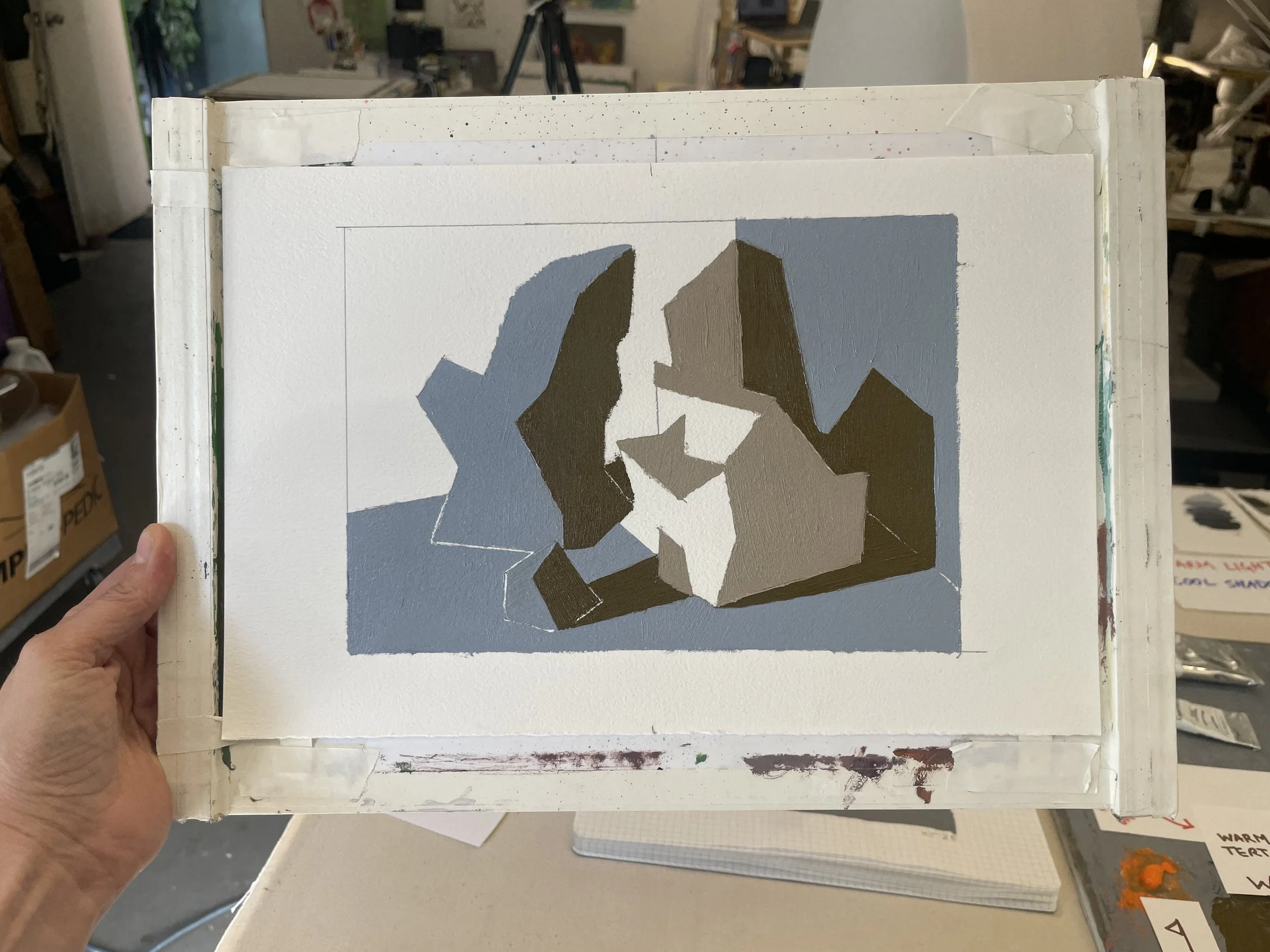
Blocking in all shadow shapes with my warmest dark (WT 4). Next, blocking in all middle values with the appropriate temperature to express light or shadow on the given surface (WT 2/ CT 2)
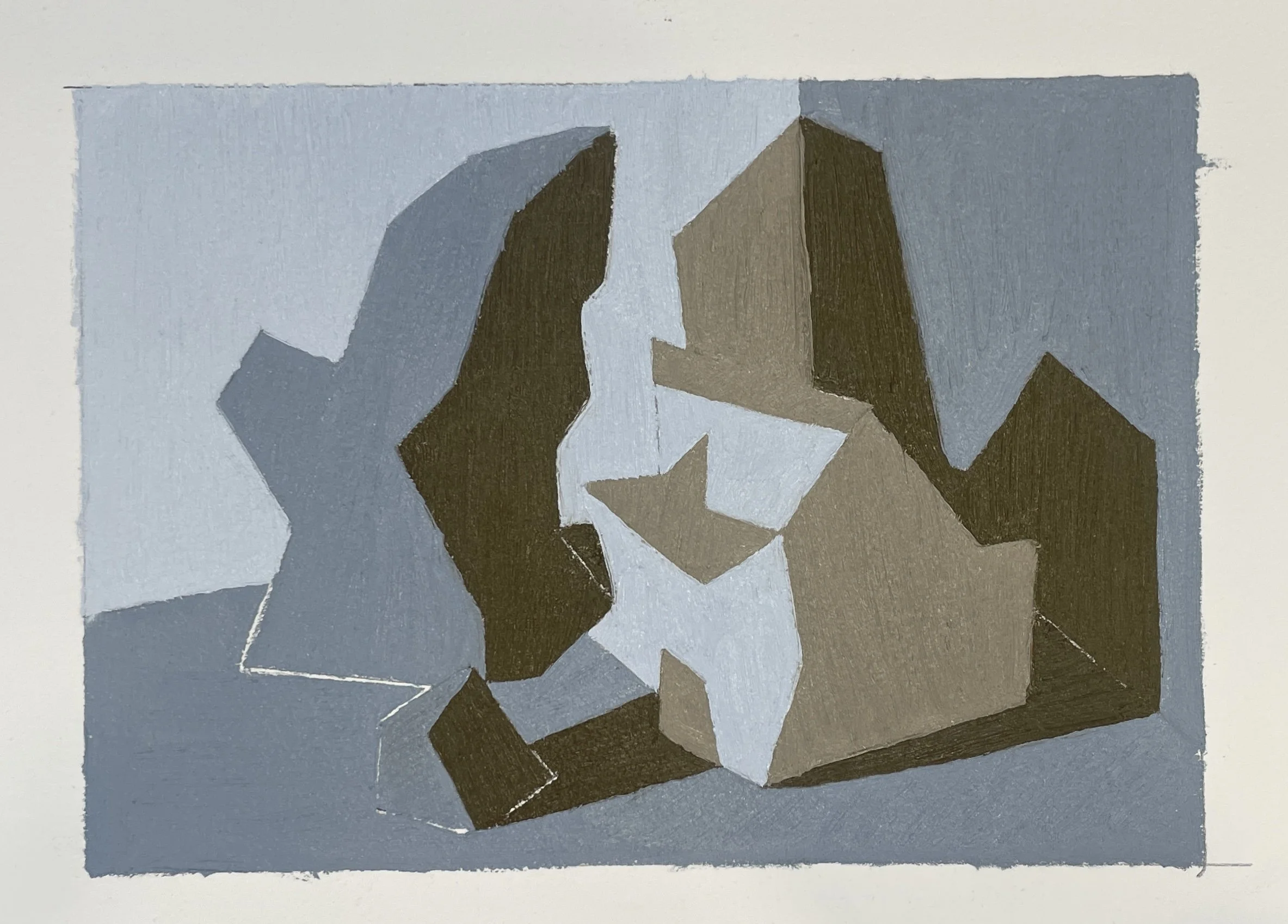
Finally, blocking in my cool light (CT 1).
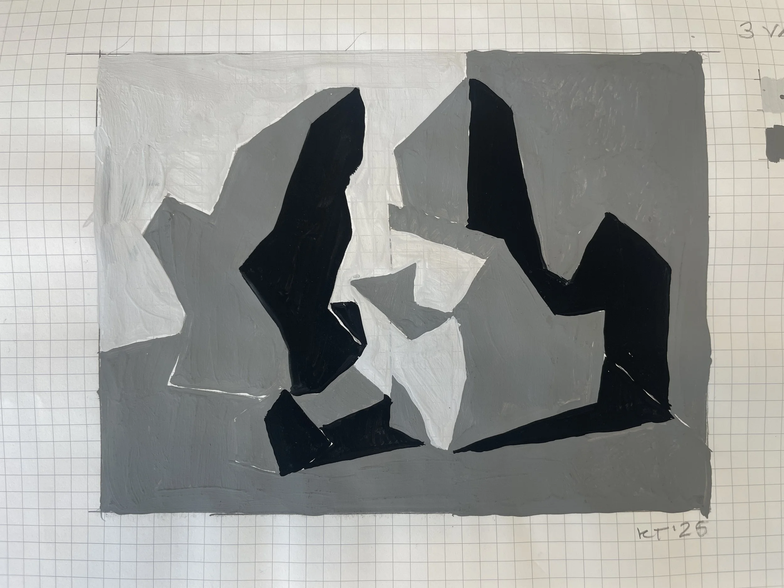
For my next experiment, I chose to work from a 4-Value gouache study. I named my light as Warm, my shadows as Cool.
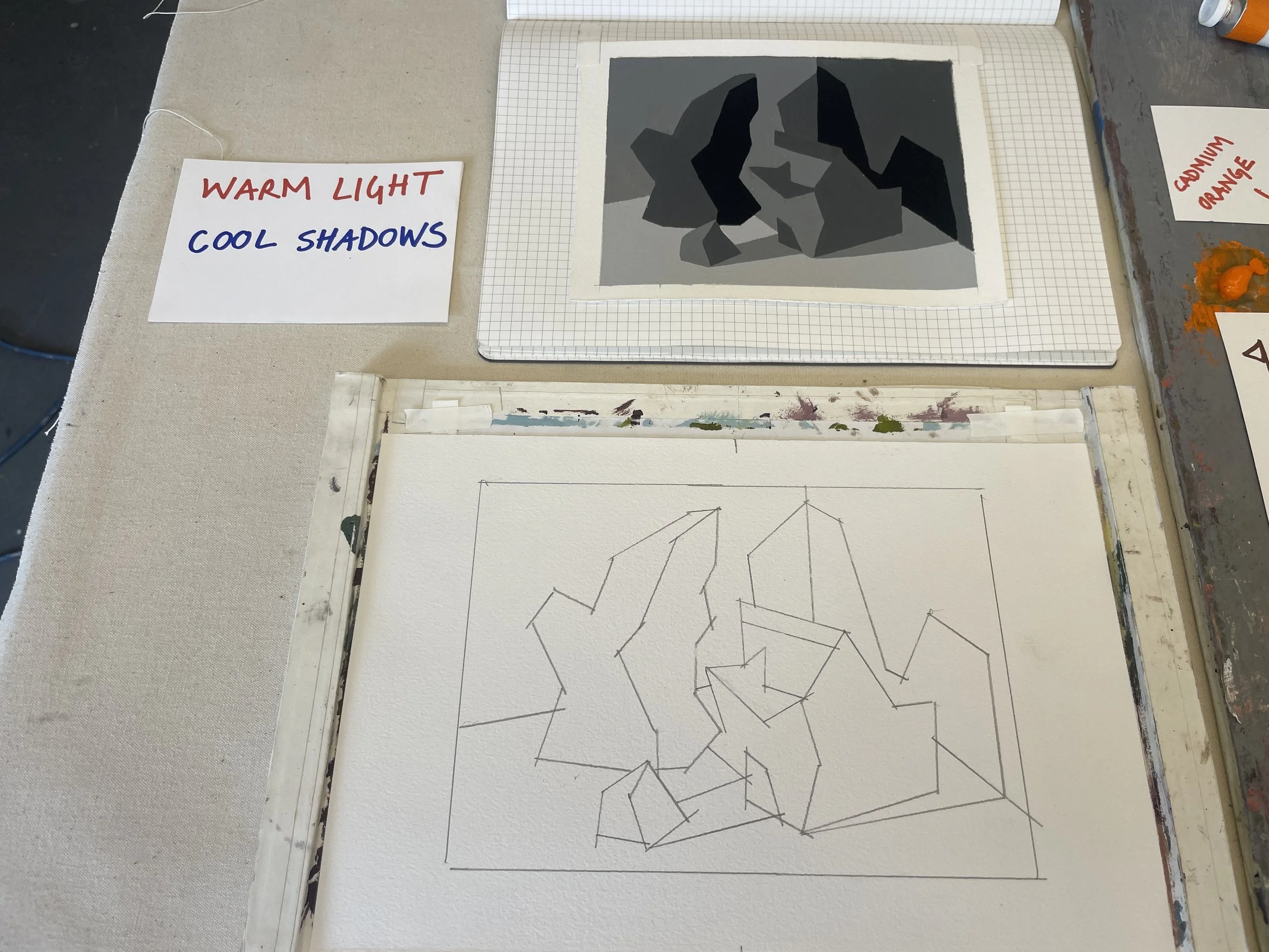
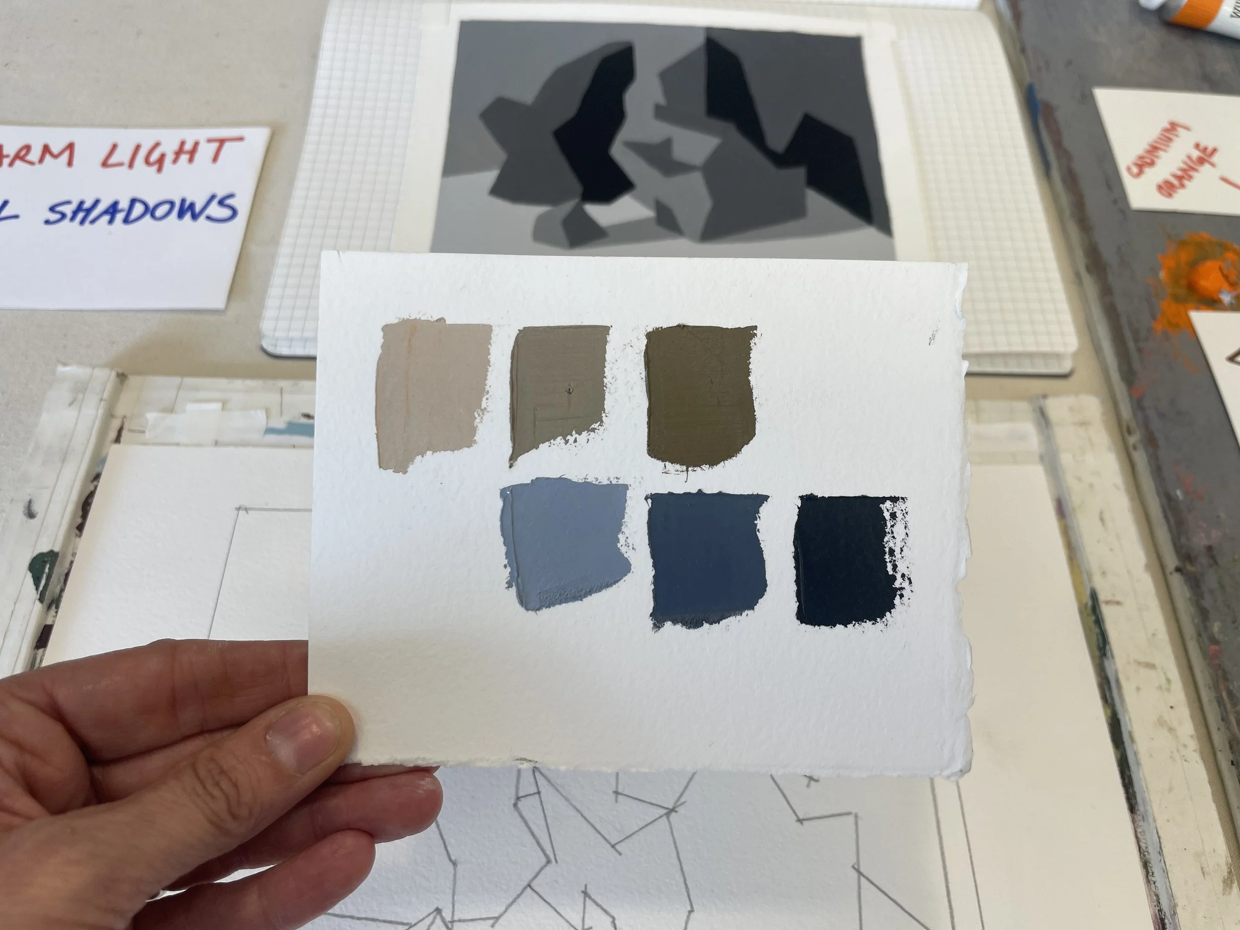
I created my color-swatch palette based on this information: my lightest light must be warm; my darkest dark must be cool. The two middle values both play light and shadow roles, so I will need a warm and cool version of each.
So, my palette is 4 Values / 6 Colors.