UNIT 1: Intro to Yellow / Violet Compliment Set
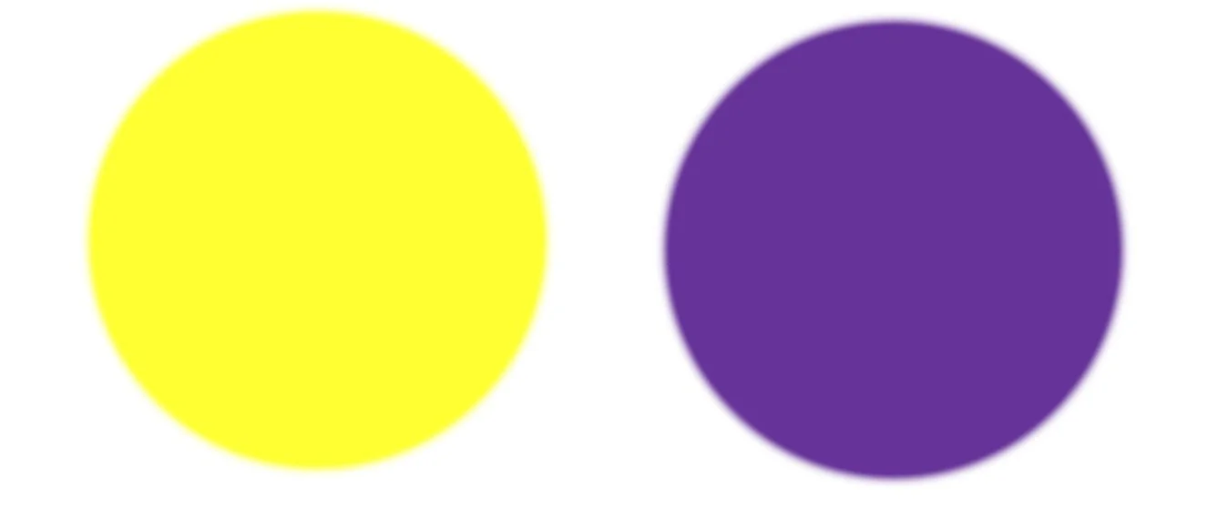
VALUE CONTRAST: HIGH
TEMPERATURE CONTRAST: NUANCED
This duet is like a comet in the night sky. This set has the highest value contrast of our compliments. Our lightest hue, yellow, paired with the indigo depths of the cosmos.
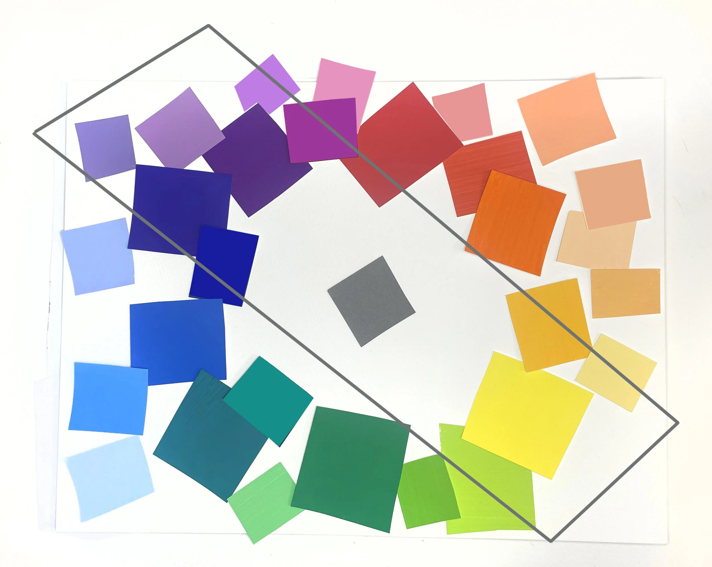
Like the Red-Green set, the temperature relativity is nuanced. Both hues can bridge into analogous warm and cool versions of themselves:
Yellow can be icy cold, pale, leaning towards green; Yellow can be warm and golden and nearly tangerine.
Violet can be a cool shadow, a cold vein on a pale wrist; Violet can lean magenta and warm the distant hills at sunset.
This set is the hardest to achieve a solid neutral with, given the pigments available to us.
It is also a challenging set in terms of viscosity and opacity- Cadmium Yellows are wonderful because they are viscous, opaque AND intense. Most other intense yellows are transparent (Hansa Yellow, Indian Yellow), but offer no body. Mars Yellow is an opaque, viscous pigment with a similar hue to Yellow Ocher, but is much stronger. Yellow Ocher is very weak, and does well paired with, say, a Cobalt Violet that is also quieter. Manganese Violet is very weak, I consider it totally useless. I hunger for a purple pigment that is viscous, intense, and strong…
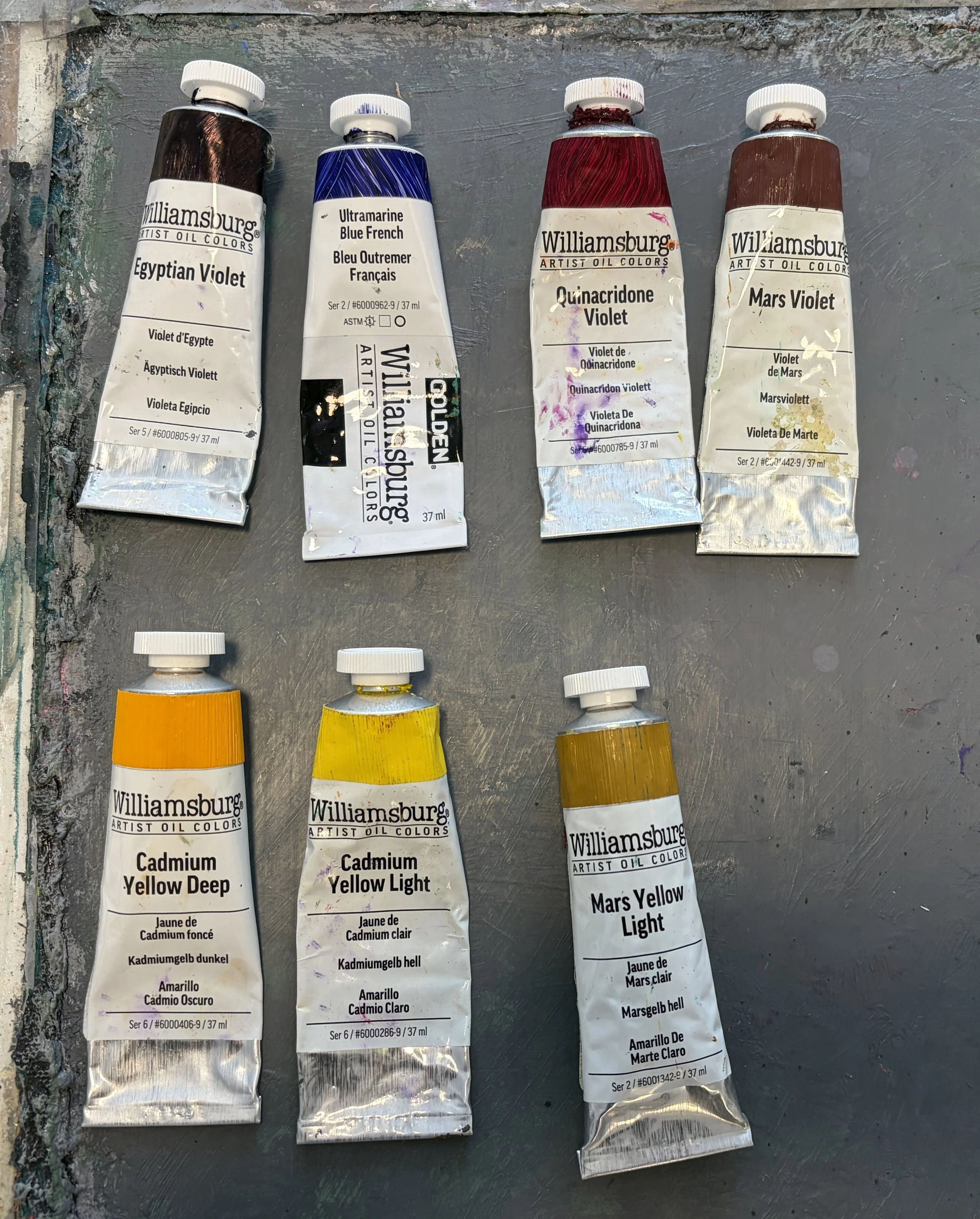
Dioxazine Violet is like a Phthalo- transparent, intense and very strong. Mars Violet is wonderful, but not intense; she’s a good viscous body to add-in some Dioxazine, in order to saturate her a bit more. Lots of experimenting to do here!
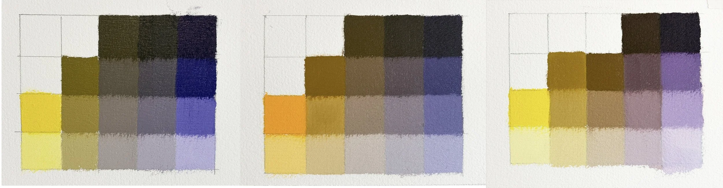
EXAMPLE 1:
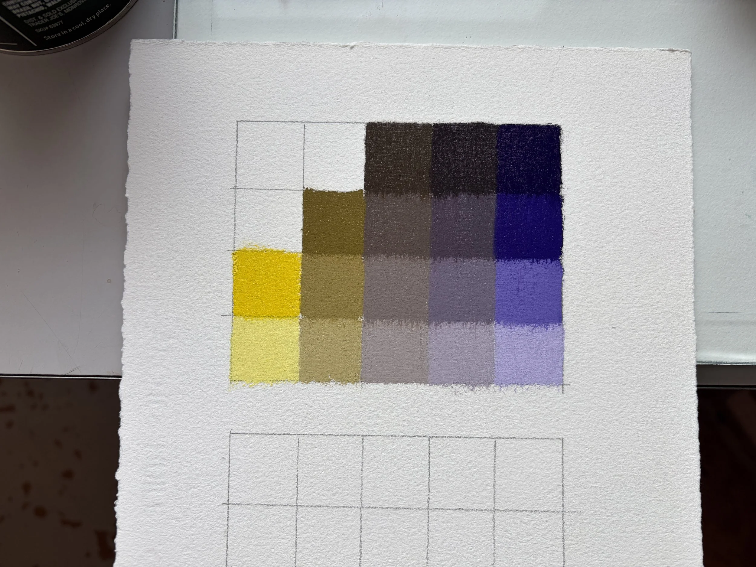
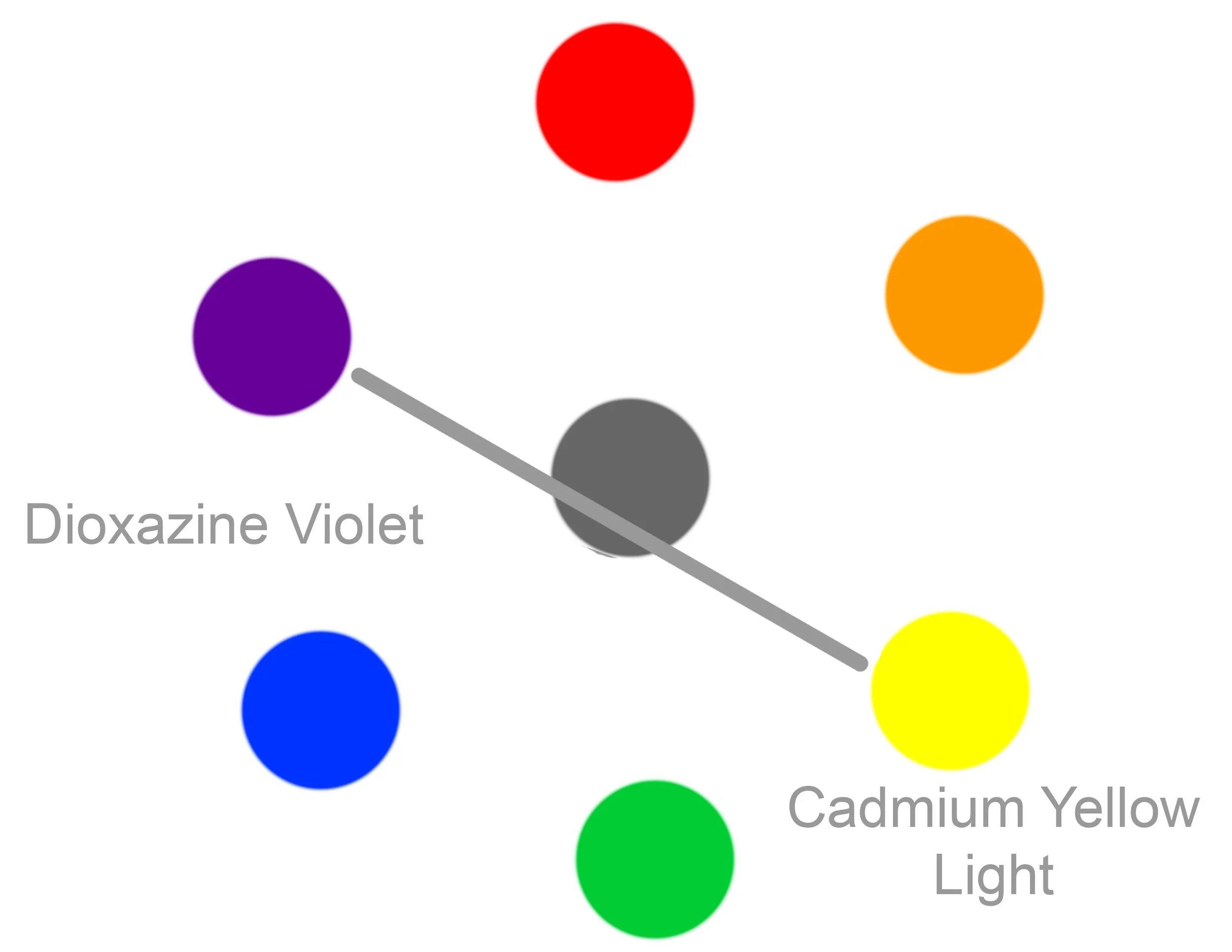
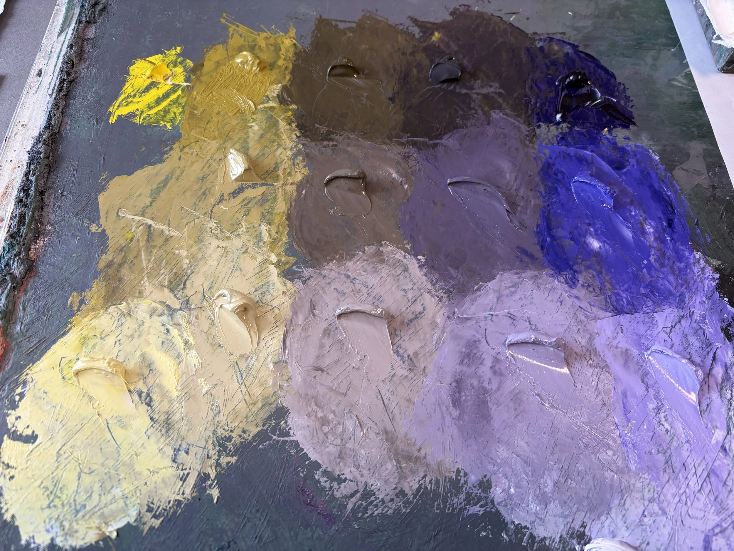
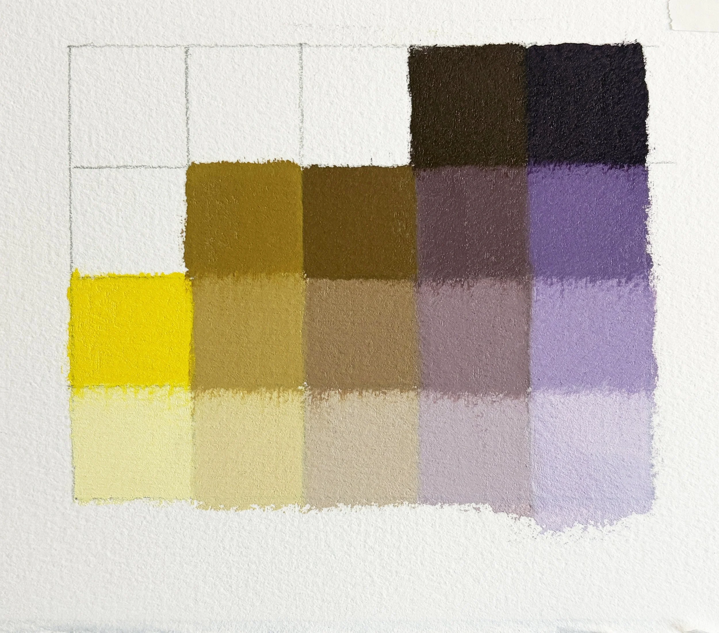
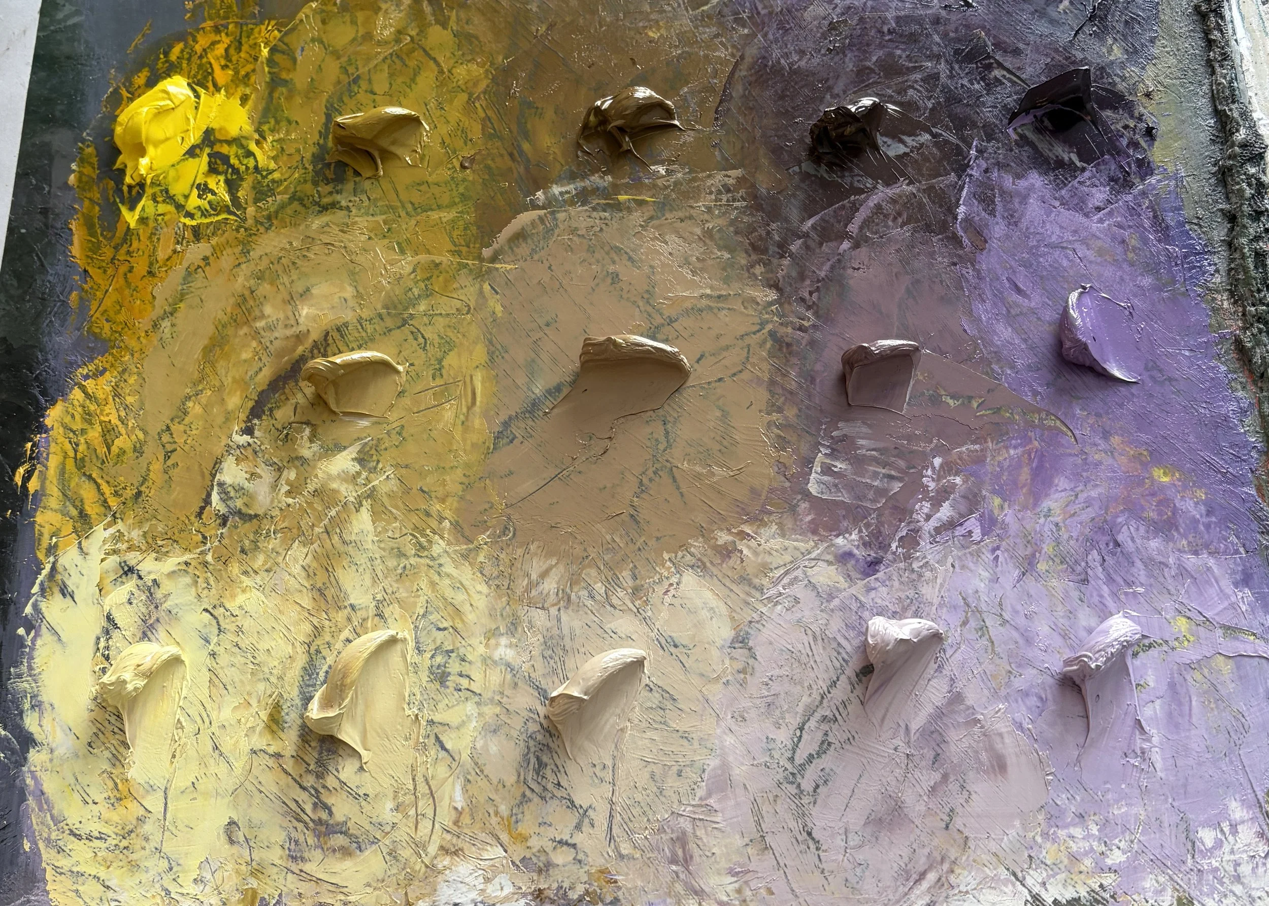
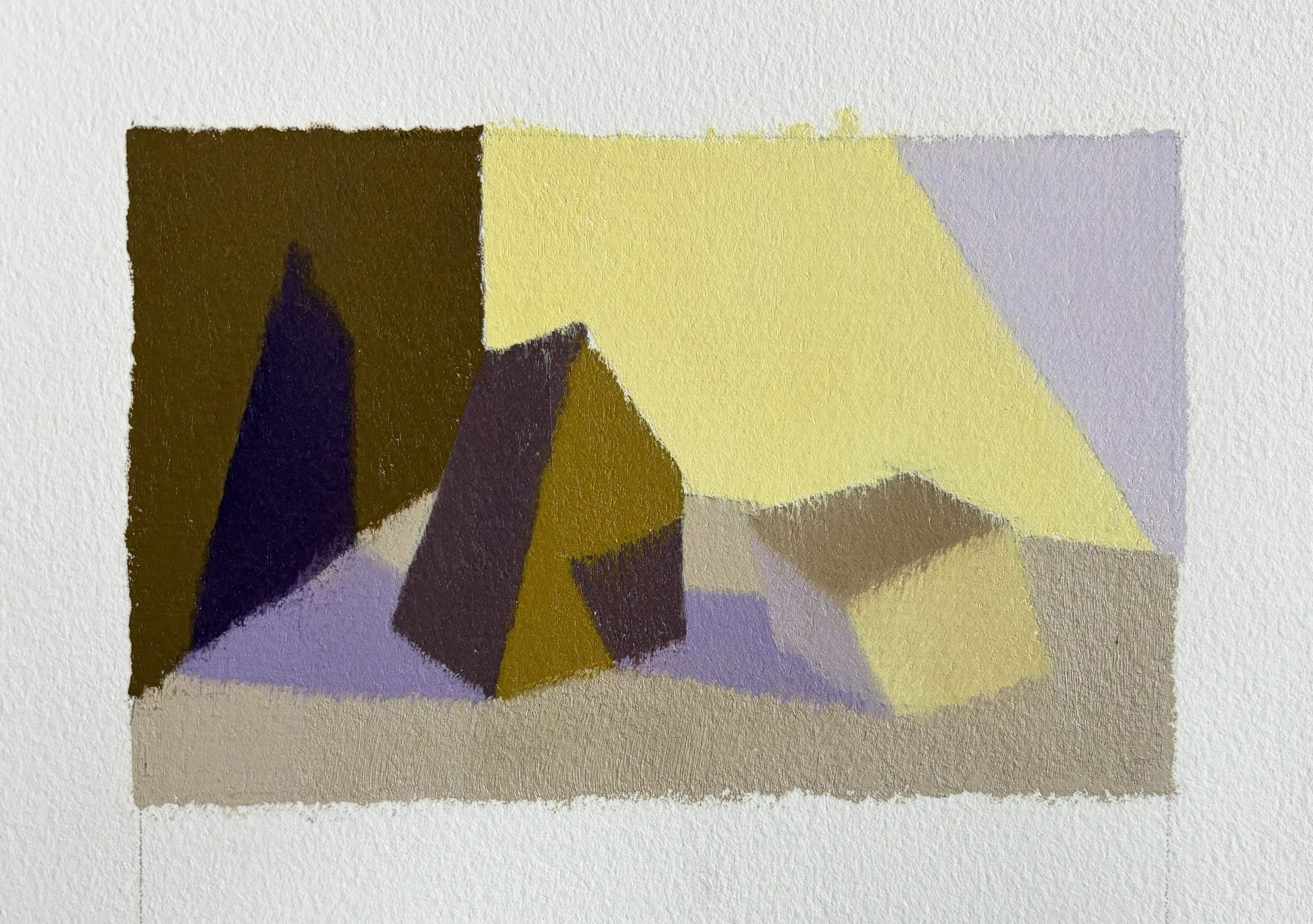
The example below uses Cadmium Yellow Light and Dioxazine Violet (Egyptian Violet); CYL is as close to primary yellow as we can get, and DV is a pretty solid purple, so the tertiary mixtures lean pretty neutral.
VIDEO: Mixing between Cadmium Yellow Light and Dioxazine Violet. NO AUDIO.
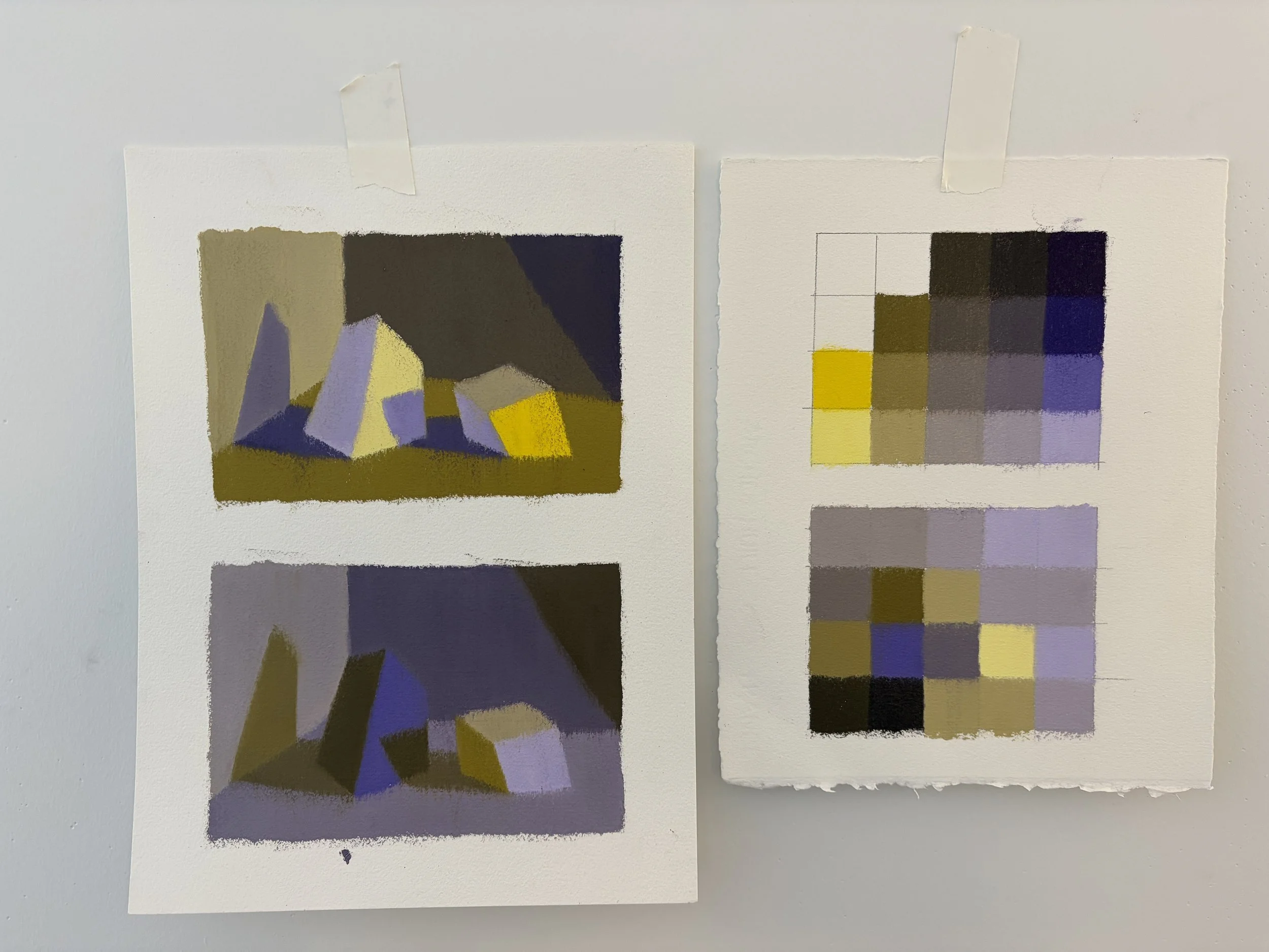
VIDEO: Applying mixtures to a color chart. NO AUDIO
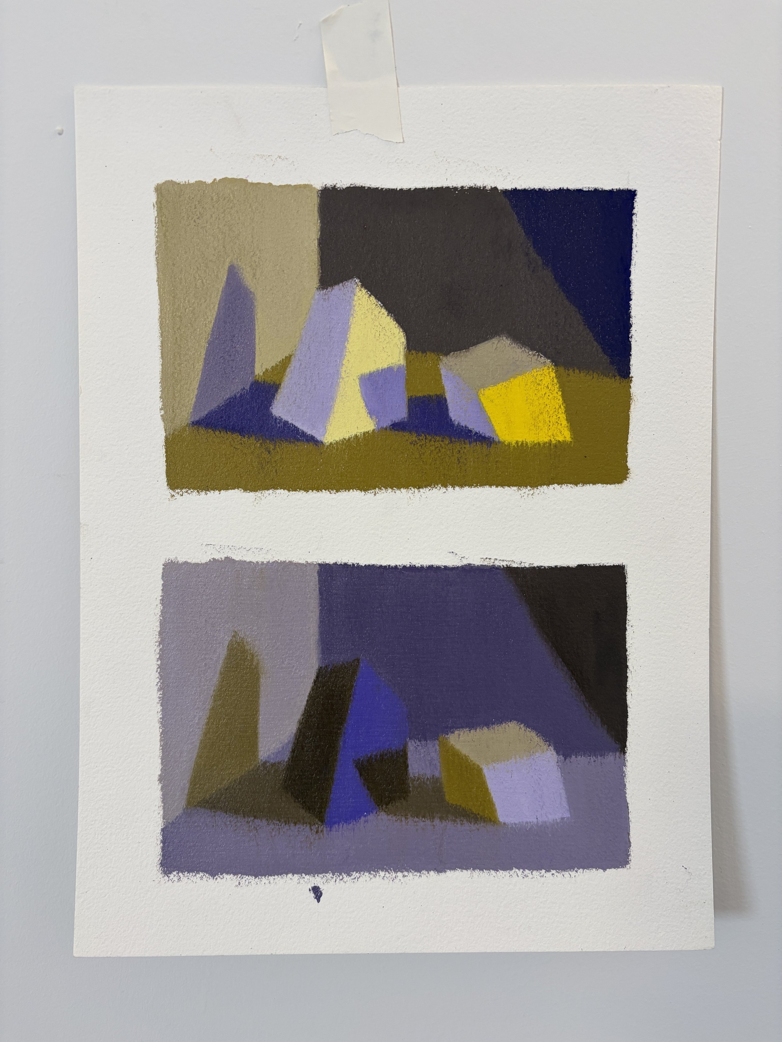
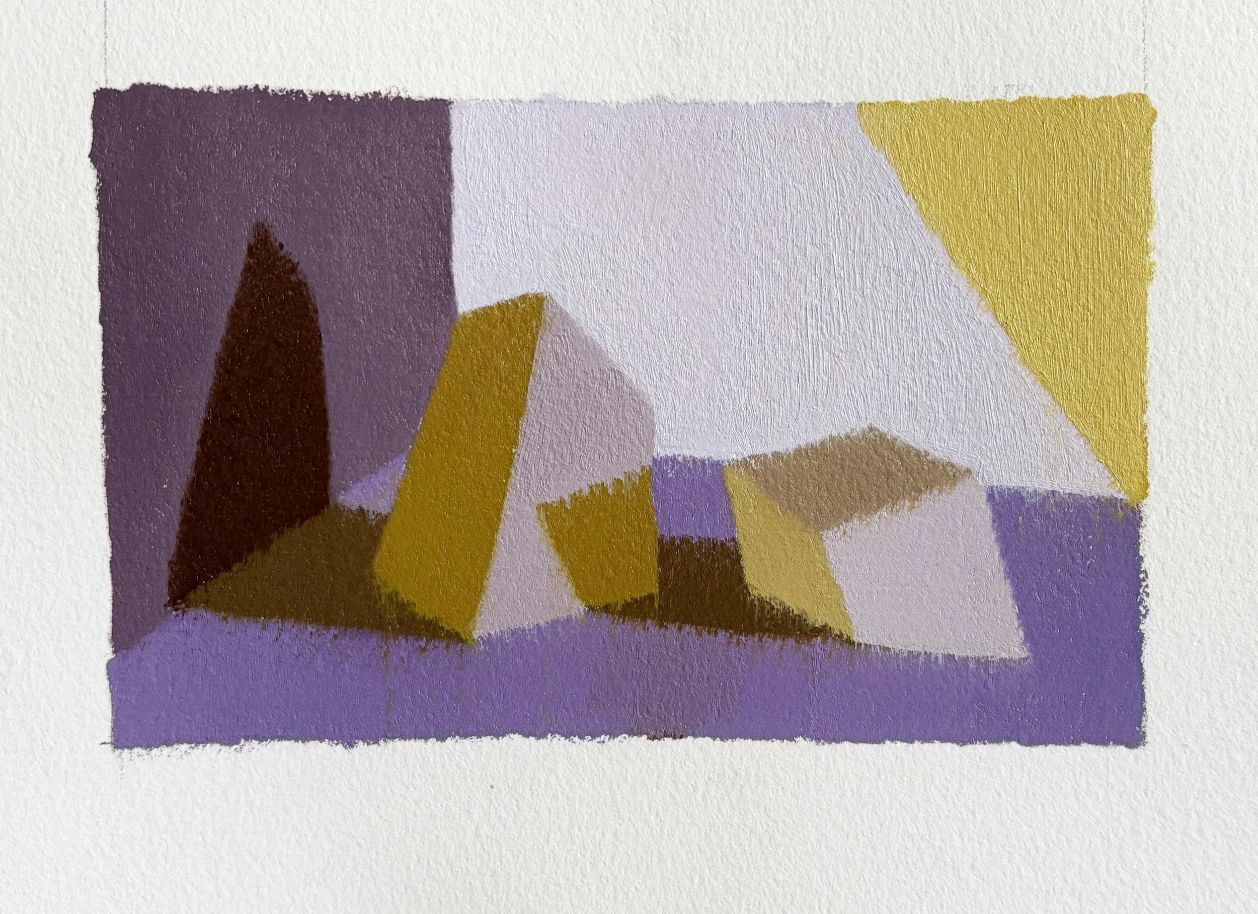
Applying these Mixtures as Form and Light:
As with the Red/ Green Compliment Set, it is not always clear which hue is warm and which is cool, and so it is helpful to simply name the hue of the light and follow that logic.
VIDEO: ROCK TEMPLATE: Yellow Light. NO AUDIO.
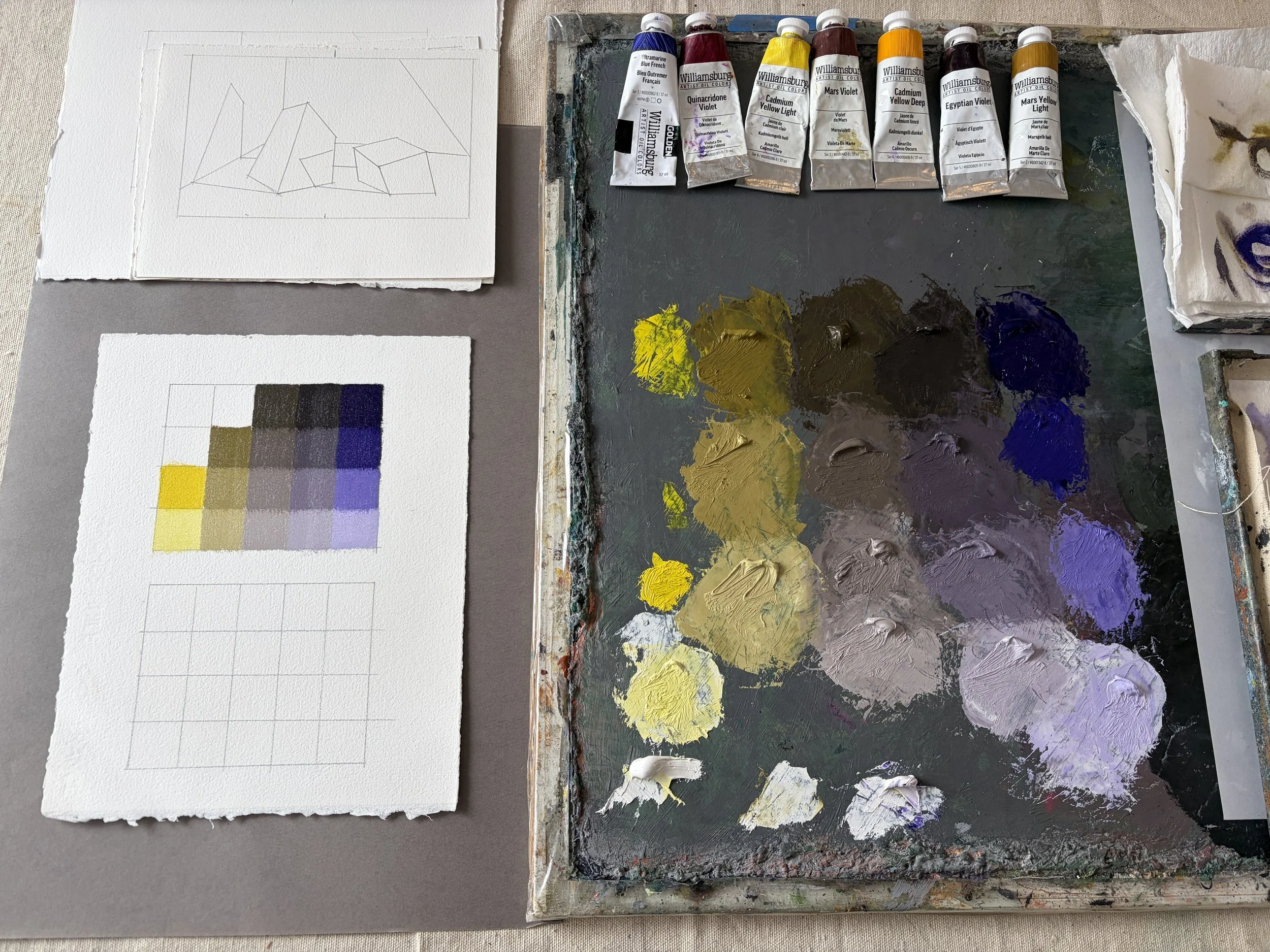
VIDEO: Filling in a “pixel chart” to experiment with color interactions. NO AUDIO.
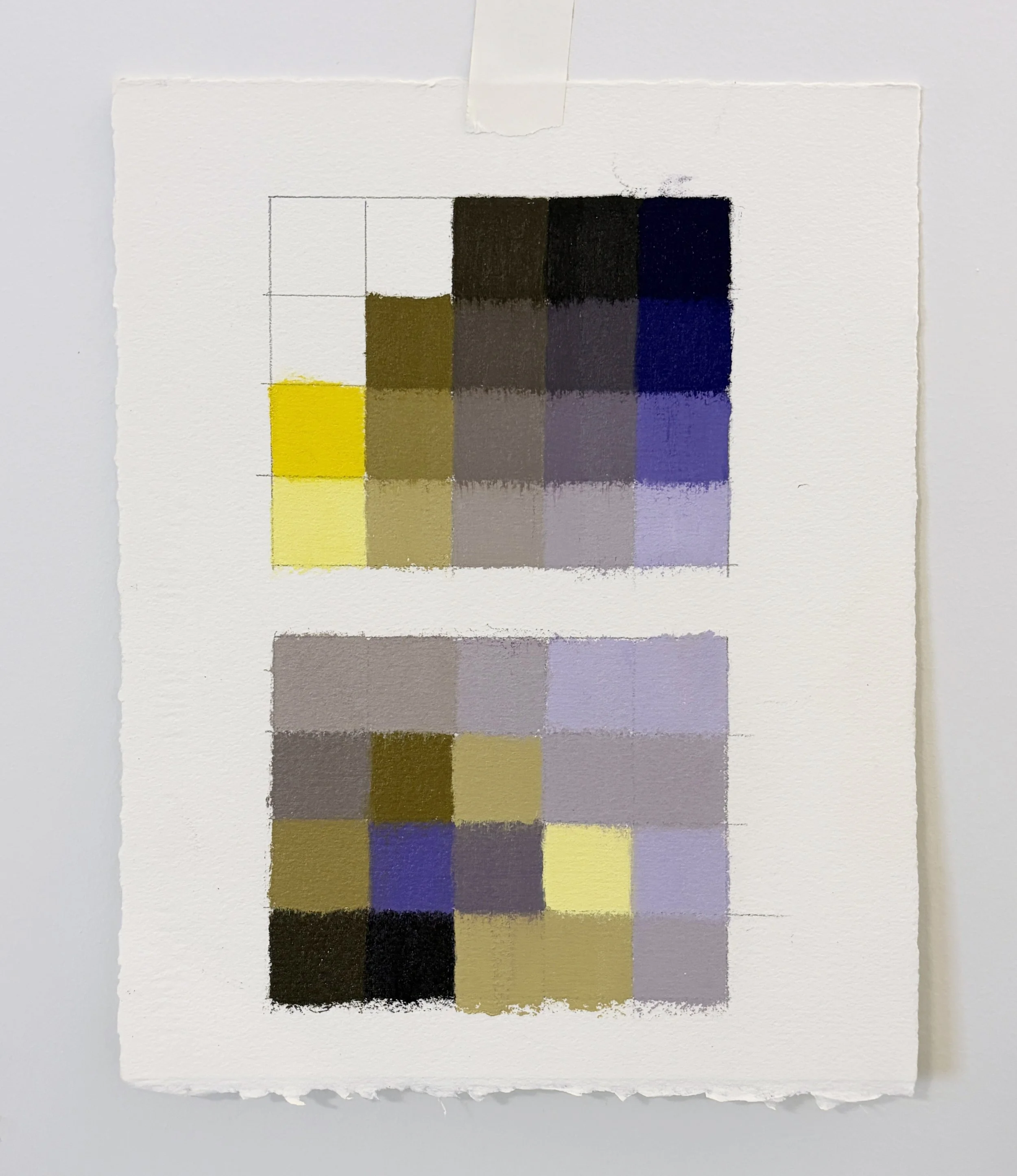
VIDEO: ROCK TEMPLATE: Purple Light. NO AUDIO.
EXAMPLE 2:
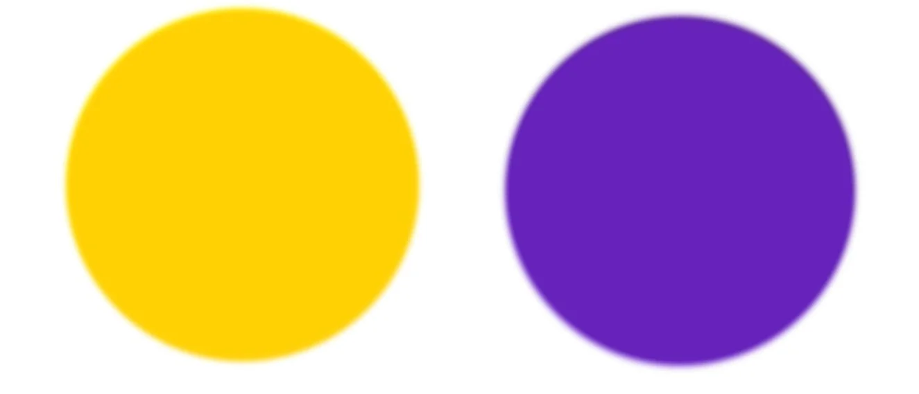
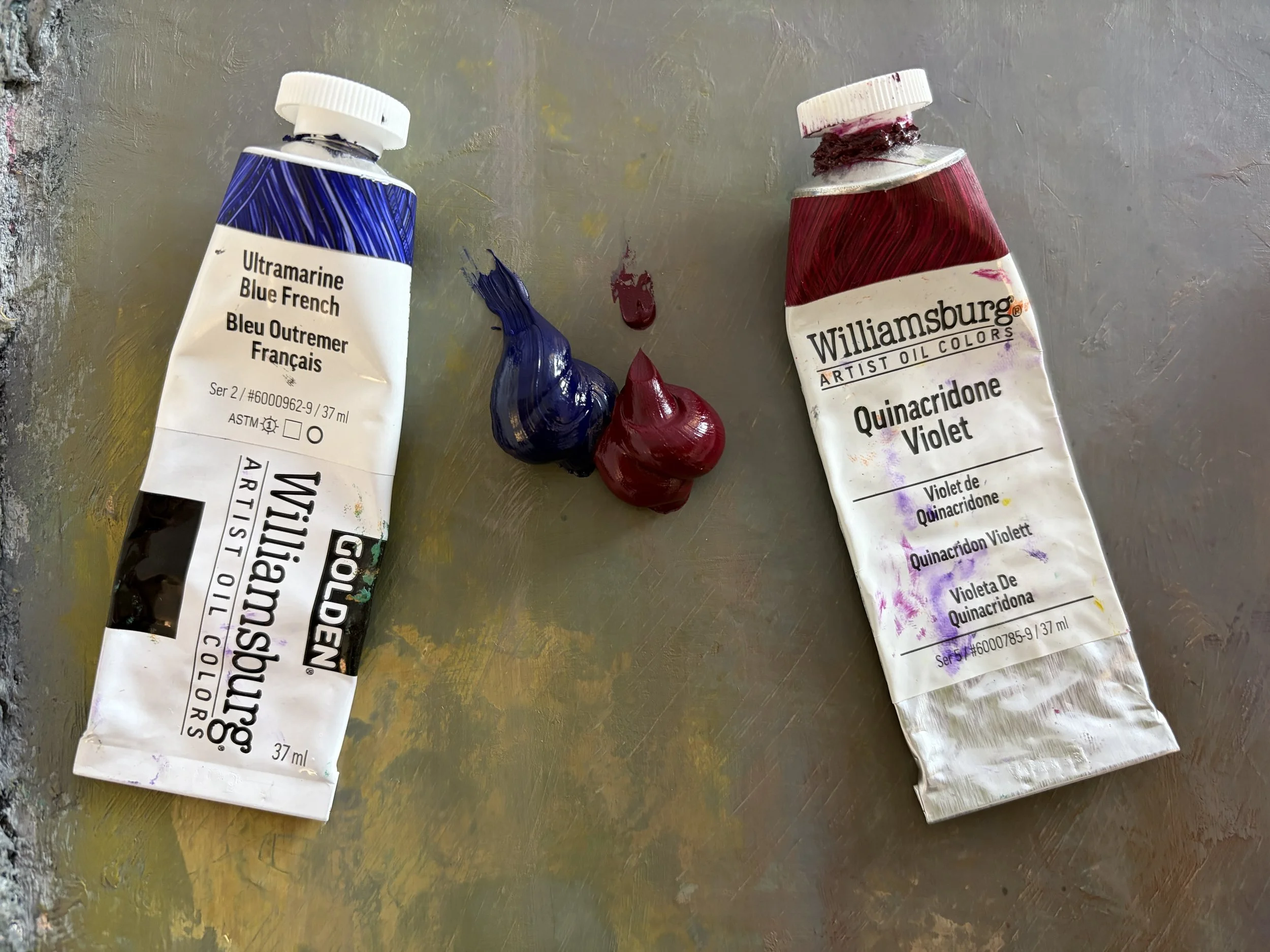
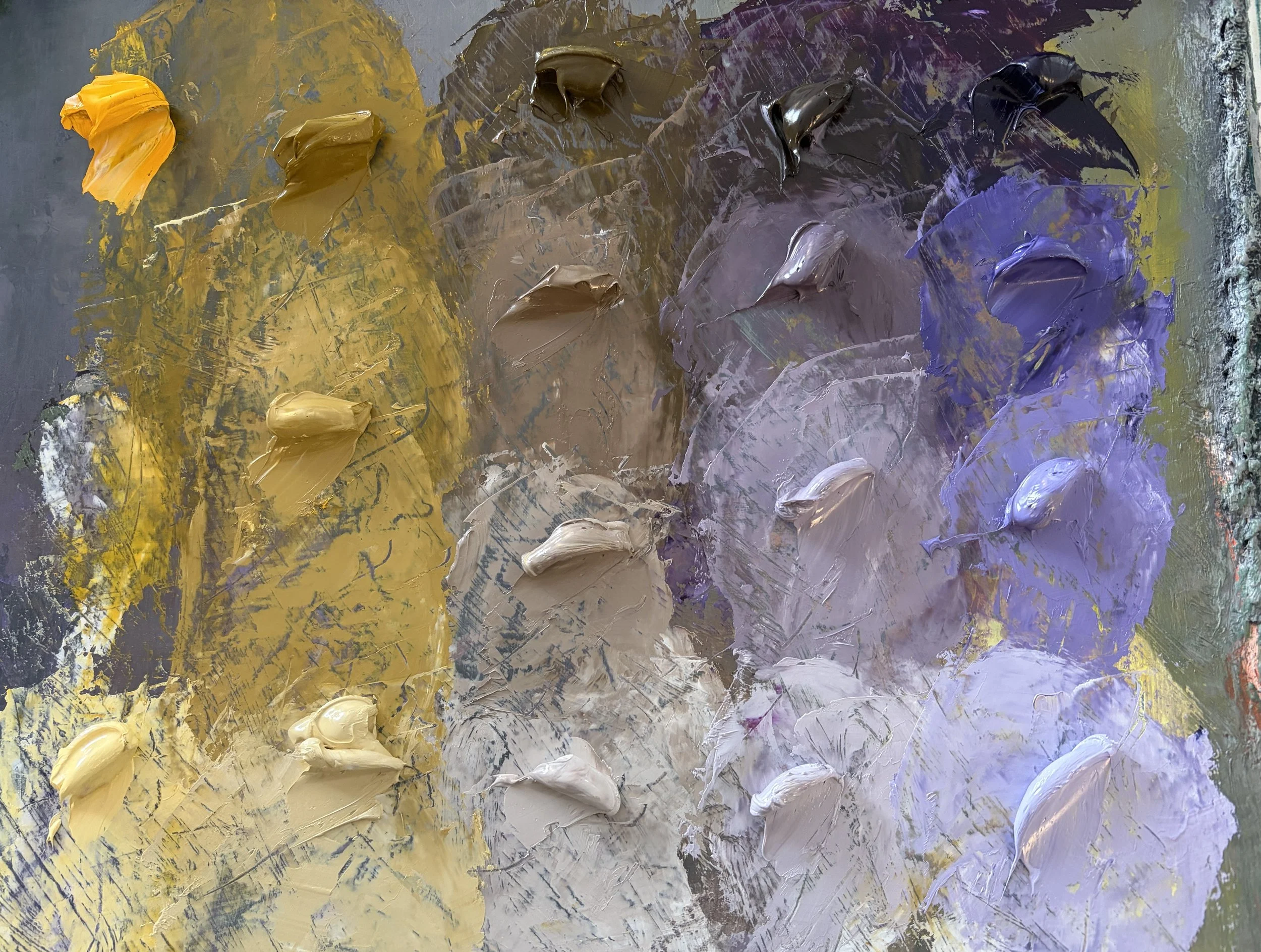
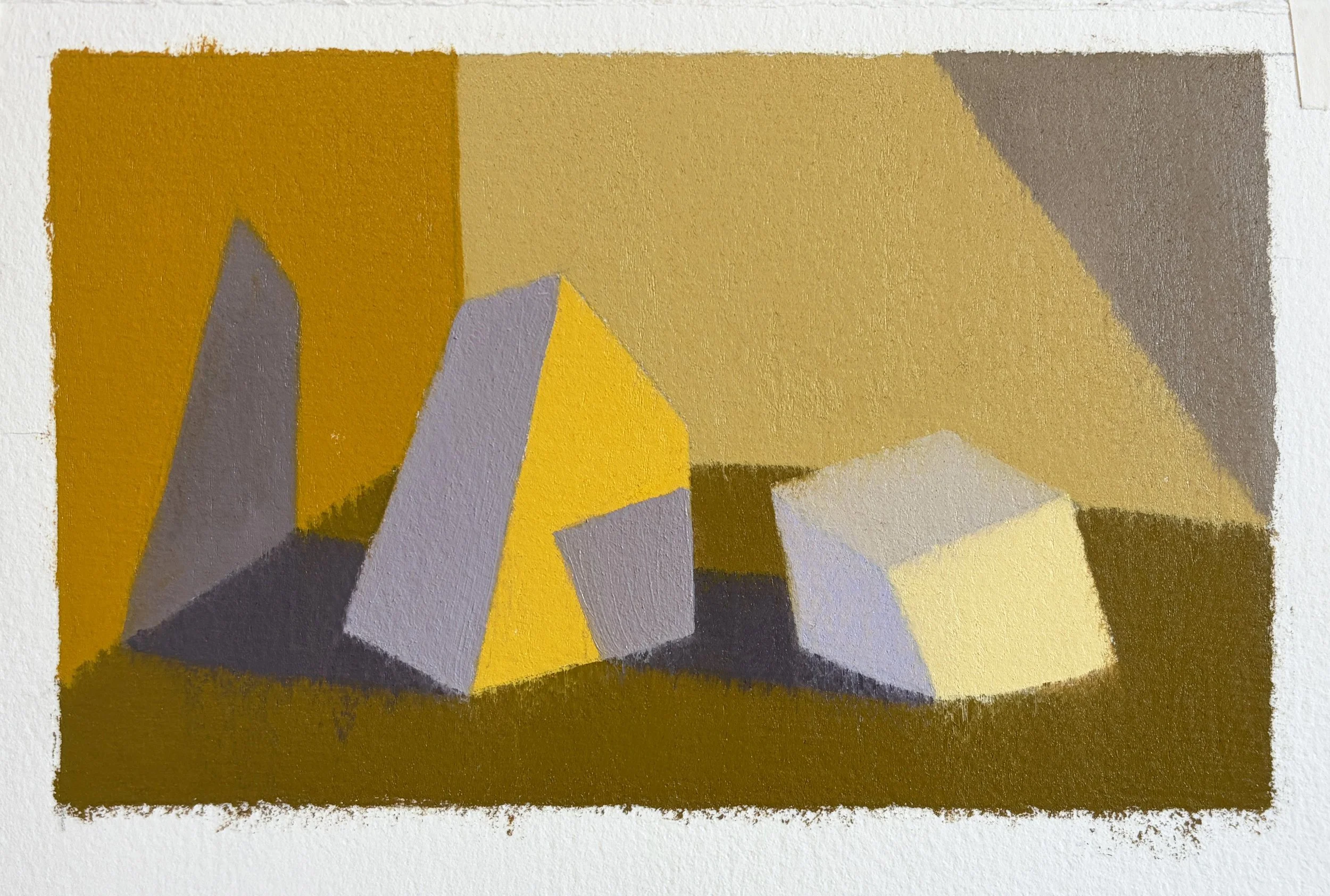
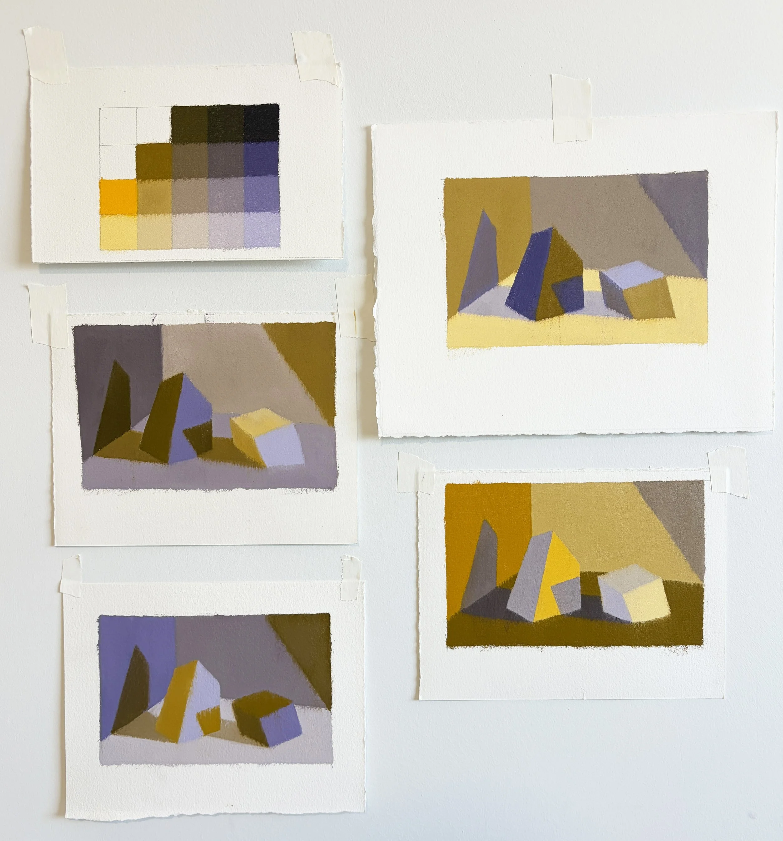
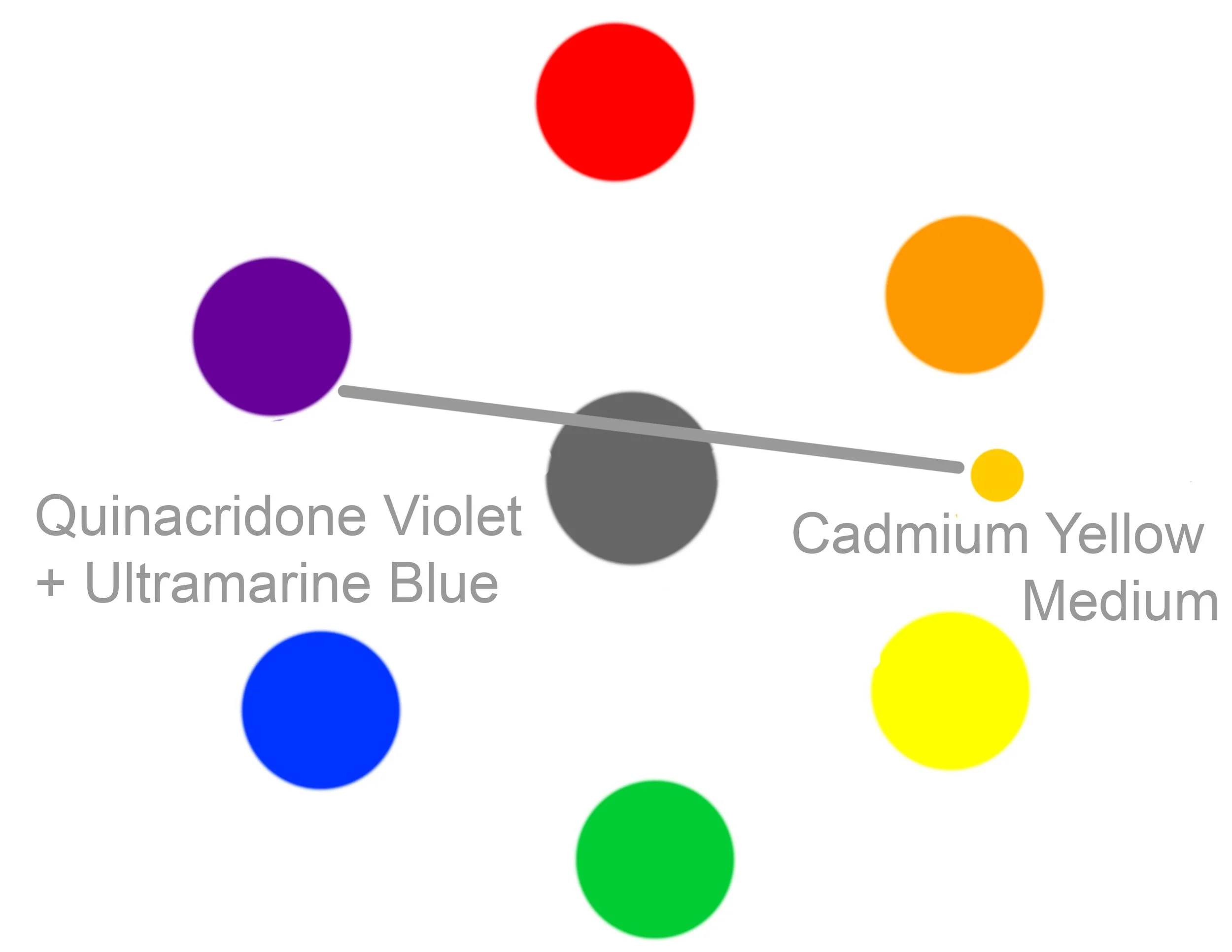
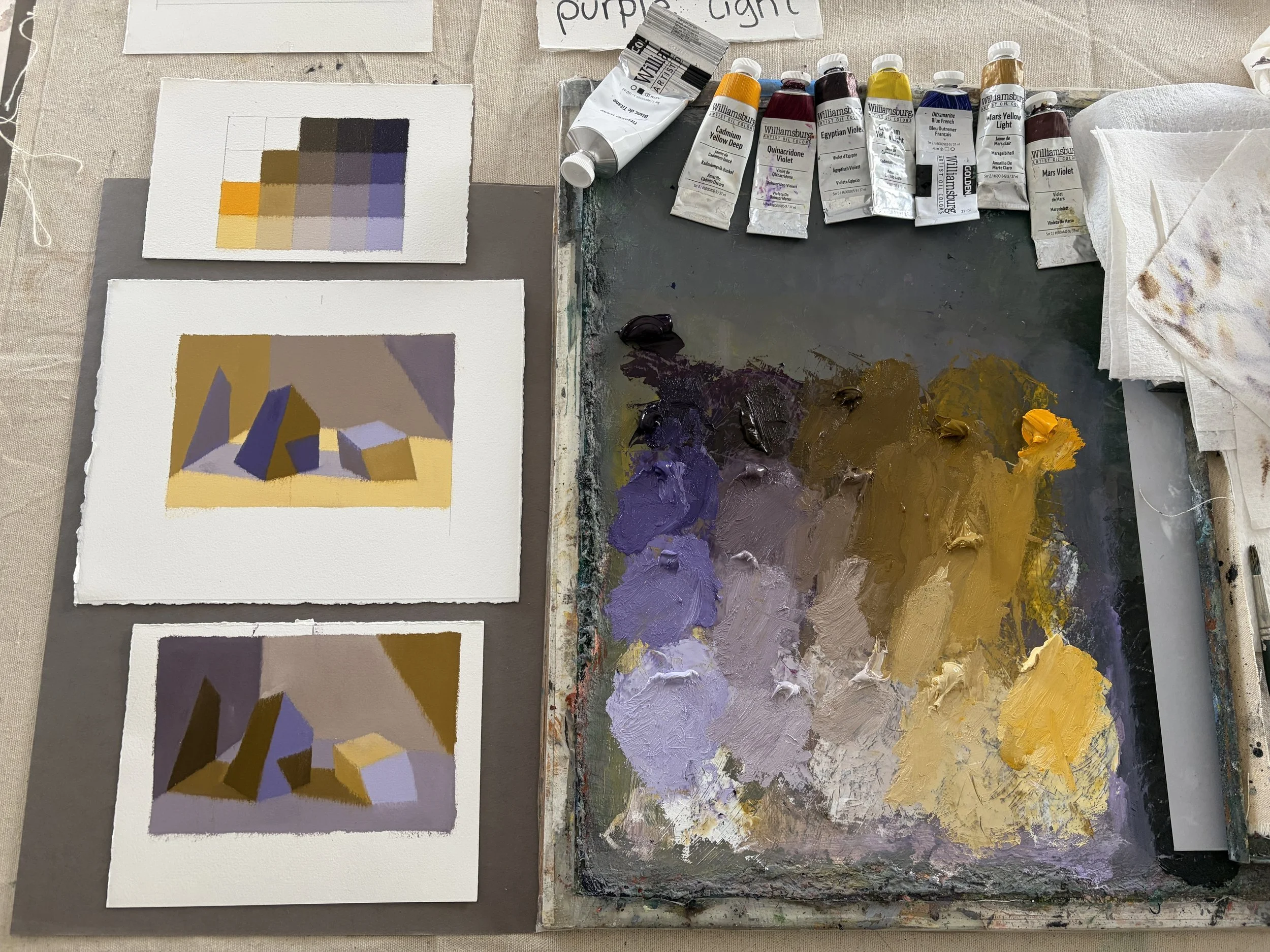
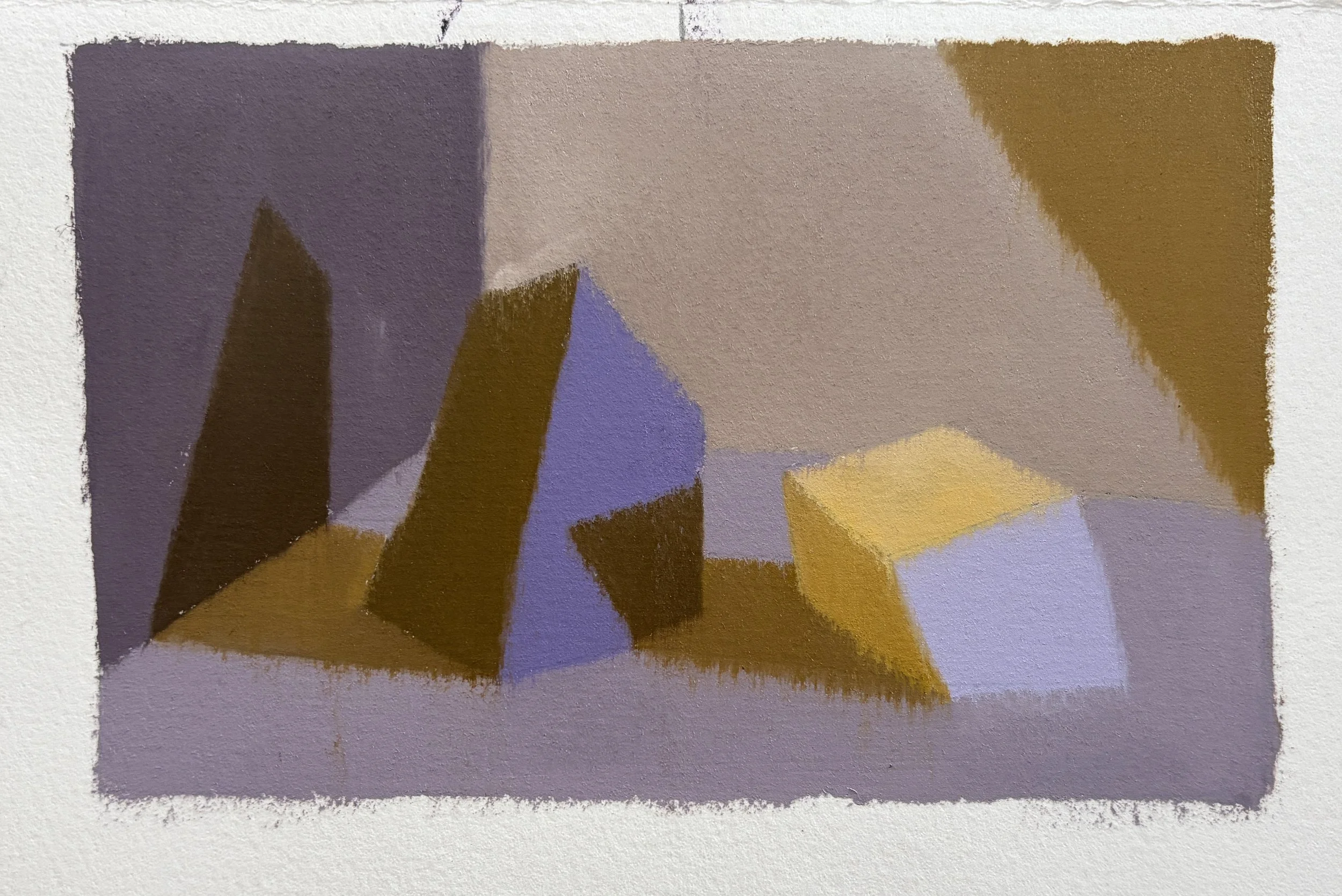
This example uses Cadmium Yellow Medium and a mix of Quinacridone Violet + Ultramarine Blue, leaning on the cooler side, very similar to the Dioxazine Violet. So, we are mainly just warming up our yellow, nudging her towards orange.


EXAMPLE 3:
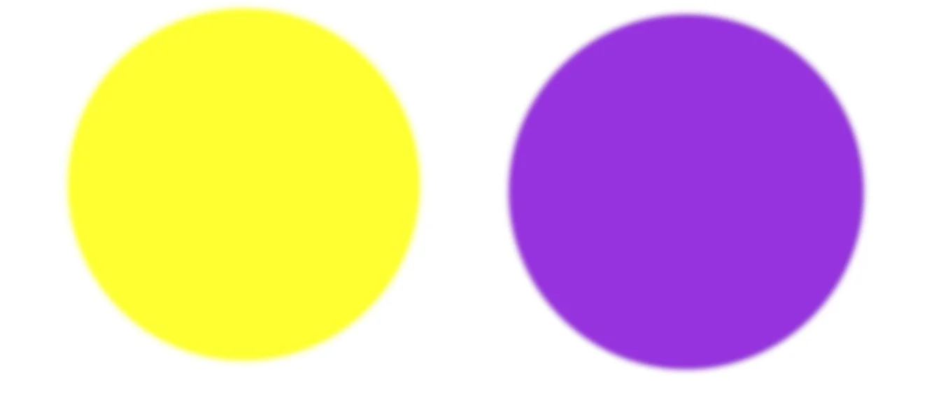
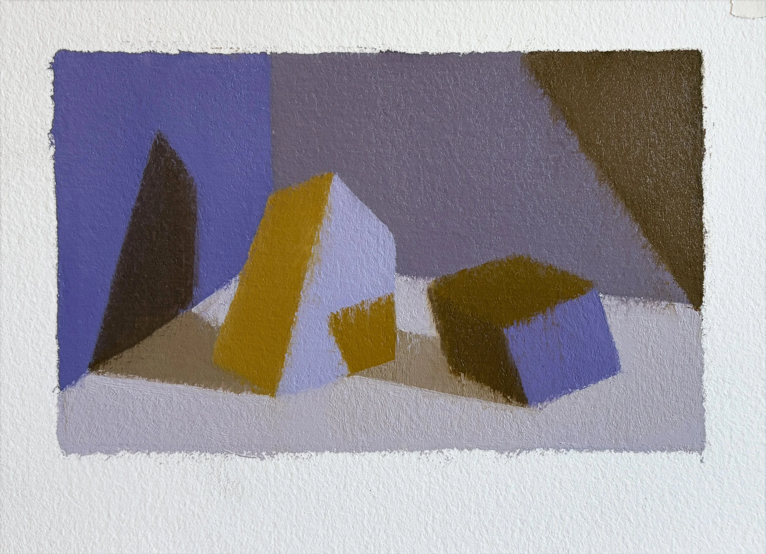
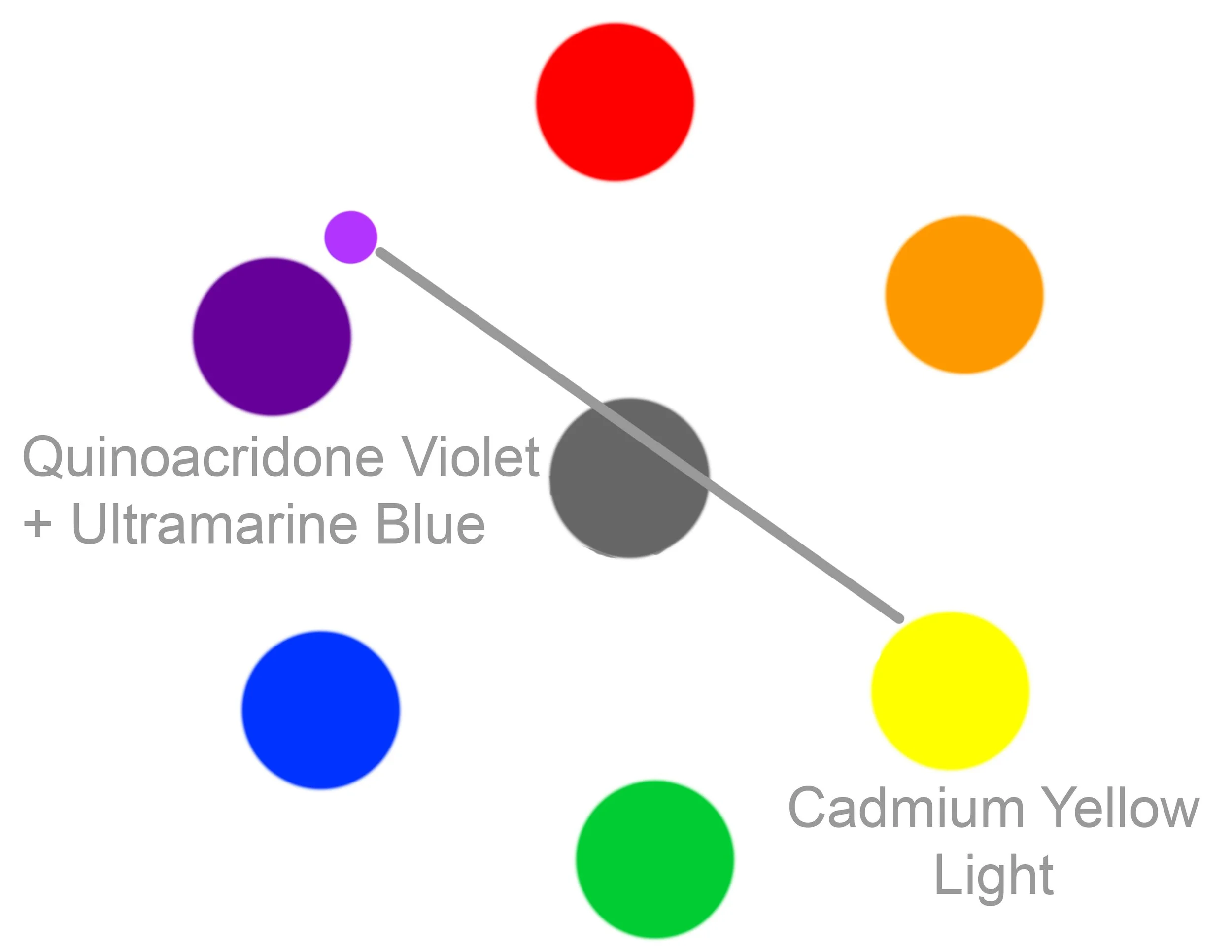
This example uses Cadmium Yellow Light and a mix of Quinacridone Violet + Ultramarine Blue, leaning on the warmer, magenta side of purple.
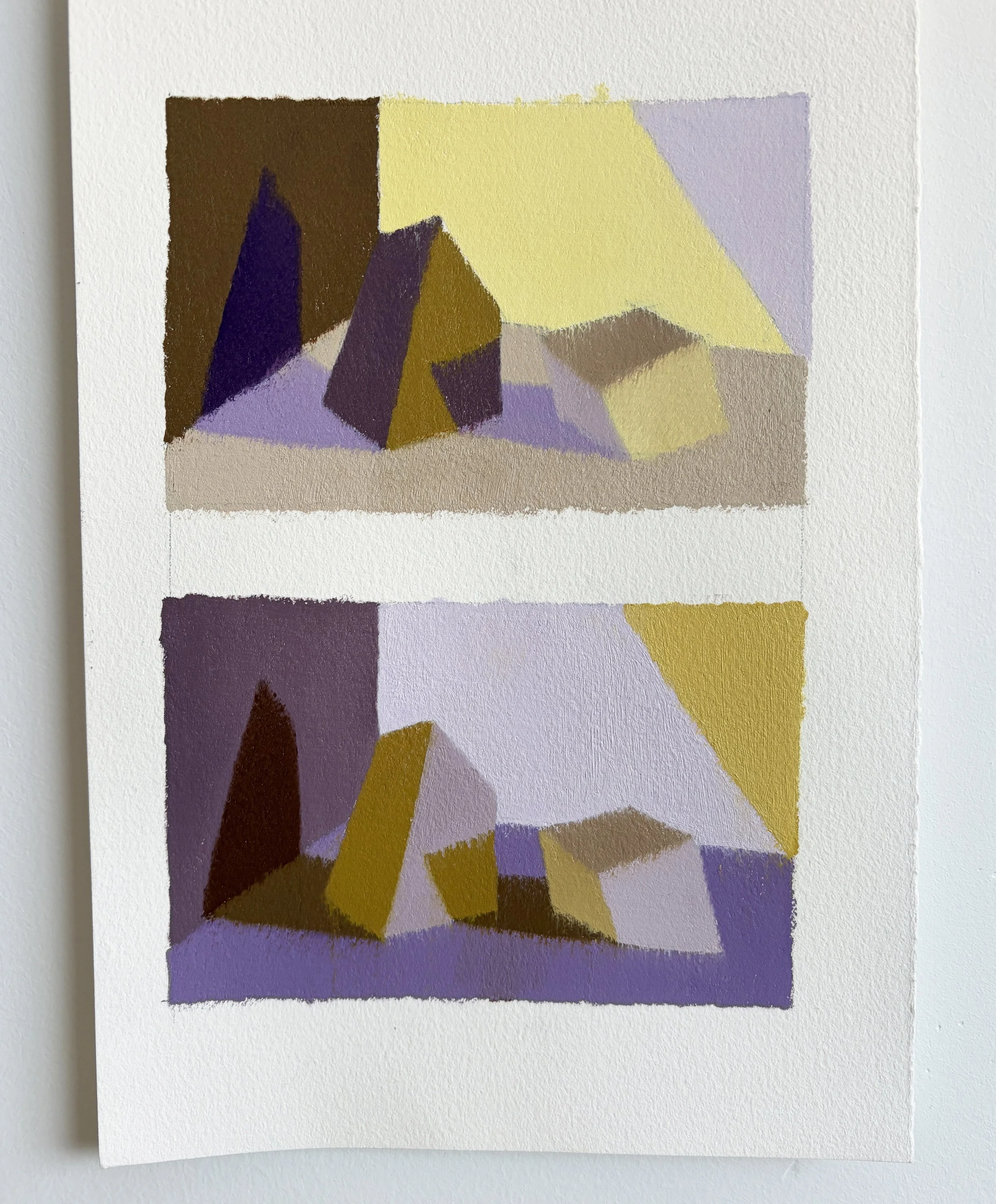
A COMPARISON:
1
1. Yellow/ Cold Violet: overall cooler hues, tertiaries lean greenish and neutral gray. Nuanced temperature hierarchy.
2
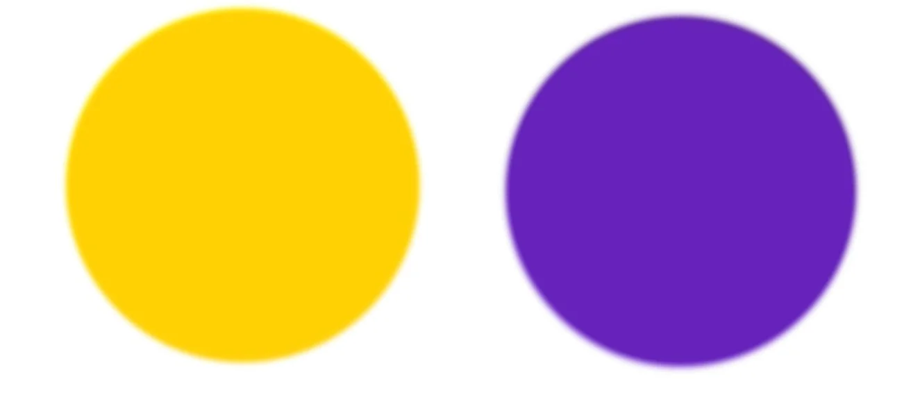
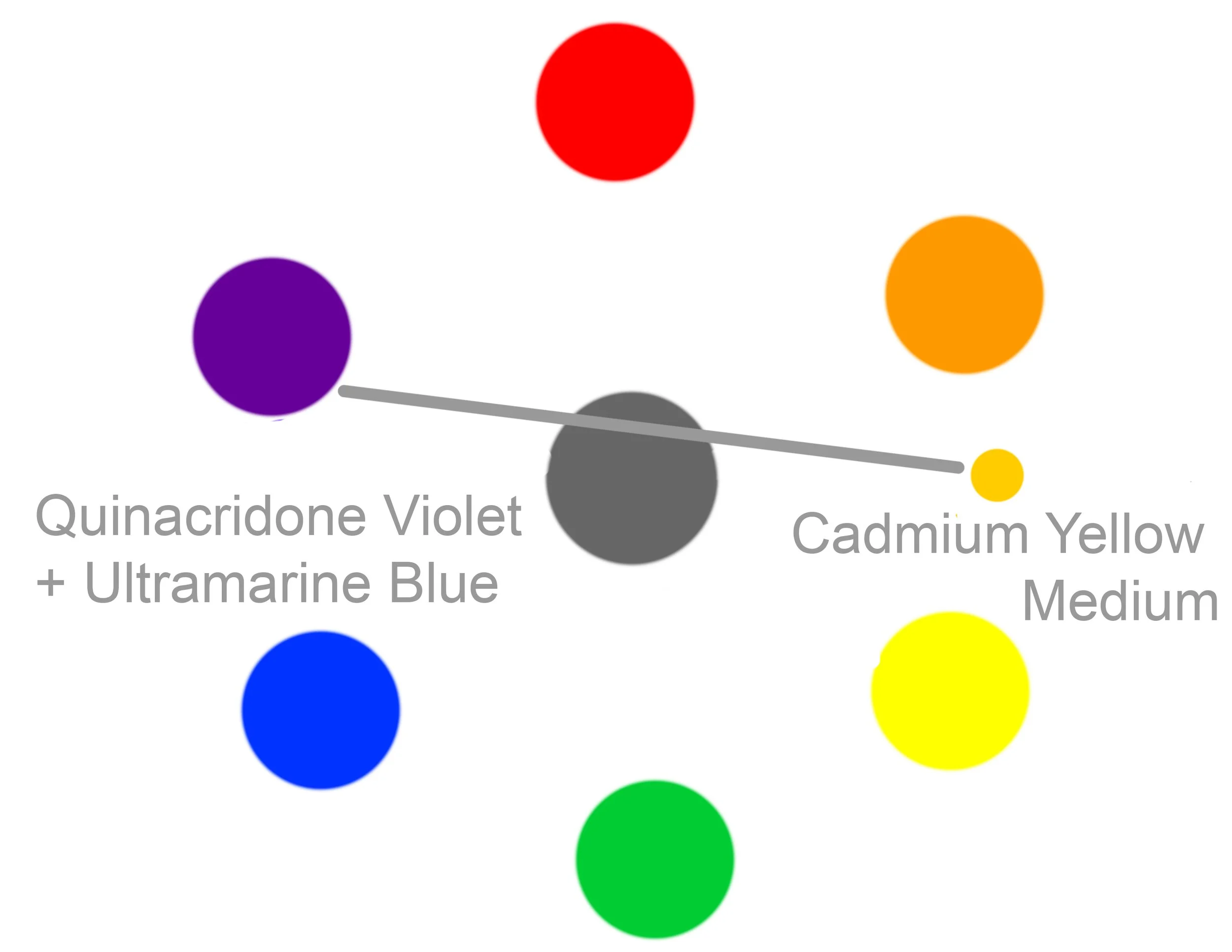
2. Warm Yellow/ Cold Violet: creates a cross section of warm and cool tertiaries. Clear temperature hierarchy.
3
3. Yellow/ Warmer Violet: overall warmer hues, less neutrals; rich warm tertiaries.